Look for the cause. The effect will take care of itself.
William Delbert Gann – 1923
Date: Jan 01, 2026 | Time: 09:30 EST | Source: Institutional Value Desk
Do You Still Lose Sleep Over the AI Bubble? (The Sleep-Well Portfolio) You stare at the charts every night, heart racing as NVDA fluctuates by $50, terrified of the inevitable pullback. That is Gambling. I watch my dividend notifications hit my account every month, and then I sleep like a baby. That is Investing.
This is the difference. While the entire world is squeezing through the narrow exit of the AI trade, Smart Money has already quietly retreated. They haven’t left the market; they have rotated into the forgotten corners—assets that generate massive Free Cash Flow (FCF) and possess deep Moats, yet have been crushed into the ground by “High Interest Rates” and “Geopolitical Fear.”
In 2026, the game isn’t about who runs the fastest; it’s about who survives the longest. This 6,000-word deep dive is for the young investor who wants to build an “Anti-Fragile” portfolio. We are going deep into REITs, Banks, Energy, Telecoms, and China Tech. First, I will give you [Style C: Data Freak] institutional intelligence—so you can dominate any conversation with professional insights. Then, I will use 18 Battle-Tested Charts to show you exactly where the “Whale Accumulation Zones” are.
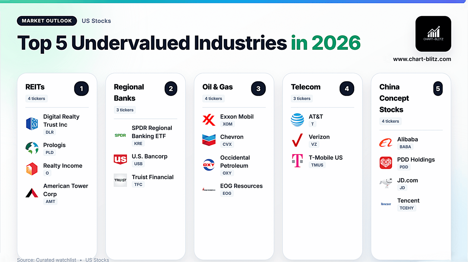
The Most Undervalued Niche Industry: REITs (The Landlords)

You need to understand: REITs didn’t fall the last two years because their businesses were bad; they fell because of the “Denominator Effect.” When the US 10-Year Treasury Yield is at 5%, who buys a REIT yielding 4%? But in 2026, as the Fed cuts rates, the Yield Spread will re-expand. This is a math problem, not a sentiment problem.
To sound like an expert, distinguish between these two types of REITs:
- Physical AI (The AI Landlords):
If your friends talk about buying NVDA, tell them: “AI doesn’t float in the cloud; AI lives in a Data Center.” Digital Realty (DLR) owns the world’s largest data center network. The key metric here is Vacancy Rate. Currently, in Northern Virginia (the world’s largest data center market), vacancy is under 1%. This gives DLR immense Pricing Power. Prologis (PLD) handles logistics. Every $1 Billion growth in E-commerce requires 1 million sq ft of warehouse space. This is Structural Demand. - Bond Proxies:
Realty Income (O) and American Tower (AMT). Their business model is Triple Net Lease—the tenant pays taxes, insurance, and maintenance. O is “The Monthly Dividend Company,” raising dividends for 25 years straight. Buying this is like buying an inflation-protected bond with upside.
Institutional View: Morgan Stanley notes that REIT FFO (Funds From Operations) multiples are at their lowest since 2008. A 100bps drop in rates could reprice NAV (Net Asset Value) upwards by 20%.
Fundamentals say “Oversold,” but the Charts say ” The Bottom is In.” REIT charts are distinct: They are waking up from a two-year Downtrend.
1. DLR (Digital Realty) – The AI Landlord
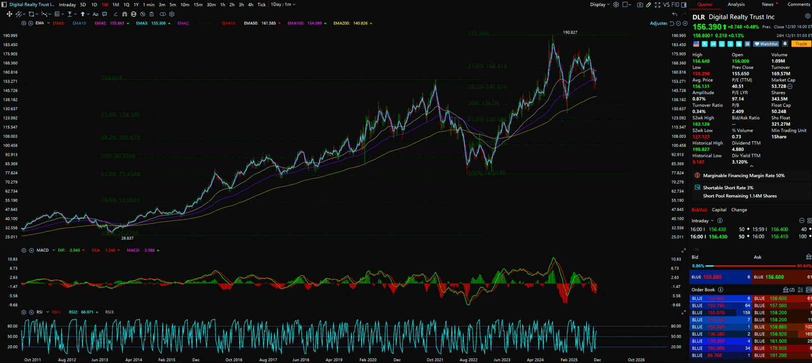
- Pattern: Ascending Channel
- Chart Decode: Look at DLR. This is a classic Leader Structure. It is stronger than other REITs because it is tethered to AI. Price is grinding up the EMA 50 without deep drawdowns.
- Action: Buy the Dip. Whenever price touches the channel midline or the 145−150 zone, accumulate aggressively. Target previous highs of $160+.
2. PLD (Prologis) – The Logistics King
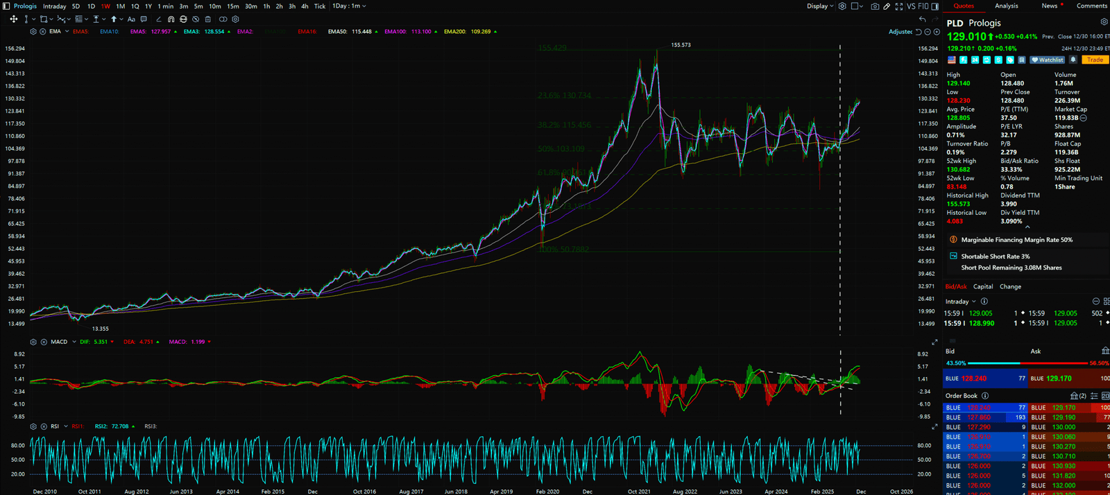
- Pattern: Cup and Handle Recovery
- Chart Decode: PLD has undergone a long correction and is now building a massive Rounding Bottom. Moving averages are aligning bullishly (EMA 20 > 50 > 200).
- Action: A breakout above the $135 neckline is the confirmation signal. This is a “Hold for 10 Years” stock.
3. O (Realty Income) – Monthly Paycheck
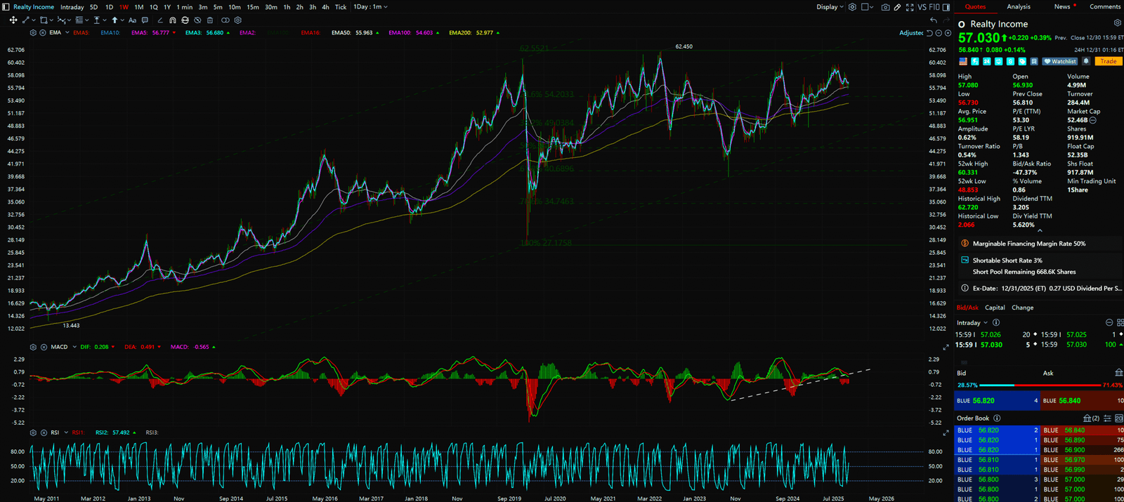
- Pattern: Rounding Bottom / Basing
- Chart Decode: The chart shows O built a fortress-like base in the 50−55 zone. This is Accumulation following Capitulation.
- Key Indicator: Watch for RSI Divergence. Price made lower lows while RSI made higher lows—ironclad proof of a reversal.
- Action: Income Play. Buy under $60 to lock in a 5%+ Yield.
4. AMT (American Tower) – 5G Infrastructure
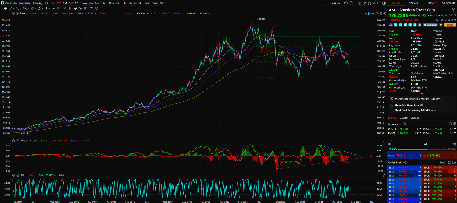
- Pattern:Trendline Breakout
- Chart Decode: AMT has broken its long-term downtrend line. The chart shows it is currently Backtesting that breakout.
- Action: Enter upon confirmation above the EMA 200. This is the defensive backbone of the telecom sector.
The 2nd Most Undervalued Niche Industry: Regional Banks (The Survivors)

This is a story about “Survival of the Fittest.” Key terms to drop: Unrealized Losses and Yield Curve Control.
- The HTM Portfolio Logic:
The 2023 banking crisis (SVB) happened because rates spiked, crashing bond prices. Now, the reverse is happening. As rates fall, the losses on banks’ HTM (Held-to-Maturity) Securities are shrinking rapidly. This directly increases Tangible Book Value (TBV). - NIM Expansion:
To sound like an expert, mention “Deposit Beta.” As rates fall, the interest banks pay to depositors drops faster than the interest they charge on loans. This causes NIM (Net Interest Margin) to expand automatically. - M&A Supercycle:
The US has 4,000 banks—way too many. Regulators (FDIC) are quietly encouraging consolidation. U.S. Bancorp (USB) and Truist (TFC) are the Predators in this game, not the prey.
Bank stocks are “Crisis Alpha.” When everyone is too scared to touch them, that is our entry signal. The charts show the panic selling is over.
5. KRE (Regional Banking ETF) – The Barometer
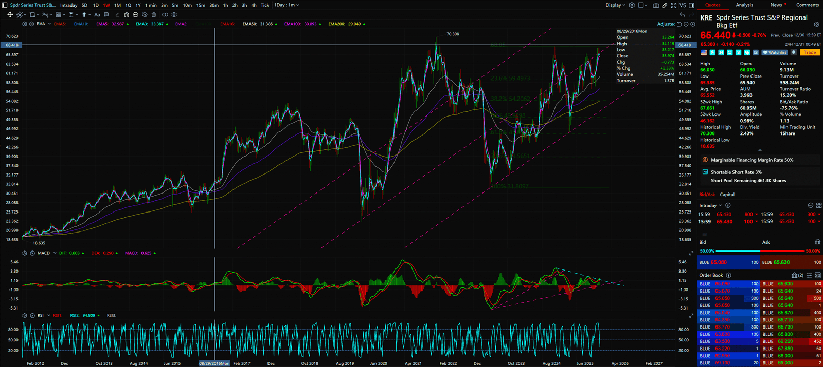
- Pattern: Inverse Head and Shoulders
- Chart Decode: KRE has formed a textbook Inverse Head and Shoulders. The right shoulder is higher than the left, indicating strengthening buying pressure. Currently testing neckline resistance.
- Action: A breakout above $55 starts the big move. This is the best tool for a basket bet on recovery.
6. USB (U.S. Bancorp) – Too Big to Fail
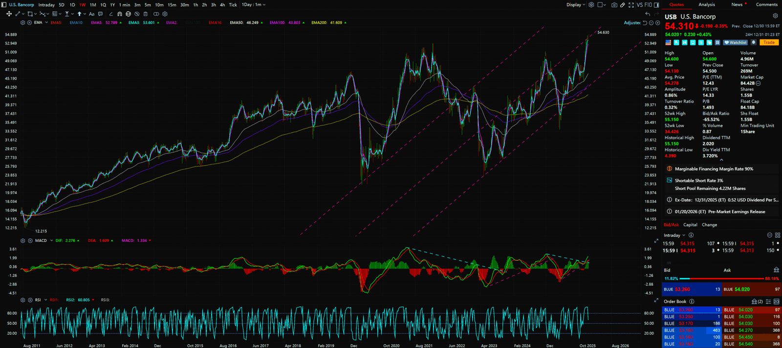
- Pattern: Ascending Triangle
- Chart Decode: USB shows Higher Lows. Price has reclaimed the EMA 200, the dividing line between Bull and Bear.
- Action: This is a Buffett Style Play. Accumulate at the bottom of the triangle, betting on a valuation repair to 1.5x P/TBV.
7. TFC (Truist Financial) – Valuation Repair
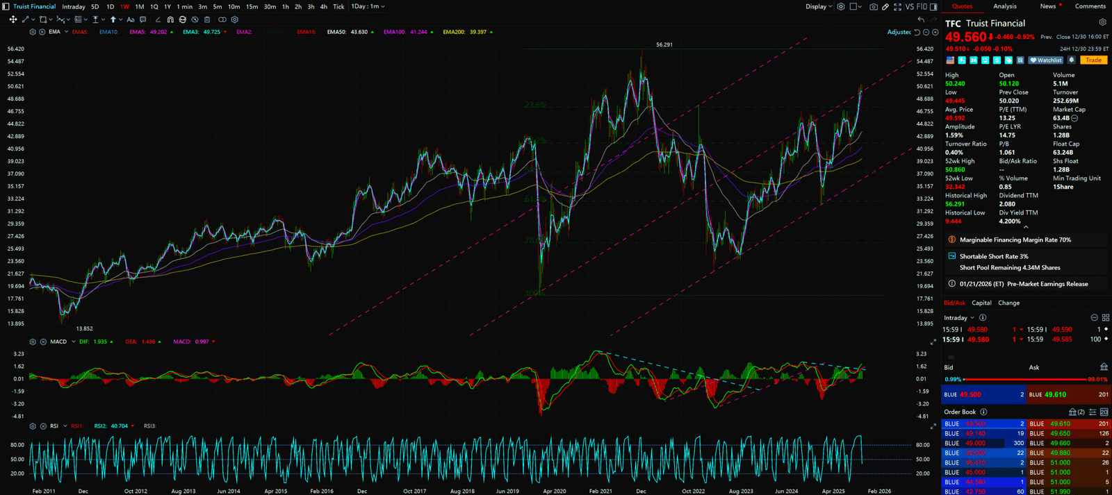
- Pattern: Gap Fill Potential
- Chart Decode: TFC has a massive overhead Gap on the chart. Technical analysis dictates: “Gaps represent targets.”
- Action: Upon confirmation above 45, the target is the gap fill at 55.


The 3rd Most Undervalued Niche Industry: Oil & Gas (The Revenge)

Is the Energy Transition a scam? No, but it is much slower than you think. AI needs power, and renewables aren’t enough. This is “Energy Pragmatism.”
- The AI-Gas Nexus:
Quote Goldman Sachs: 60% of new Data Center power demand will be met by Natural Gas. Wind and Solar are intermittent; AI needs 24/7 Baseload Power. - Capital Discipline:
This is the sexiest phrase in Oil right now. Historically, when oil prices rose, companies drilled like crazy. Now? They do Stock Buybacks. Exxon (XOM) and Chevron (CVX) have become “Cash Flow Machines.” Their Free Cash Flow Yield is 8-10%—numbers tech stocks can only dream of. - Geopolitical Hedge:
The Middle East is a perpetual Black Swan. Allocating 10-15% of your portfolio to Energy is the cheapest insurance policy against war.
These stocks won’t rip 10% in a day like NVDA, but they won’t crash 20% either. Their charts show a Slow Grind, perfect for the steady investor.
8. XOM (Exxon Mobil) – The King
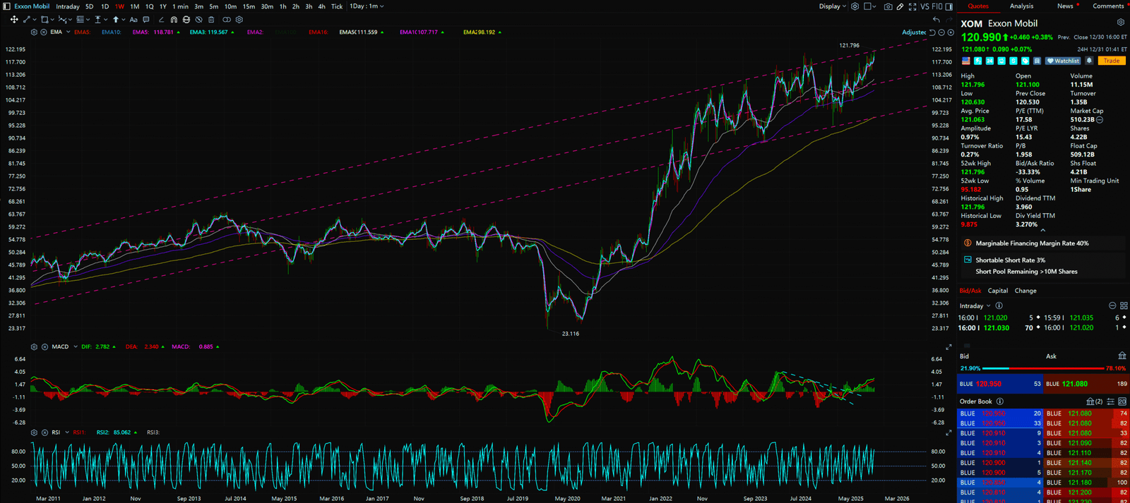
- Pattern: High Tight Flag / Breakout
- Chart Decode: XOM is the strongest in the sector. It formed a Bull Flag near all-time highs. This means no one wants to sell.
- Action: Trend Following. As long as it holds the EMA 50, every dip is free money.
9. CVX (Chevron) – The Catch-Up
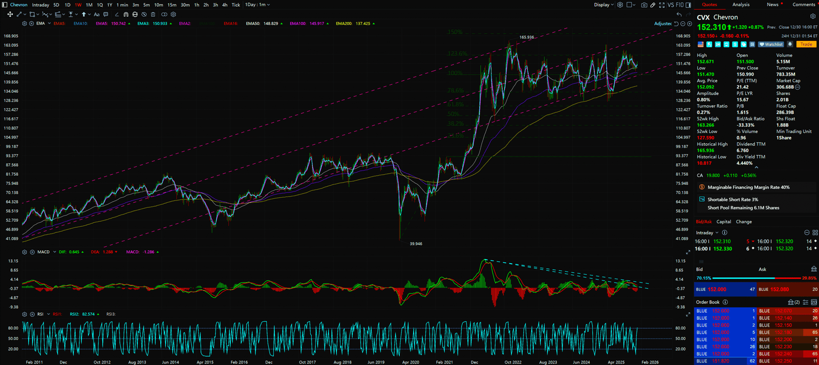
- Pattern: Double Bottom
- Chart Decode: CVX is weaker than XOM, which means it has Catch-up Potential. The chart shows strong support at $140.
- Action: Value Play. Buy at the bottom of the range, collect the dividend, and wait for the rotation.
10. OXY (Occidental) – Buffett’s Choice
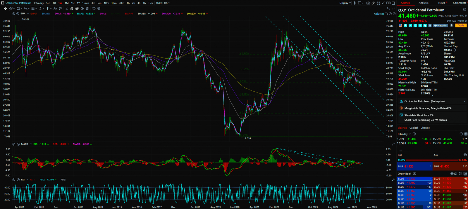
- Pattern: Symmetrical Triangle
- Chart Decode: OXY is coiling. $60 is Buffett’s cost basis and the “Iron Floor.”
- Action: Buy blindly near $60. This is following the greatest investor on earth.
11. EOG (EOG Resources) – The Efficiency Monster
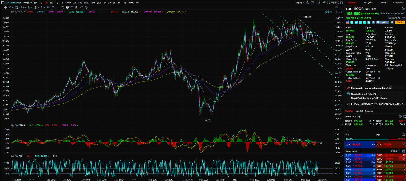
- Pattern: Range Bound
- Chart Decode: EOG runs inside a large box.
- Action: Swing Trade. Buy the box bottom, sell the top.
The 4th Most Undervalued Niche Industry: Telecom (The Utilities)

Telecoms used to be bad investments because they burned cash building 5G. But now, the Capex Cycle has peaked.
- From Capex to FCF:
This is the inflection point. AT&T (T) and Verizon (VZ) have finished the heavy lifting. Now they are in Harvest Mode. As spending drops, Free Cash Flow explodes. This money goes to Deleveraging and Dividends. - Recession Proof:
If 2026 brings a recession, you might cut Netflix, but you won’t cut your phone plan. This is Utility-like Stability. - Pricing Power:
The “Big Three” (T, VZ, TMUS) form an oligopoly. They have quietly raised prices recently, and Churn has not increased.
These “High Yield Traps” have transformed into “Value Plays.” The charts show the long-term downtrends have been broken.
12. T (AT&T) – The Ugly Duckling Turnaround
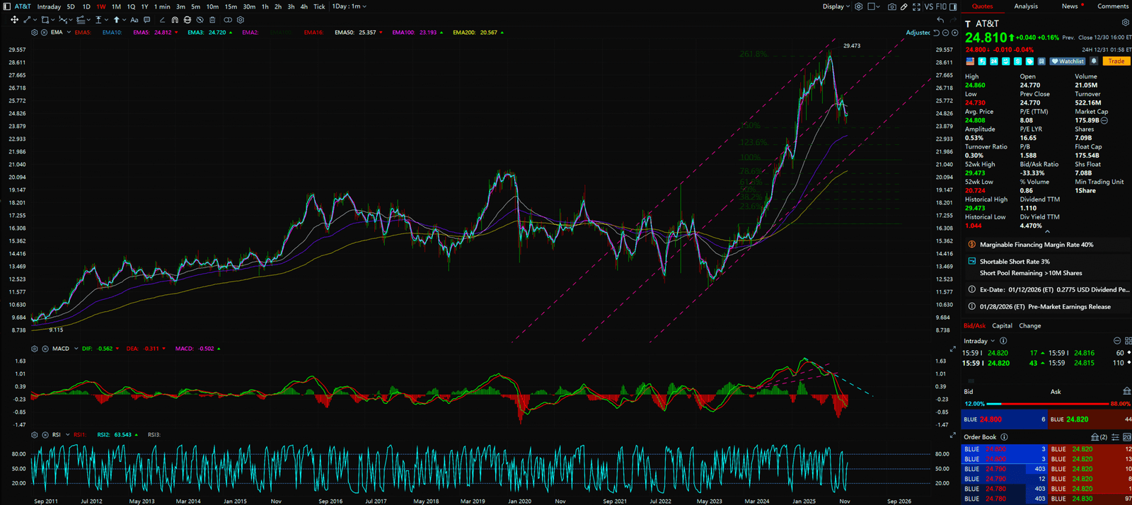
- Pattern: Rounding Bottom Breakout
- Chart Decode: T is back from hell. The chart shows a breakout from a multi-year descending channel, with MAs curling up.
- Action: Any retest of 22−23 is a buy. This is a cash cow paying 6%.
13. VZ (Verizon) – The Dividend Aristocrat
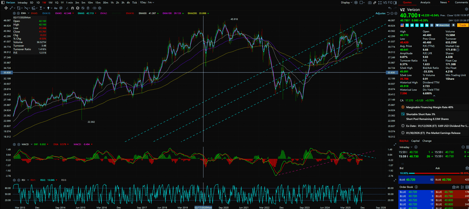
- Pattern: Base Building
- Chart Decode: VZ is building a base. Volatility is contracting, volume is supporting.
- Action: Perfect for retirement accounts. Accumulate near $40.
14. TMUS (T-Mobile) – The Growth Engine
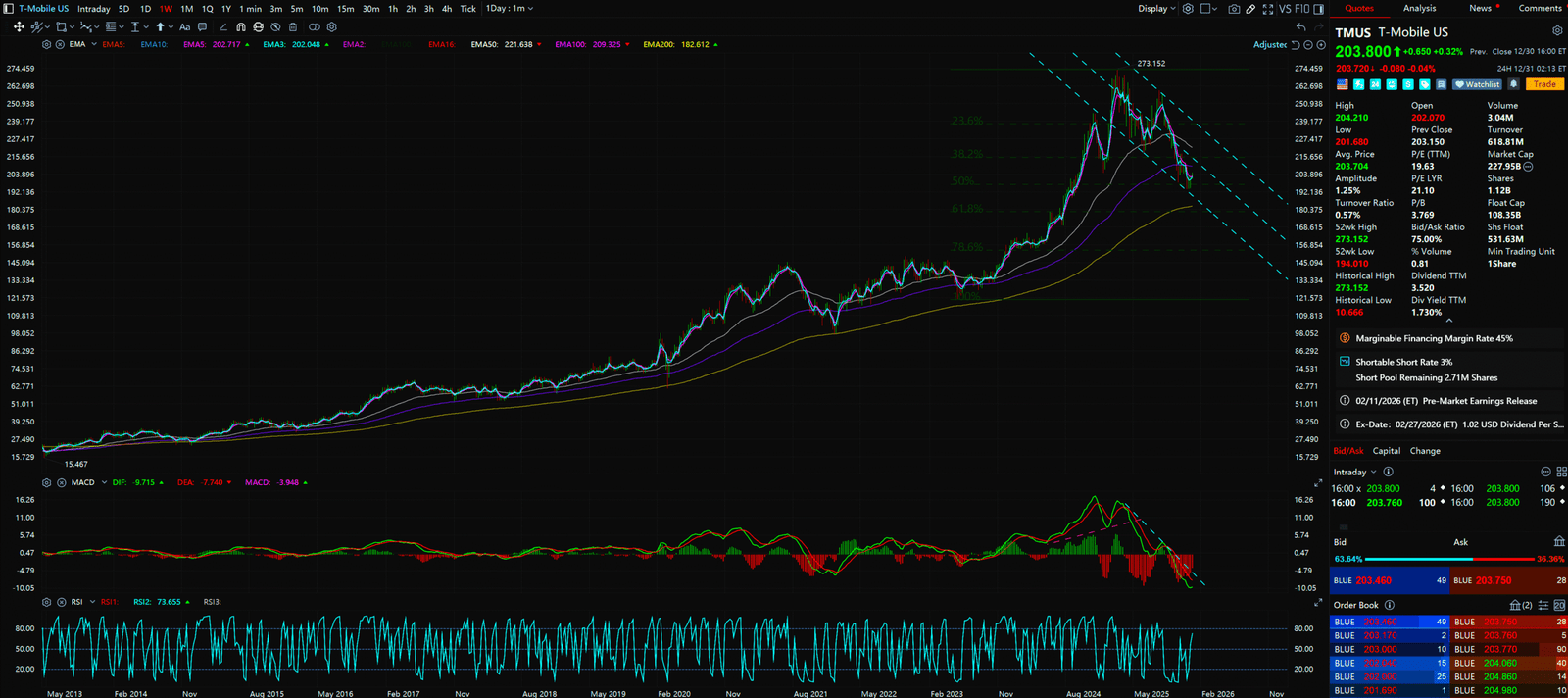
- Pattern: Linear Uptrend
- Chart Decode: TMUS is different; it’s a growth stock. The chart is a perfect uptrend, consistently making new highs.
- Action: Momentum Play. Buy along the EMA 20.
The 5th Most Undervalued Niche Industry: China Tech (The Deep Value)

This is controversial. But as Contrarians, we look for “Maximum Pessimism.”
- Valuation Dislocation:
Alibaba (BABA) trades at 9x Non-GAAP PE, holding billions in cash. The “Ex-cash Valuation” is near 5x. That is a bankruptcy valuation, not the valuation of the world’s largest e-commerce platform.
Michael Burry and David Tepper are buying. Why? Asymmetric Risk/Reward. Downside is limited (already down 70%), upside is massive (Mean Reversion). - Shareholder Return Revolution:
Chinese tech didn’t use to buy back stock. Now? BABA and TCEHY are executing some of the largest buybacks in market history. This provides a massive Downside Protection. - Stimulus Put:
The Chinese government recognizes the demand issue. PBOC liquidity injections and fiscal stimulus are inevitable. This is a Macro Call Option.
China Tech is volatile. Not for the faint of heart. But the charts show that “Selling Exhaustion” has occurred.
15. BABA (Alibaba) – The Dragon Wakes
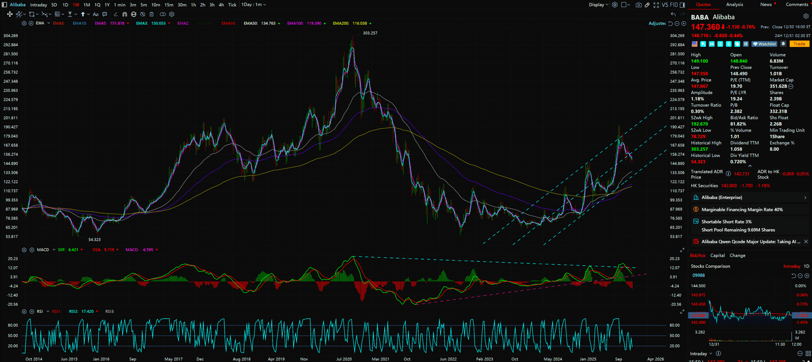
- Pattern:Broadening Wedge / W-Bottom
- Chart Decode: BABA formed a massive Double Bottom (W-Bottom) near $70. It is now testing the long-term downtrend line.
- Key Detail: Watch the Gap Fill. If it breaks $167, there is a vacuum of resistance above.
- Action: Chase the breakout above $167, or accumulate in the 140−144 zone.
16. PDD (PDD Holdings) – The Growth Monster
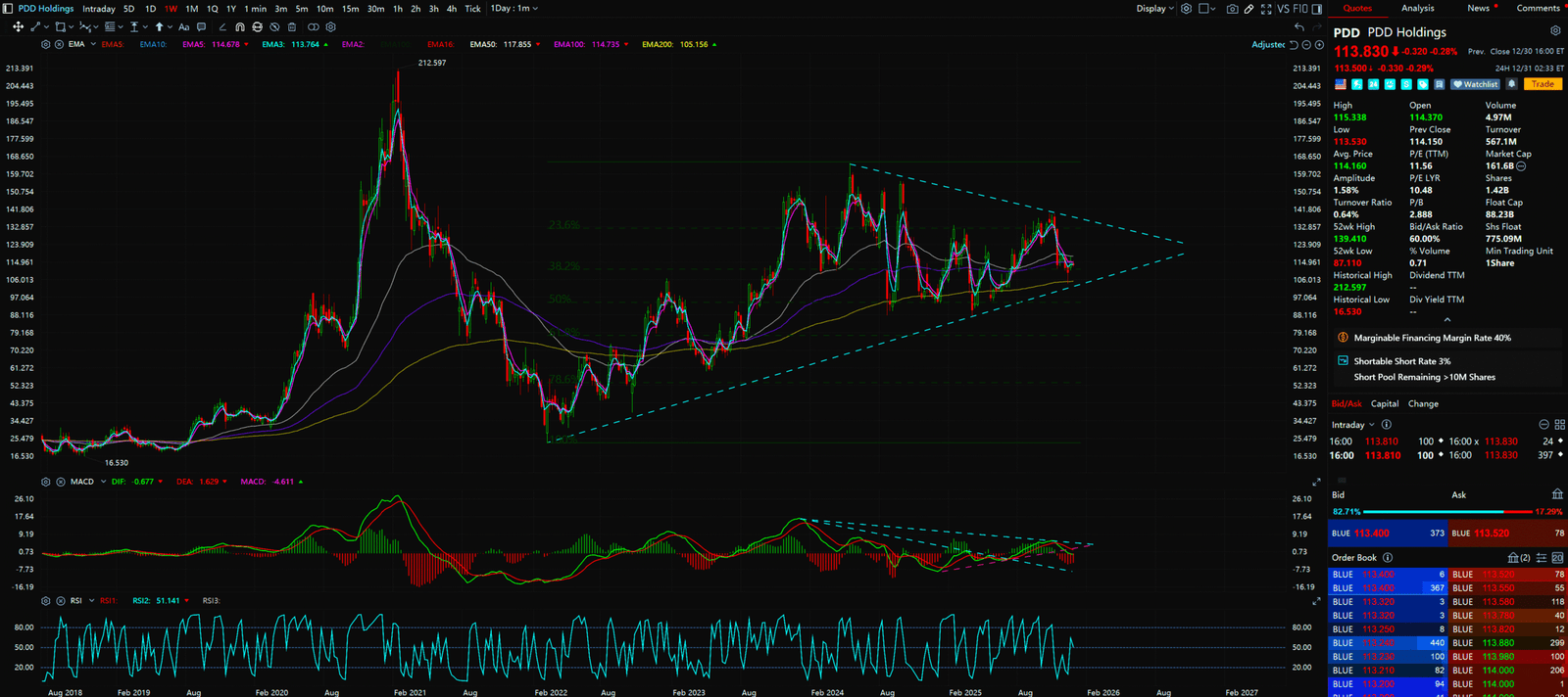
- Pattern: Volatility Compression
- Chart Decode: PDD is the strongest of the bunch. Temu’s expansion supports the price. The chart shows it digesting gains.
- Action: Play the box breakout.
17. JD (JD.com) – The Value Pocket
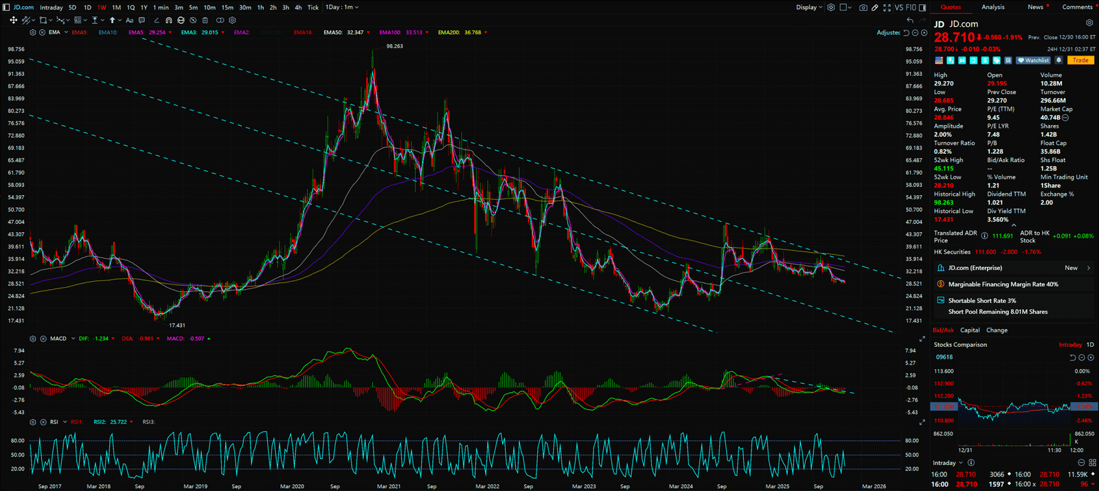
- Pattern: Falling Wedge
- Chart Decode: JD fell hard, but the Falling Wedge is a bullish reversal pattern.
- Action: For contrarians playing the bounce.
18. TCEHY (Tencent) – The Empire
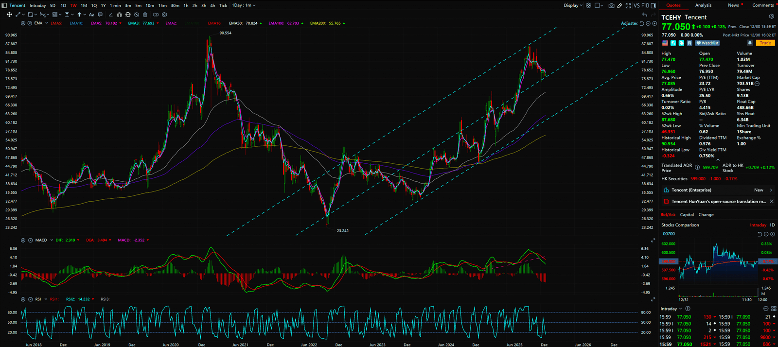
- Pattern: Ascending Channel Recovery
- Chart Decode: Tencent is steadier than BABA, showing a slow grind upwards.
- Action: Long Term Hold. This is the ETF of the Chinese Internet.
Conclusion: Bubbles Burst, Value Endures
When the party ends and the music stops, you see who has been swimming naked.
AI is a great technology, but NVDA is a crowded trade. In 2026, the smart investor builds a “Barbell Strategy”: Hold a small amount of AI growth, but heavily weight these High Cash Flow, Low Valuation, High Dividend fortress assets.
Don’t be the last one holding the bag.
Be the Landlord. Be the Banker. Be the Patient Hunter.
🔥 Looking for the Chart-Blitz team’s “Top 5 Hottest US Stocks for 2026“?
👉 Head over to Top 5 Hottest Industries in 2026 and discover our proprietary trading models!
References
- Morgan Stanley, “2026 REIT Outlook: The Great Repricing”.
- Goldman Sachs, “Powering AI: The Natural Gas Opportunity”.
- PBOC & Bloomberg, “China Market Liquidity Report 2025”.
DisclaimerThis content is for educational and entertainment purposes only and does not constitute financial advice. Investing involves risk. The author may hold positions in the securities mentioned. Do Your Own Research (DYOR).