The big money is not in the individual fluctuations, but in the main movements. That is, not in reading the tape but in sizing up the entire market and its trend.
Jesse Livermore – 1923
The News-Blinded Retail Investor, Destined to Be Fuel. Here we go again! Today’s financial media headlines are screaming: “Geopolitical Tensions Rise, Defense Stocks May Become a Safe Haven!” or “Pentagon Signs New Multi-Billion Dollar Contract, Company X’s Profit Outlook is Bright!” 😏 Reading this, do you feel like you’ve cracked the market’s code, ready to charge in and make a killing? Wake up. This so-called “good news” is nothing more than mental opium fed to retail investors like you. Its sole purpose is to make you, at the market’s peak, willingly take the baton from the Wall Street elites.
Remember our core philosophy, your only creed for survival in this market: Fundamentals are the rearview mirror; technical analysis is the map. News, earnings reports, government contracts—they are all things that have already happened. They are the rearview mirror, allowing you to look back and console yourself. But the real wealth train moves forward, and what you need is a precise map. That map is the price chart. Today, using the U.S. Defense and Aerospace industry as our case study, we will personally tear down the hypocritical veil of fundamental analysis. We will use the most authentic, scientific method of technical analysis to show you where the market’s truth really lies. We will dissect three industry giants: Lockheed Martin (LMT), RTX Corp (RTX), and Northrop Grumman (NOC). We’re not looking at how pretty their financial statements are, nor are we listening to so-called experts analyze their “economic moats.” Instead, we are looking directly at the flow of capital, the psychological warfare, and the imminent trends revealed on their price charts. Are you ready? This million-dollar lesson is about to begin.
Chapter 1: Fundamental Analysis – The Elaborately Designed Trap
Before we unveil the secrets of the map, we must first understand why the rearview mirror is so dangerous. In the realm of the defense industry, fundamental analysis is particularly deceptive, primarily through these traps:
Trap 1: The Lag and Uncertainty of Government Contracts
The story retail investors love to hear most is “winning a big contract.” The media will hype a multi-billion dollar contract to the moon, claiming a company’s revenue is secured for the next decade. But have you ever considered the time lag between contract negotiation, signing, funding, and its actual conversion into revenue? It can be one to two years at best, or three to five years at worst. By the time the news is reported, do you think the stock price hasn’t already priced it in?
Let me tell you, not only has it been priced in, it has likely been over-priced. The real “Smart Money” gets wind of these developments far earlier, during the initial negotiation phase or even at the rumor stage. Their actions leave footprints on the chart—a gentle increase in volume, the price repeatedly testing key support levels, bullish divergences on indicators. When you rush in after seeing the news, you are simply helping this Smart Money unload their shares at the top, turning their profits into your account’s losses.
For example, let’s say a rumor circulates that Northrop Grumman (NOC) will win the contract for the next-generation bomber. In the six months leading up to the official announcement, you might see the stock price slowly climbing from the bottom of a long-term consolidation range. Each pullback fails to break below significant moving averages, and volume on up-days is noticeably higher than on down-days. This is the evidence of institutional investors quietly accumulating shares. On the day the news is officially announced, the stock might gap up at the open. And then what? Then comes a flood of profit-taking. The stock opens high and closes low, perhaps even ending the day in the red. And you? You chased the open, and you’re immediately underwater. This is the lethal trap of fundamental news. You thought you caught a golden egg, but you actually caught a live grenade.
Trap 2: Geopolitics – The Unpredictable “Noise”
“Russia-Ukraine conflict escalates!” “Tensions rise in the Middle East!” Every time this kind of news breaks, a horde of financial commentators rushes out to declare, “Defense stocks are about to soar!” Is this logic not intuitive? War requires weapons, so defense companies will make a fortune. But is the market really that simple and direct?
First, geopolitical events are inherently “black swans”—they are unpredictable. You cannot consistently make money in the market by analyzing which world leader said what. Tensions today could be de-escalated tomorrow. Trading based on today’s news is no different from flipping a coin.
Second, even if a war does break out, the impact on different companies varies wildly. Some companies specialize in missiles, some in fighter jets, others in radar systems. Which type of weapon will be heavily consumed in which conflict? How would an average investor like you know this? The news you see is only the most superficial layer.
Most importantly, the market price reflects expectations. When the whole world believes that geopolitical tension will cause defense stocks to rise, that expectation itself is already digested and embedded in the price. The stock price may already be at a relative high due to this persistent atmosphere of tension. When the news of an actual “escalation” breaks, it might instead be a “sell the news” event. Why? Because market uncertainty has been reduced, the “expectation” has been fulfilled, and capital will move on to find the next theme to speculate on. And the result, once again, is you, rushing in when the news is hottest, becoming the last bagholder.
A true trader does not predict geopolitics; they react to it. How do we react? By looking at the charts. The chart tells us how the collective wisdom of the market is digesting this “noise.” If a stock price holds a key support level and even rallies against a backdrop of bad news, with confirming volume, that is an extremely strong buy signal. Conversely, if, amidst a chorus of good news, the price fails to break through a significant resistance level and even forms a bearish reversal pattern like a “bearish engulfing,” that is a clear signal to exit. The chart is the only truth.
Trap 3: The Fog of Earnings Reports – A Numbers Game and Wall Street’s Pact
The earnings report is hailed as the bible of fundamental analysis. Every quarter, the EPS (Earnings Per Share), Revenue, and Guidance are dissected number by number by analysts. But are these figures really that important? Let me tell you, more often than not, the earnings report is a show, a performance filled with tacit understanding between the publicly-listed company and Wall Street analysts.
Think about it. Who sets the “Earnings Estimate”? The analysts on Wall Street. Does the company’s management have an incentive to “manage” this expectation? Of course, they do! Their favorite trick is to subtly guide analysts to lower their expectations before the results are announced. Then, on announcement day, as long as the actual numbers are slightly better than the lowered estimate, they can stage a grand show of an “Earnings Beat.”
The media then reports with great fanfare: “Company XXX posts strong earnings, far exceeding expectations!” The retail investor sees this and thinks, “Wow, so impressive! I’m buying!” And the result? Very often, the stock gaps up after the announcement, and then it’s distribution all day, followed by a steady decline for days or even weeks. This phenomenon has a name: the “Beat and Drop.” Why does this happen? Because the true insiders and the Smart Money knew what the numbers were all along. Their goal is to use you, the investor who trades on earnings reports, to smoothly unload their shares at a high price.
Let’s dig deeper. The accounting practices in the defense industry are exceedingly complex. How is revenue from a weapons contract recognized? How are R&D expenses capitalized? How are inventories valued? Minor changes in these accounting methods can create a world of difference in the final earnings figures. How can an ordinary investor possibly see through the machinations behind the numbers? What you see are only the numbers management wants you to see. Therefore, stop idolizing earnings reports. They reflect the past, and a carefully beautified past at that. What we need to watch is the market’s reaction to the report, not the content of the report itself. The price action is the most honest voting machine. A brilliant earnings report that fails to trigger a sustained upward breakout, or even leads to a price drop, is an extremely dangerous sign, proving that the market is not optimistic about its future. Conversely, a lackluster report where the price refuses to fall on bad news and finds support at a key level could be an excellent buying opportunity. This is the essence of technical analysis.
Chapter 2: The Truth on the Charts – Dissecting the Three Defense Giants
Alright, now that we have thoroughly shattered the false idols of fundamental analysis, it’s time to get to the real core—technical analysis. We will use the purest elements of price, volume, time, and space to interpret the stock price maps of Lockheed Martin (LMT), RTX Corp (RTX), and Northrop Grumman (NOC), to see what the Smart Money is really doing and where the path forward lies.
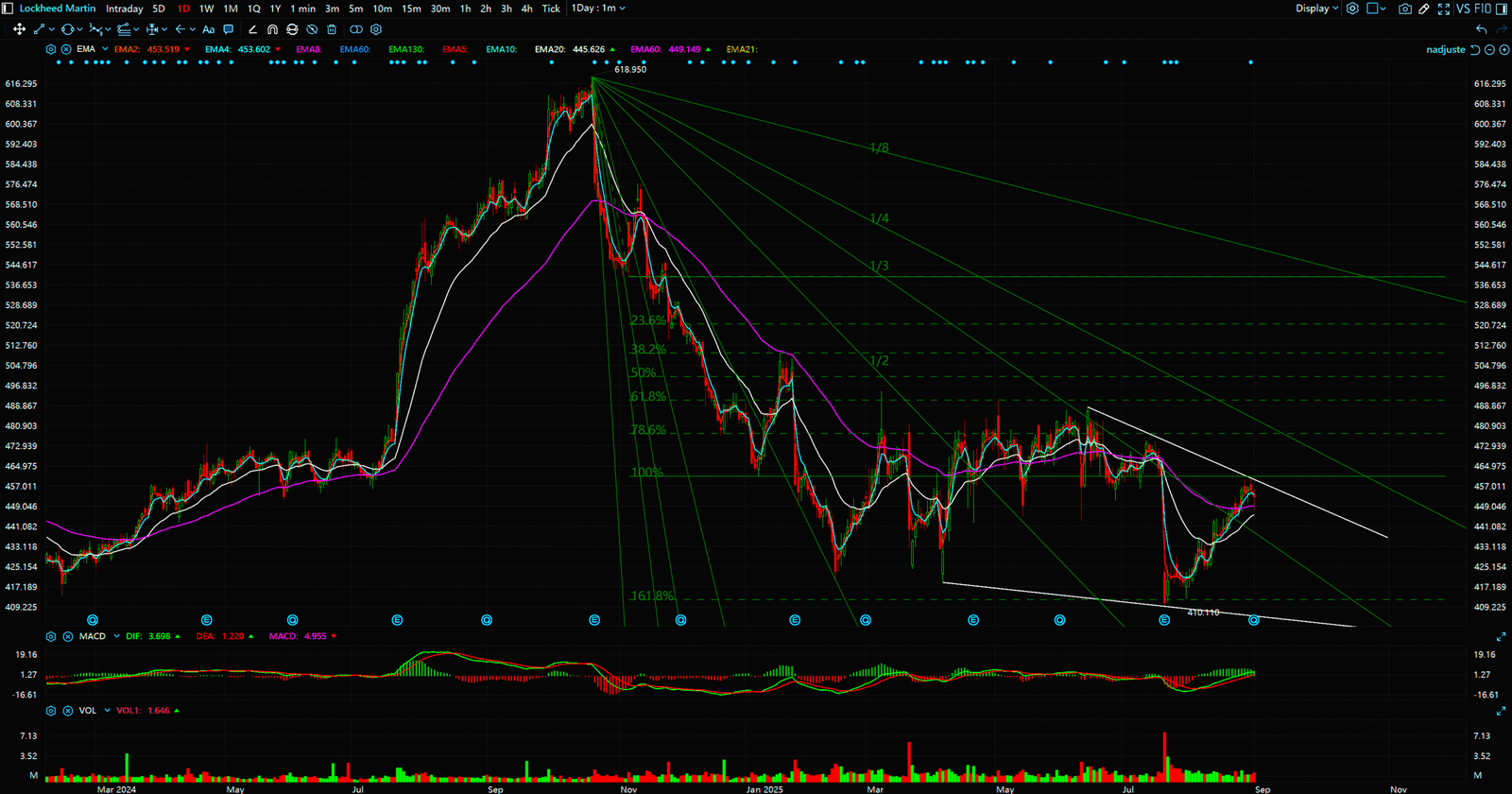
Case Study 1: Lockheed Martin (LMT) – The Calm Before the Perfect Storm
Lockheed Martin, producer of the F-35 fighter jet, the undisputed leader of the defense industry. A fundamental analyst will tell you about its stable order book and its technological superiority. But that’s all noise. Let’s open up LMT’s weekly chart. What do you see?
Chart Pattern Analysis: The Giant Symmetrical Triangle
For more than two years, LMT’s stock price has been trapped within a massive “symmetrical triangle” pattern. The upper boundary is a descending trendline connecting several major highs, forming powerful resistance. The lower boundary is an ascending trendline connecting several major lows, providing solid support. What does this pattern represent? It represents that after a long and fierce battle between bulls and bears, their forces are reaching an equilibrium. The market is coiling, accumulating energy for a monumental breakout.
A symmetrical triangle is a “continuation pattern,” which means it doesn’t have a directional bias on its own. However, once it is broken, the subsequent move will be extremely sharp and will follow the direction of the breakout. In other words, if LMT’s price can break above the descending trendline with significant volume, its target price isn’t a mere 10% or 20% gain, but potentially the beginning of a multi-year bull market. Conversely, if it breaks down below the ascending trendline, it could be the start of a disaster.
Insights from Volume and Indicators: The Storm is Gathering
Within this giant triangle, we can observe even more details. Pay attention to the volume. You will notice that as the price approaches the lower support trendline, volume often shrinks to an extreme low. This is a crucial signal. It indicates that panic selling pressure has been exhausted, and the floating supply of shares has been thoroughly washed out. Then, as the price bounces off the support line, volume gently increases, showing that capital is beginning to enter and accumulate shares.
Now look at technical indicators like the MACD (Moving Average Convergence Divergence). On the weekly chart, you might see the MACD lines (the fast and slow lines) intertwining around the zero line for a long period. The histogram bars are also flipping between red and green without much magnitude. This is a classic characteristic of a long-term consolidation. What we are waiting for is a “golden cross” of the MACD lines above the zero line, with the histogram turning from green to red and continuously expanding. This signal will be a critical piece of the puzzle to confirm the uptrend.
As for the RSI (Relative Strength Index), it might be showing a “bullish divergence” within this consolidation pattern. This occurs when the price makes a new low, but the RSI fails to follow, instead forming a higher low. This is a strong reversal signal, indicating that the downward momentum is waning and potential upward momentum is building.
Trading Strategy: Wait for the Kill Shot
Faced with a chart like LMT’s, the most foolish thing to do is to trade randomly inside the triangle. Every buy and sell you make will just get you whipsawed by short-term fluctuations, wasting time and money. A true hunter is patient. Our strategy is crystal clear:
- Set Alerts: Place price alerts just above the descending trendline and just below the ascending trendline.
- Watch for the Breakout: We are waiting for a massive bullish (or bearish) candle that closes decisively above (or below) the trendline.
- Volume Confirmation: The volume on the breakout day (or week) must be significantly higher than average, preferably at least 1.5 times the average volume of the past three months. A breakout without volume confirmation is a fakeout.
- Entry and Stop-Loss: Once a valid breakout is confirmed, enter in the direction of the trend. If it’s an upside breakout, the stop-loss should be placed a reasonable distance below the broken trendline. If it’s a downside breakout, the stop-loss goes above the breached trendline.
This is professional trading. It’s not based on guessing or listening to news. It’s based on developing a high-probability trading plan from the objective signals the chart provides.
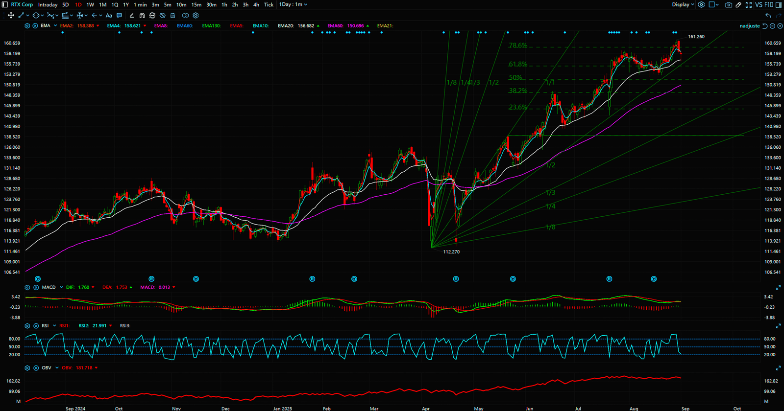
Case Study 2: RTX Corp (RTX) – A Forgotten Value Play or a Falling Giant?
RTX, formerly Raytheon, is a giant in its own right, with businesses spanning missiles, radar, and aviation engines. However, if you look at its stock chart, you’ll see a very different picture from LMT. In recent years, RTX’s stock performance has been relatively weak, even underperforming the broader market. Fundamental analysts might tell you it’s because its commercial aerospace business was hit by the pandemic, or because of delays in certain defense projects. Are these explanations correct? Perhaps. Are they important? Not at all.
The only question we need to ask is: What is the chart telling us?
Chart Pattern Analysis: The Potential Double Bottom and the Battle at the Neckline
On RTX’s daily or weekly chart, we might find a potential “W-bottom” (double bottom) pattern. After a prolonged downtrend, the price finds a floor and tests it twice, forming two lows at roughly the same price level. Between these two lows, there is a rebound high. A horizontal line drawn from this high is the “neckline.”
The W-bottom is a classic bottom reversal pattern. Its logic is this: after the first wave of selling, some buyers step in, forming the first bottom and the subsequent rally. But market confidence is weak, and the price falls again to test the previous low. If this second decline occurs on significantly lower volume, and the price fails to break below the first low (or even forms a slightly higher low), it signals that selling pressure is exhausted. When the price rallies again and breaks through the neckline with high volume, a new uptrend is officially established.
RTX’s chart is currently staging this very “battle for the neckline.” The price may have already formed the two bottoms and is now rallying towards this critical resistance level. This is a make-or-break point. All the profit-takers who bought at the bottom and all the trapped longs from the previous downtrend will create immense selling pressure here.
The Game of Volume and On-Balance Volume (OBV)
At this crucial juncture, we must watch volume and money flow indicators (like OBV) like a hawk.
If, as the price approaches the neckline, volume steadily increases and the OBV indicator also trends upwards, even making a new high, it’s a very positive sign. It means strong buying power is consistently absorbing the selling pressure. This suggests that a breakout above the neckline is only a matter of time.
Conversely, if the price repeatedly tries to breach the neckline but on diminishing volume, and the OBV indicator turns down, forming a “bearish divergence” (price makes a new high, but the indicator doesn’t), then we must be extremely cautious. This indicates a lack of follow-through buying, suggesting that the upward momentum may be exhausted. The price is highly likely to be rejected at the neckline and fall back to test the support at the lows again.
Trading Strategy: Right-Side Trading, Don’t Be a Hero
Faced with a chart like RTX’s, many retail investors love to play the “hero.” They rush in to “bottom-fish” before the neckline breakout is confirmed, betting on a reversal. We call this “left-side trading,” and it is extremely risky. How do you know it’s a true W-bottom? It could just be a minor pause in a continuing downtrend, destined to form lower and lower lows.
The professional approach is “right-side trading.” We don’t need to buy at the absolute bottom. We need to buy at the safest, most confirmed starting point of the new trend.
- Wait for Breakout Confirmation: We wait for a high-volume, large bullish candle to close decisively above the neckline.
- Confirm with a Retest: An even more conservative approach is to wait for a “retest” of the neckline after the breakout. If the price pulls back to the neckline, holds it as new support, and then rallies again on increasing volume, that is an excellent entry point. This retest process serves to shake out the last of the weak hands.
- Set a Price Target: Once the W-bottom is confirmed, we can measure a minimum price objective. Draw a vertical line from the lowest point of the W to the neckline. This height is the minimum theoretical distance the price should travel upwards from the breakout point.
Through this disciplined approach, we can significantly increase our probability of success and avoid making emotional trades at the wrong time.
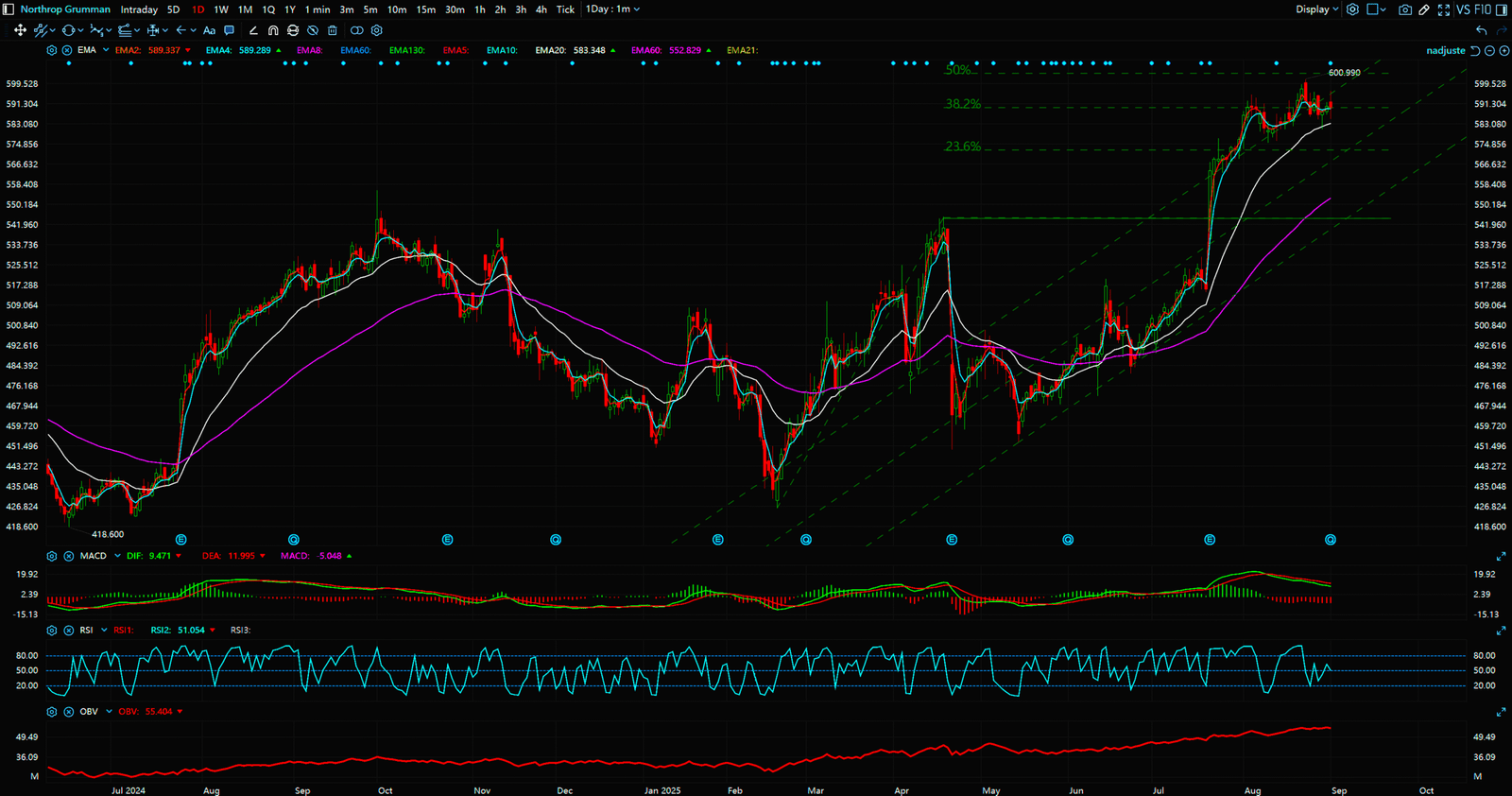
Case Study 3: Northrop Grumman (NOC) – The King in the Ascending Channel
Finally, let’s look at NOC. It may not be as iconic as LMT or have as dramatic a story as RTX. But in the world of technical analysis, the most boring stocks are often the most consistent money-makers. Open NOC’s monthly chart, and a perfect picture unfolds before your eyes.
Chart Pattern Analysis: The Textbook Ascending Channel
For years, even decades, NOC’s stock price has been moving almost perfectly within an “ascending channel.” What is an ascending channel? Connect a series of lows on the price chart to form a straight line—this is the “support line.” Then, draw another line parallel to the support line, connecting a series of highs—this is the “resistance line.” The area between these two parallel lines is the ascending channel.
As long as the price remains within this channel, it signifies that the stock is in a long-term, stable, and healthy bull market. The logic behind this pattern is that long-term holders (the Smart Money) are extremely optimistic about the company’s prospects. They will unhesitatingly buy whenever the price pulls back to the lower rail of the channel (the support line). Meanwhile, short-term traders will take profits when the price rallies to the upper rail (the resistance line). This rhythmic oscillation is the hallmark of a mature bull market.
The Escort of Moving Averages: The Power of a Bullish Stack
On NOC’s chart, you will also see another group of powerful allies—the Moving Averages. For example, the 10-month, 20-month, and 50-month moving averages will display a perfect “bullish stack.” This means the short-term average is above the medium-term average, which is above the long-term average, and all averages are pointing upwards.
What does this configuration represent? It means that the cost basis for short-term, medium-term, and long-term holders is continuously rising. The market trend is incredibly strong, and any pullback will find support at various moving average levels. The long-term moving average (like the 50-month) acts like the spine of a dragon. As long as the price does not decisively break below this line, the entire bull market structure remains intact.
Trading Strategy: Go with the Flow, Trend is Your Friend
For a stock like NOC, the most important principle is: Never try to pick a top, and never fight the trend by shorting. The trend is your best friend. Any attempt to short the stock at the upper channel boundary is likely to be crushed by the powerful upward momentum.
Our strategy is simple, yet highly effective:
- Entry Point: The optimal entry point is when the price pulls back to the lower support line of the ascending channel. The risk/reward ratio is highest at this point. Another good entry is when the price pulls back to and finds support at a key long-term moving average (like the 50-month MA).
- Holding: As long as the price remains within the ascending channel, and as long as the bullish stack of moving averages is not broken, hold your position firmly. Do not let short-term volatility or some so-called “bearish news” scare you out of a high-quality position.
- Exit Signal: When should you consider exiting? First, when the price breaks down below the lower support line of the channel on high volume. Second, when the short-term moving average starts to roll over and crosses below the long-term moving average, forming a “death cross.” Before these signals appear, any selling is likely premature.
These three companies, three completely different chart patterns, represent three different market states. LMT is “awaiting a breakout,” RTX is “seeking a reversal,” and NOC is “riding the trend.” See? Isn’t technical analysis so much clearer and more practical than fundamental analysis? It doesn’t give you ambiguous answers. It gives you a clear map and a rigorous set of rules for engagement.


Chapter 3: Conclusion – Your Choice Determines Your Wallet
In this brutal battlefield of finance, you have only two choices.
The first choice is to remain a blinded “fundamentalist believer.” You chase financial news daily, listen to analyst reports, and study lagging earnings data. You think you’ve done your homework, but in reality, you are just running in a maze designed by the Wall Street elites. Every trade you make is based on outdated information and manipulated emotions. Your destiny is to become market fuel, using your hard-earned money to light the victory fires of the Smart Money.
The second choice is to embrace the truth and become a “disciple of technical analysis.” You will learn to ignore all the noise in the market because you know that all information—whether public or inside, and all emotions—whether greed or fear, will ultimately be honestly reflected on a simple price chart. The chart is the language of the market, the EKG of capital flow.
You will learn to wait patiently for the optimal moment like a hunter, not to bet randomly like a gambler. You will learn to create a disciplined trading plan, manage your risk, and protect your capital. You will understand that trading is not a game of “prediction,” but a science of “reaction” and “probability.”
Our use of the U.S. defense industry today is just the tip of the iceberg. This philosophy, this methodology, can be applied to any market, any stock, any timeframe. It is a universal dragon-slaying skill.
So, don’t hesitate any longer. Starting today, turn off your financial news app. Ignore the so-called experts. Open your charting software and learn to read the language of the market. This path may be lonely, it may require you to put in the effort to learn, but it is the only path to true financial freedom.
Are you ready to ditch the rearview mirror and pick up the map? Leave a comment below and tell me which defense stock chart you’re most interested in, and we can interpret it together. Remember, in the world of technical analysis, there are no secrets, only signals you haven’t learned to see yet. Join us, and let’s become winners in the market together. 🚀
Sources:
- https://www.tradingview.com/
- https://finviz.com/
- https://www.sec.gov/edgar/searchedgar/companysearch
- https://www.investopedia.com/trading/technical-analysis/
- https://school.stockcharts.com/
Unlocking Technical Analysis: Power Moves with Diagrams
Daily Timeframe (LMT)
Daily Timeframe (RTX)
Daily Timeframe (NOC)