When you make a trade, you should have a clear target of where you expect to get out
William Delbert Gann – 1949
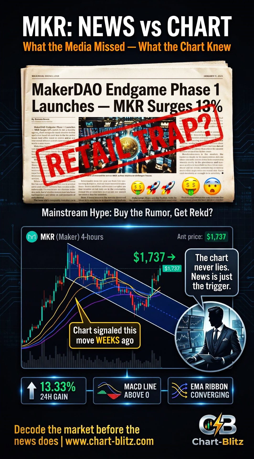
Catalyst Breakdown: Is the News a Smokescreen, or the Real Deal?
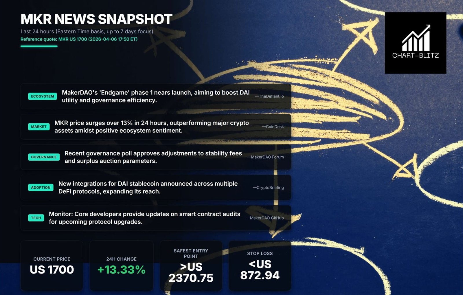
By the time you read this, MKR has already surged over 13% in the past 24 hours, outperforming the vast majority of major crypto assets. Social media is flooded with headlines like “MakerDAO Endgame Launches,” “DAI Integration Expands,” and “Governance Vote Passes” — all designed to trigger FOMO in retail investors who rush in without a second thought.
But as a former bank trader with over 20 years in the trading room, I need to deliver a cold, hard truth: every “positive news” headline you see could be institutional players manufacturing “Exit Liquidity.” Early in my career, I witnessed firsthand how a major institution quietly built a massive short position near a key resistance level on the chart — two full weeks before a major positive announcement. When the news dropped and retail piled in, the institution was already distributing, transferring their high-cost bags to every retail trader who was trading the news.
This is the brutal reality of markets. Fundamental news provides the “subject of analysis,” but only rigorous technical analysis can precisely predict the “timing” and “manner” of future market movements.
So what was the MKR chart quietly telling us before this surge?
【📊Analysis Baseline Statement】
All technical analysis below is based on a price snapshot locked at April 6, 2026, 17:50 EST: MKR = $1,737 USD (CoinMarketCap: $1,740.97; CoinGecko: $1,733.33; market average taken). Please treat this report as an “analysis map,” not a real-time quote.
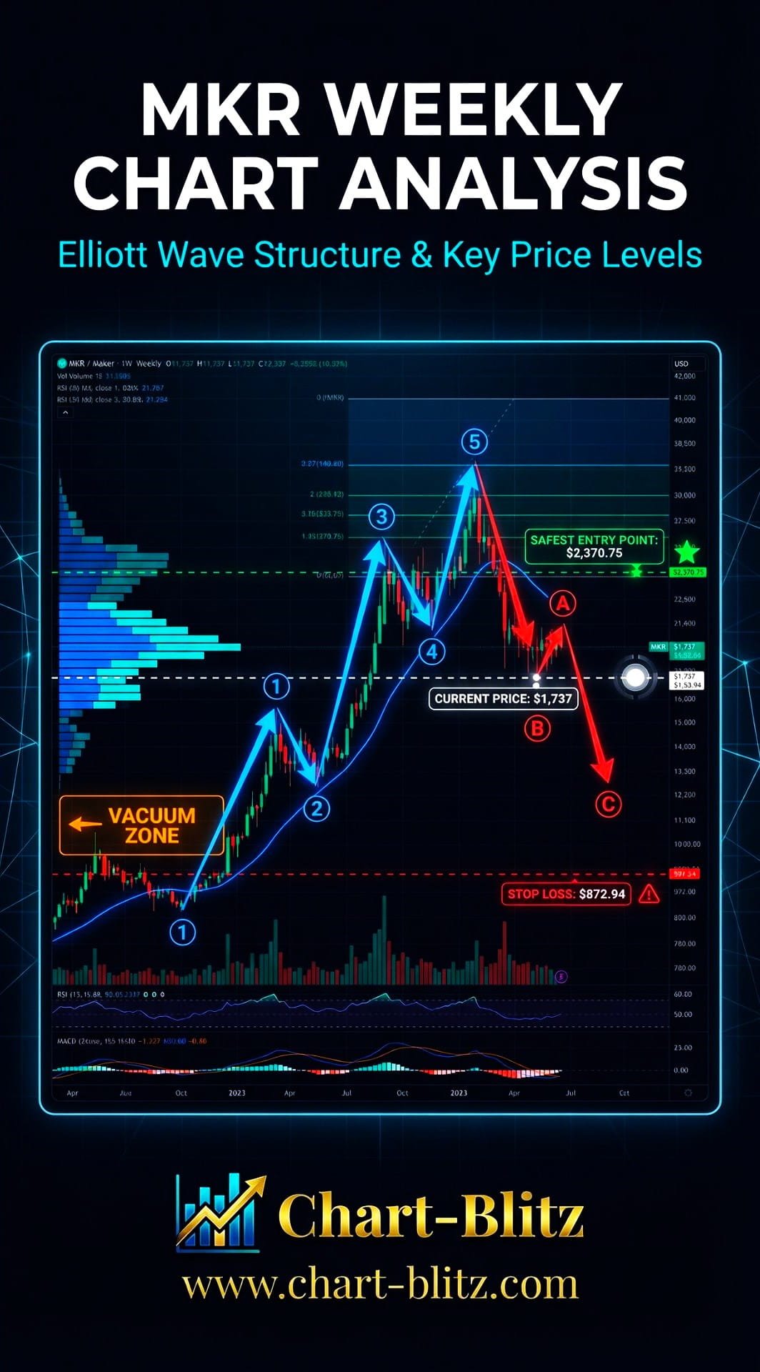
📈 Weekly Chart Deep Dive: Wave Structure & Institutional Intent
The weekly chart is always the core battlefield of analysis. It filters out the noise from daily and shorter timeframes, revealing the truest and deepest intentions of capital. Any analysis that ignores the weekly chart in favor of daily or 4-hour charts is fundamentally misguided.
Weekly Timeframe for MKR (Maker)
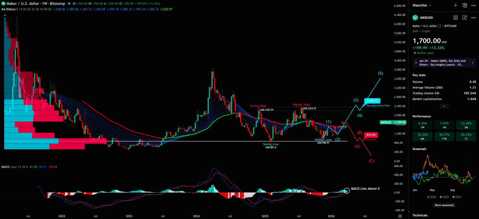
1. Elliott Wave Theory: Reading the Market’s Language
The user-provided MKR weekly chart clearly marks a forward-looking Elliott Wave structure. We can identify the following key wave nodes:
| Wave Label | Key Price Level | Significance |
| Swing Low | USD 881.60 | Starting point of the entire upward structure |
| Swing High | USD 2,207.97 | First major top |
| Higher High | USD 2,323.57 | Confirms the uptrend with a higher top |
| Higher Low | USD 996.91 | Bottom of Wave (2), critical support |
| Current Position | USD 1,737 | Suspected early stage of Wave (1) or (3) |
| The Safest Entry Point | USD 2,370.75 | Chart-marked safest entry point |
| Stop Loss | USD 872.94 | Hard stop-loss level |
According to the chart’s markings, MKR’s price action shows a clear “Higher High, Higher Low” structure — the basic condition for confirming an uptrend under Dow Theory. The structure from the Swing Low at $881.60, to the Higher High at $2,323.57, and back to the Higher Low at $996.91 is exceptionally clear.
Elliott Wave Iron Rule: When projecting the future Wave (4) correction, one iron rule must be remembered: The bottom of Wave (4) must NEVER overlap with the top of Wave (1). If MKR’s price breaks below the Wave (1) top (approximately the $996 Higher Low area) during a future correction, the entire 1-2-3-4-5 impulse wave hypothesis will be completely invalidated. The current rally may then be nothing more than part of a larger corrective (A)-(B)-(C) structure, not a genuine impulse wave.
The chart simultaneously marks a bearish scenario: if MKR fails to hold key support, it could follow an (A)-(B)-(C) corrective structure downward to seek a lower bottom.
2. Volume Profile Fixed Range (VPFR): The Warning of the Vacuum Zone
On the left side of the weekly chart, the Volume Profile Fixed Range (VPFR) clearly displays the volume distribution at each price level over the past period. VPFR is an exceptionally forward-looking indicator that identifies which price levels have strong volume support and which are “Vacuum Zones.”
What is VPFR? VPFR displays the trading volume at each price level within a specific time range, helping traders identify the Point of Control (POC — the price level with the highest volume), High Volume Nodes (HVN), and Low Volume Nodes (LVN). When price enters a low-volume node, rapid price movement often occurs because there are insufficient buyers and sellers to maintain stable trading.
From MKR’s VPFR, a clear “Vacuum Zone” exists below $1,200 USD. This means that if price breaks below the $1,200 key support, there will be insufficient buy-side absorption below, and price could experience a cliff-like drop, directly testing the $872.94 stop-loss level or even lower.
3. EMA Ribbon: The “Skeleton” of Trend
The EMA Ribbon on the weekly chart currently presents a fascinating state. Multiple EMA lines (8, 14, 20, 26, 32, 38, 44, 50, 60) are still in a bearish arrangement (short-term EMAs below long-term EMAs), but we can observe that the short-term EMA lines (EMA 8 and EMA 14) have started to curve upward, gradually approaching the long-term EMA lines.
EMA Ribbon Design Principle: The EMA Ribbon simultaneously displays multiple exponential moving averages of different periods, forming a “ribbon” structure. When all EMA lines are in a bullish arrangement (short-term above, long-term below) and diverging upward, it represents a strong uptrend; the opposite indicates a downtrend. When the EMA lines begin to narrow and cross, it often signals a trend change.
The current narrowing of the EMA Ribbon is an early signal worth watching closely. If the short-term EMAs can successfully break above the long-term EMAs and form a “Golden Cross,” this will be a strong medium-term bullish signal.
4. MACD: The Leading Indicator of Momentum
The MACD indicator on the weekly chart (settings: 12, 26, 9) shows that the MACD Line is currently above the zero line at 51.50, with the Signal Line at 38.55. This is a critically important signal, as the MACD Line crossing above zero typically indicates that medium-term momentum has shifted from bearish to bullish. More notably, the chart specifically annotates “MACD Line Above 0” — this signal aligns perfectly with MKR’s recent price rebound, once again confirming the forward-looking nature of technical indicators
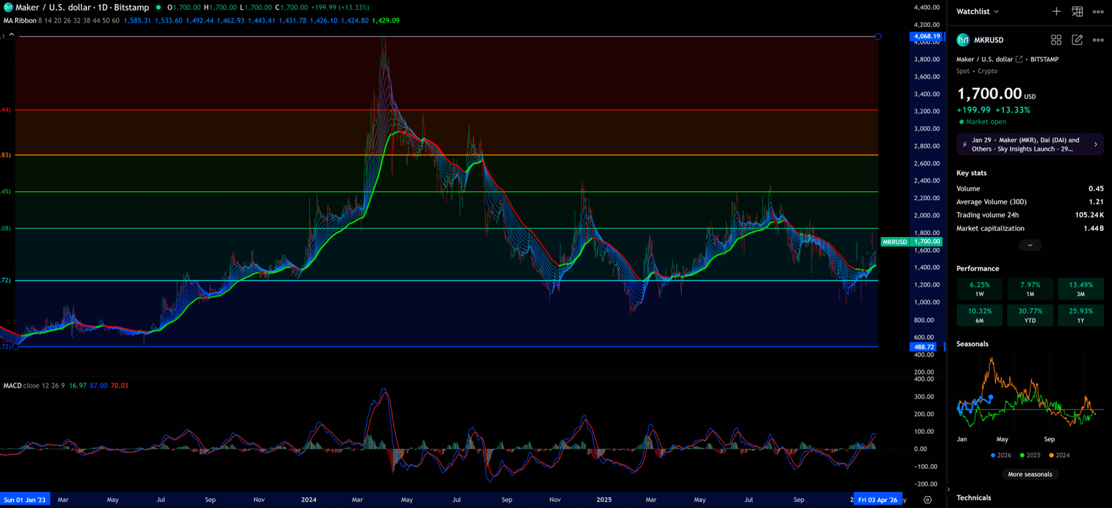
📉 Daily Chart Deep Dive: Medium-Term Trend & Key Defense Lines
Daily Timeframe for MKR (Maker)
1. News Context & Market Sentiment
Within the daily chart timeframe, the most significant recent news catalysts are MakerDAO’s “Endgame” plan progression and Binance’s announcement to migrate DAI services to USDS on April 9th. These developments have provided short-term positive stimulation for MKR’s price, but from a technical standpoint, whether these news catalysts can sustain their impact still requires chart confirmation.
2. EMA Ribbon & Key Fibonacci Levels
The EMA Ribbon on the daily chart presents a clearer picture. We can see that price has recently broken above the short-term EMA lines (EMA 8 and EMA 14), but is still running below the long-term EMA lines (EMA 44 and EMA 50).
The chart marks several key horizontal support and resistance levels:
| Price Level | Type | Significance |
| ~$4,068 | Historical ATH Resistance | 2021 bull market peak |
| ~$3,200 | Major Resistance | Fibonacci 0.618 extension |
| ~$2,800 | Secondary Resistance | Fibonacci 0.5 extension |
| ~$2,300 | Key Resistance | Near Higher High |
| ~$1,800 | Near-term Resistance | Upper edge of consolidation zone |
| ~$1,737 | Current Price | Analysis benchmark |
| ~$1,200 | Key Support | Upper edge of VPFR Vacuum Zone |
| ~$488 | Strong Support | Long-term bottom support |
MACD Daily Analysis: The daily MACD shows MACD Line at 16.97, Signal Line at 87.00, Histogram at 70.03. Notably, while the MACD Line is still below the Signal Line, the narrowing Histogram suggests bearish momentum is weakening.
3. Retail vs. Institutional: The Information Asymmetry Shock
Here lies the greatest information asymmetry between retail and institutional players: Retail trades the news; institutions trade the chart.
When MakerDAO’s Endgame news broke on April 6th, retail investors celebrated on social media and rushed to buy. However, if you look carefully at the daily chart, you’ll notice that MKR’s price had been quietly building a base in the $1,200-$1,400 range for several weeks before the news broke. This is the footprint of institutional accumulation.
When the news breaks and retail rushes in, institutions already have a cost basis far below the market price. This is why every “positive news” event is often followed by a “Buy the Rumor, Sell the News” pullback.
🗓️ Monthly Chart Deep Dive: Long-Term Vision & Extreme Positions
Monthly Timeframe for MKR (Maker)
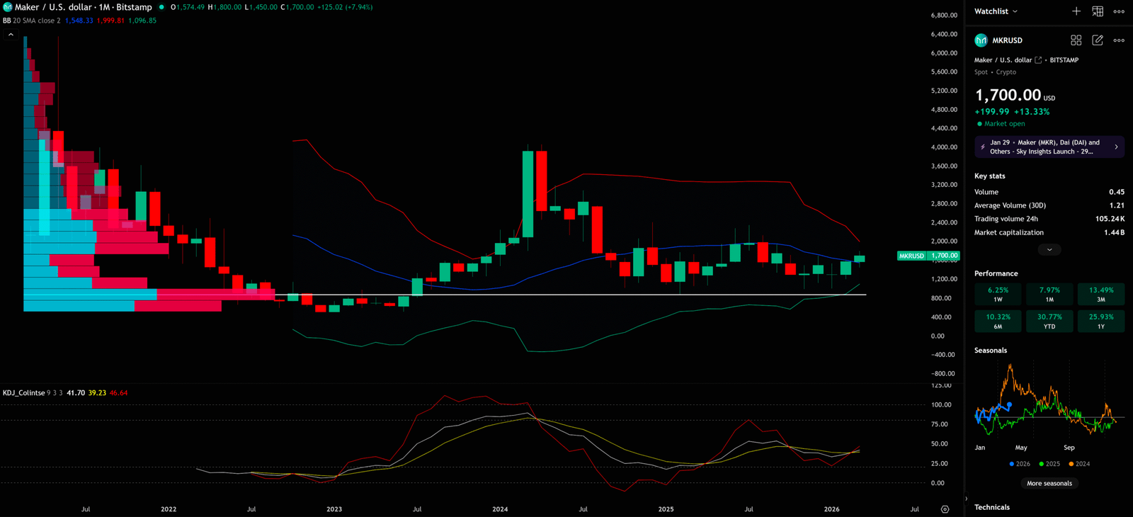
1. Bollinger Band: The Boundary of Long-Term Trend
The monthly chart provides the most macro perspective. From the Bollinger Band (BB) perspective, MKR’s monthly BB (settings: 20 SMA) shows the Upper Band at approximately $1,999.81, the Middle Band (20 SMA) at approximately $1,548.33, and the Lower Band at approximately $1,096.85.
MKR’s current price ($1,737) has already broken above the BB Middle Band and is moving toward the Upper Band. This is a positive signal, suggesting the long-term trend may be transitioning from bearish to bullish.
Bollinger Band Design Principle: BB draws a “band” channel above and below the middle band (moving average) by calculating the standard deviation of price. When price touches the Lower Band, it’s typically viewed as an oversold signal; when it touches the Upper Band, it’s typically viewed as an overbought signal. BB Squeeze (narrowing) often foreshadows imminent large price swings.
2. KDJ: Confirmation of Long-Term Bottom
The KDJ indicator on the monthly chart (settings: 9, 3, 3) shows K at 41.70, D at 39.23, J at 46.64. While KDJ is still at a neutral-to-low position, we can observe that the K and D lines have started to curve upward, with the J line gradually recovering.
KDJ Design Principle: KDJ is a momentum indicator that measures overbought/oversold market conditions by comparing the closing price to the highest/lowest price within a specific period. A Golden Cross of K and D lines (K crossing above D from below) is typically viewed as a buy signal, while an extreme low J value (near 0) often represents a market bottom area.
The monthly KDJ bottom recovery, combined with the BB Middle Band breakout, provides some technical support for MKR’s long-term reversal.
⏱️ 4-Hour Chart Deep Dive: Short-Term Game & Entry/Exit Timing
4-Hour Timeframe for MKR (Maker)
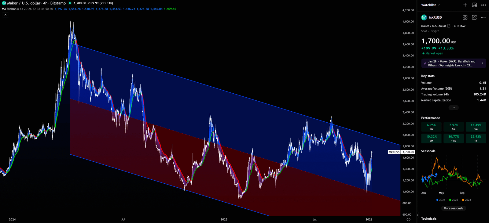
1. Descending Parallel Channel: The Critical Short-Term Battleground
The 4-hour chart is the best timeframe for finding specific entry and exit timing. From the chart, MKR is currently running within a clear descending Parallel Channel. This channel consists of two parallel trend lines, with the upper line serving as resistance and the lower line as support.
The recent 13% surge has brought MKR’s price close to the channel’s upper resistance line (approximately the $1,700-$1,800 range). This is a critical short-term battleground:
Scenario A (Bullish): If MKR can forcefully break above the channel’s upper line on the 4-hour chart and close above it, this will be a strong short-term bullish signal, suggesting the channel may be broken and price will advance toward higher resistance levels.
Scenario B (Bearish): If MKR is rejected at the channel’s upper line and shows clear signs of reversal (such as long upper wicks or large bearish candles), price may fall back to the channel’s middle or lower line, forming a “false breakout” trap.
2. EMA Ribbon (4-Hour): Short-Term Trend Confirmation
The 4-hour EMA Ribbon currently shows that short-term EMA lines (EMA 8, 14) have started to cross above long-term EMA lines (EMA 20, 26), forming an initial bullish arrangement. This aligns with the recent price rally, but it’s important to note that whether this short-term bullish arrangement can sustain depends on the direction of the weekly chart’s macro trend.
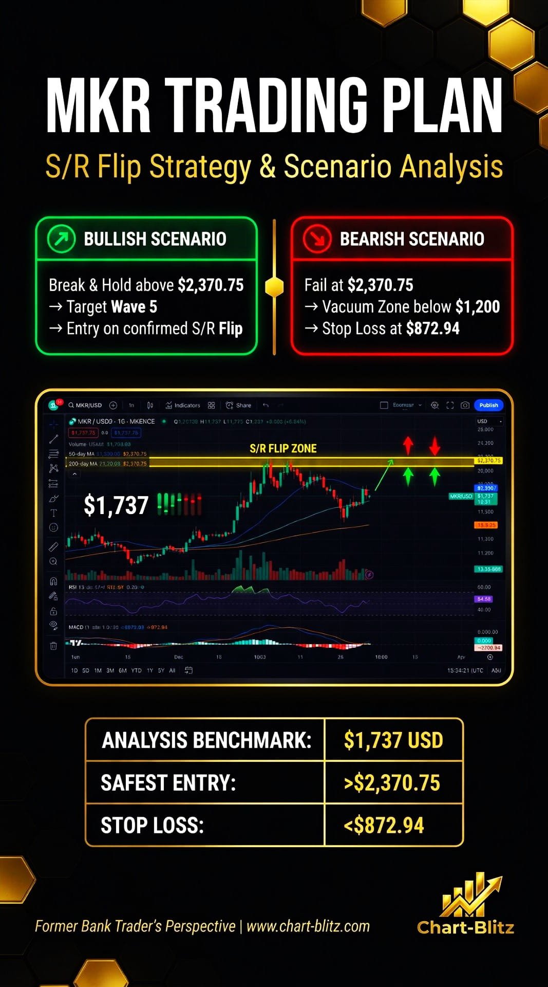
♟️ Comprehensive Conclusion & Trading Plan
1. Multi-Scenario Analysis
Bullish Scenario:
If MKR can effectively break above and hold the $2,000 psychological resistance level on the daily chart, and the EMA Ribbon on the weekly chart forms a perfect upward divergence (bullish arrangement), then we have reason to believe that the Wave (3) main impulse wave has officially launched.
Investors may consider building positions in batches after a confirmed pullback, targeting the chart-marked “The Safest Entry Point” — $2,370.75 USD. If MKR successfully breaks above and holds $2,370.75 (S/R Flip confirmed), the space above will be completely opened, and the ultimate target of Wave (5) could far exceed $3,000.
Bearish Scenario:
If the recent 13% rally was merely institutional “Exit Liquidity” bait, and price is rejected at the 4-hour channel’s upper line and falls sharply, breaking below $1,500 short-term support and then breaking through the $1,200 key support, price will enter the VPFR “Vacuum Zone.”
In this case, investors must strictly execute their stop-loss plan, with the stop-loss set at $872.94 (the Stop Loss level marked on the chart). Once this level is broken, the entire 1-2-3-4-5 impulse wave hypothesis will be completely invalidated, and MKR may face a much deeper correction.
2. S/R Flip Rule Application
Theoretically, MKR’s downtrend should not be completely over yet. But if MKR’s price action not only fails to continue falling but instead turns upward and explodes, we need to watch whether it can reach the resistance zone at $2,370.75. If it breaks above and holds, enter the market; otherwise, when it reaches the stop-loss at $872.94, sell immediately and exit.
3. Trading Plan Summary
| Item | Value | Notes |
| Analysis Benchmark | $1,737 USD | April 6, 2026 EST |
| Safest Entry Point | >$2,370.75 USD | Enter after S/R Flip confirmation |
| Stop Loss | <$872.94 USD | Execute strictly, no compromise |
| Bullish Target (Short-term) | $2,000-$2,370 USD | After channel upper line breakout |
| Bullish Target (Medium-term) | $2,370-$3,000+ USD | After S/R Flip confirmation |
| Key Support | $1,200 USD | Break below = enter Vacuum Zone |
I will continue to closely monitor the price action of this Crypto. As soon as a critical reversal signal appears on the charts, I will update my analysis and insights right here immediately. Remember to Bookmark this page and come back often to check for the latest updates! Want to unlock more bank-grade, exclusive trading models and indicator parameters? Head over to www.chart-blitz.com now to explore more in-depth content. Let’s use an institutional perspective to conquer this noise-filled market!.
Want to see our full, interactive chart breakdown? If you want to learn how to draw Fibonacci Retracement Ratio yourself, identify S/R Flips, and stop trading blind. Please browse the following『Further Reading』links. Fundamental news tells you what happened. Technical analysis predicts what will happen. To master the professional framework that separates market signal from noise, explore our exclusive models at www.chart-blitz.com.
📚Further Reading:
- Complete Guide to Fibonacci Retracement — The magical application of Fibonacci sequences in financial markets, and how to combine them with other indicators to improve the accuracy of Fibonacci levels.
- Elliott Wave Theory for Beginners — Learn the counting methods for 1-2-3-4-5 impulse waves and A-B-C corrective waves, as well as the four iron rules of Elliott Wave theory. Master this tool and you’ll be able to see the “roadmap” that retail investors cannot.
- Volume Profile (VPFR) Tutorial — Learn how to use VPFR to identify POC (Point of Control) and “vacuum zones,” thereby predicting market maker layouts and retail liquidity traps.
- S/R Flip Support and Resistance Swap Strategy — S/R Flip is one of the most powerful concepts in technical analysis. This article uses real cases to teach you how to use S/R Flip to capture the highest win-rate trading opportunities.
- MACD Momentum Indicator Momentum First — What Does the MACD Line Crossing Above Zero Mean?
- KDJ Stochastic Indicator Bottom Confirmation — How Monthly KDJ Golden Cross Helps You Catch Long-Term Bottoms.
- Parallel Channel Short-Term Game — How to Use Parallel Channels to Find Precise Entry/Exit Points for MKR.
- Bollinger Band Long-Term Boundaries — The Practical Significance of BB Middle Band Breakout and Squeeze.
【Disclaimer】 The content herein is for educational purposes and reflects the author’s personal opinion only; it is not investment advice. All financial investments, including cryptocurrencies, carry significant risk, and you could lose your entire capital. To support this site, this article may contain affiliate links. While we strive for accuracy, we cannot guarantee all information is complete or error-free. Please conduct your own research and be fully responsible for your own investment decisions.