When you make a trade, you should have a clear target of where you expect to get out

William Delbert Gann – 1949

The Battle Between News Facade and Chart Reality

Over the past 24 hours, the market has been inundated with a flurry of news surrounding Ethereum. From discussions about Account Abstraction (EIP-7702) brought on by the Pectra upgrade, to concerns over spot ETF outflows, and the widespread adoption of Layer 2 scaling solutions — these developments have left many retail investors bewildered. On the surface, the fundamentals appear to send contradictory signals: on one hand, we see technological breakthroughs and sustained institutional accumulation (such as Bitmine Immersion Technologies buying over 120,000 ETH during the dip); on the other hand, there is price weakness and the historic gloom of potentially closing three consecutive quarters in the red — ETH fell 28.28% in Q4 2025, another 29.26% in Q1 2026, and is already down over 18% in Q2 2026.

However, for someone who has navigated bank trading rooms for over 20 years, this news is often merely a smokescreen released by market makers to align with chart movements. While retail investors are still arguing over whether every headline is bullish or bearish, Smart Money has long left indelible marks on the charts.

I recall a veteran colleague in the trading room who once said something I’ve never forgotten: “Retail reads newspapers; institutions read charts. When retail investors are too excited to contain themselves over a piece of news, that’s when institutions are quietly distributing their holdings.” Today, from the perspective of a former bank trader, we will peel back the facade of the news, delve into the true structure behind the ETH charts, and reveal how institutional funds are executing precise maneuvers at these critical price levels. The real danger isn’t the drop itself; it’s that people still perceive it as an opportunity after key levels are broken!.

【📊Analysis Baseline Statement】

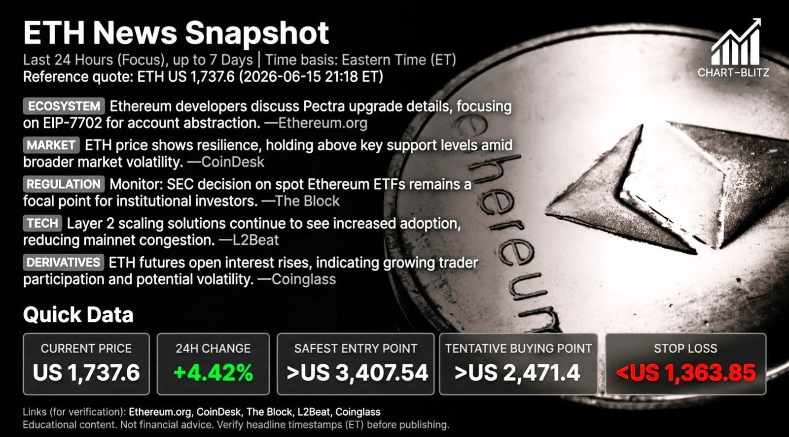
The following technical analysis is based on a price snapshot locked at 2026-06-15 21:18 ET: ETH = 1,737.6 USD. Please treat this report as an “analysis map” rather than a real-time quote.

The most shocking news recently is that Ethereum might set a historic record of three consecutive red quarters. According to Coinglass data, ETH experienced two consecutive down quarters in 2022 before rebounding 24% in the following quarter. But will history repeat itself? Or is this a larger trap?

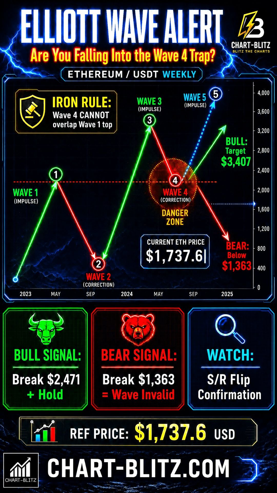
📈Section 1: Weekly Chart — Elliott Wave, VPFR & The Institutional Liquidity Trap

The Chart Already Signaled This: Open the ETH weekly chart, and you’ll discover a chilling truth. The chart clearly displays a “Lower Highs, Lower Lows” descending trend structure. Specifically:

Weekly Timeframe for ETH (Ethereum)
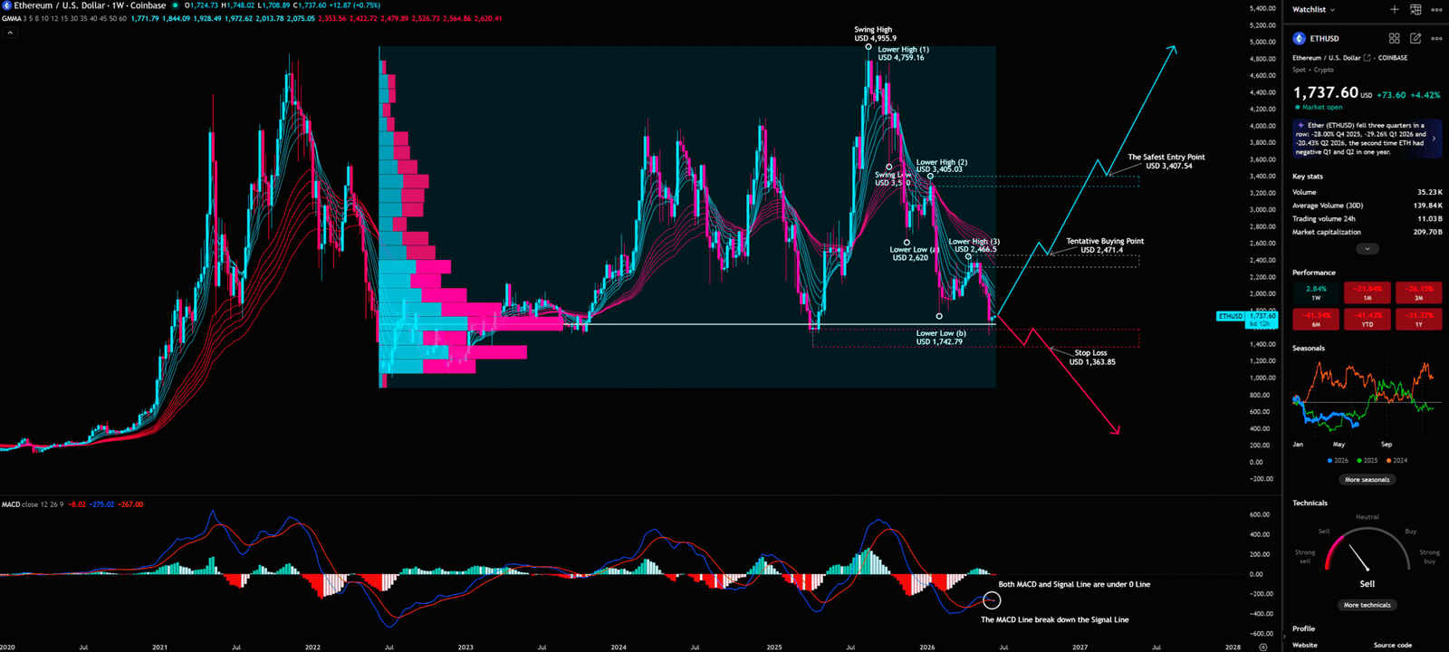
Key Swing PointPrice LevelTechnical Implication
Swing High (Peak)USD 4,955.9Bull market top
Lower High (1)USD 4,759.16Failed rally, trend weakening
Lower High (2)USD 3,405.03Second rally, still below prior high
Lower High (3)USD 2,466.5Third rally, downtrend confirmed
Lower Low (a)USD ~3,500First significant support
Lower Low (b)USD 1,742.79Current critical support level

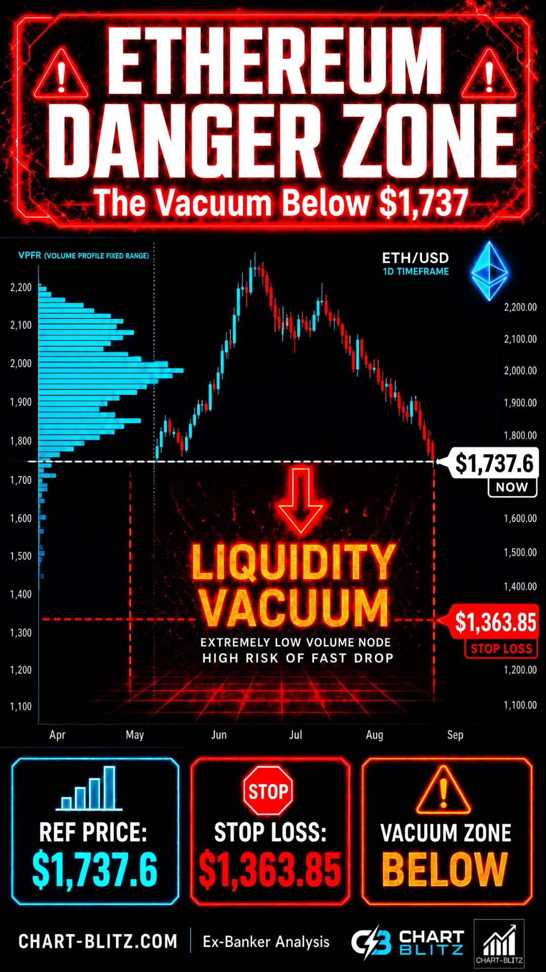
VPFR (Volume Profile Fixed Range) Deep Dive:

VPFR is a powerful tool for revealing institutional fund movements. It displays the distribution of trading volume across different price levels within a specific time range, helping traders identify the POC (Point of Control — the price level with the highest concentration of volume) and “Vacuum Zones” — areas lacking historical volume support.

From the VPFR distribution on the chart, the bulk of trading volume is concentrated between 1,742 and 2,600. Below 1,742, volume drops sharply, forming a clear “Vacuum Zone.” This means if ETH breaks below the 1,742 support, there simply won’t be enough buying pressure to absorb the sell-off, and the price will accelerate downward until it reaches the next area with volume support.

Elliott Wave Iron Rule Warning:

Elliott Wave Theory is a cornerstone of technical analysis. When interpreting the ETH weekly chart, one iron rule must be strictly observed: The bottom of Wave 4 must absolutely not overlap with the top of Wave 1. If this line is breached, the entire assumption of a 1-2-3-4-5 upward impulse wave will be completely shattered. The market might just be part of a larger degree corrective wave (A-B-C), and the true bottom remains unfathomable. One must never easily conclude that a certain downward level is already the Wave 4 bottom!

MACD Signal: The MACD indicator on the chart shows both the MACD line and Signal Line below the 0 line, with the MACD line having broken down below the Signal Line. This is a strong long-term bearish signal, indicating that bearish momentum still dominates the market.

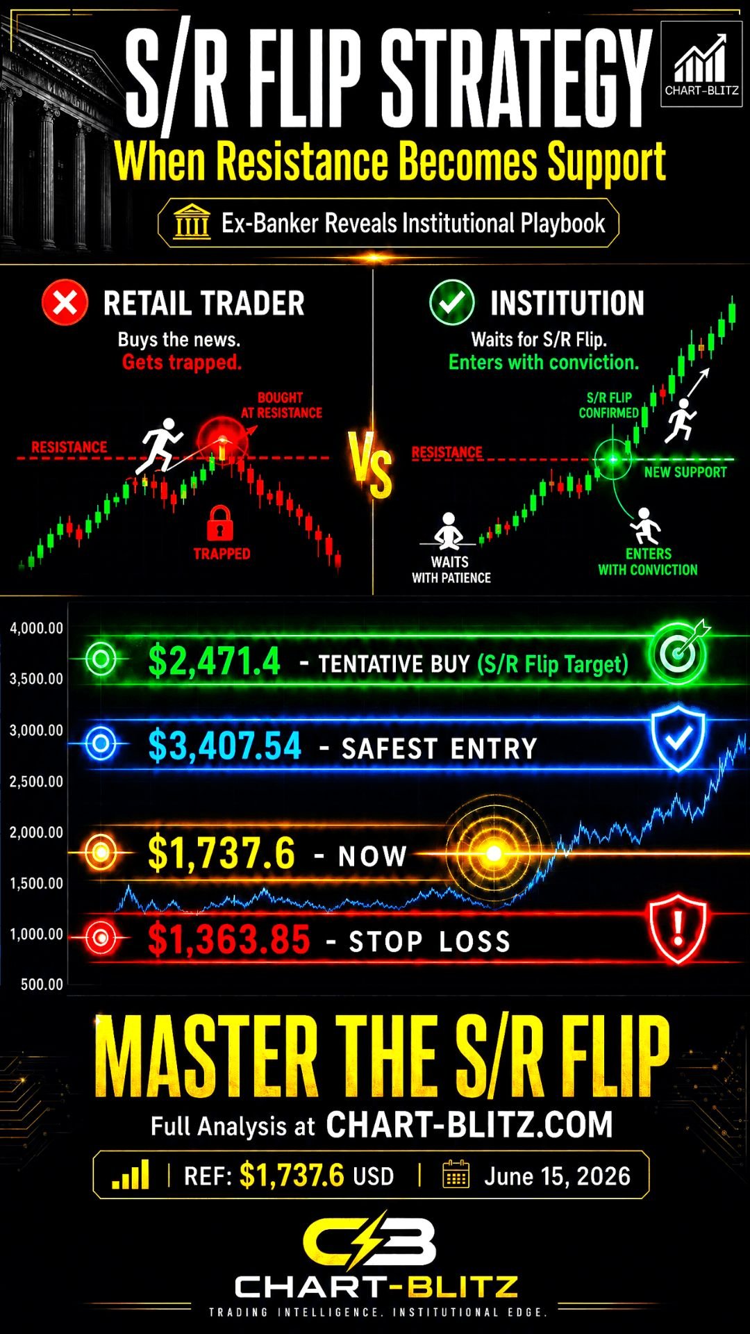
Institutional vs. Retail Perspective:

When retail investors see news about “Pectra upgrades” and “institutional accumulation,” their first reaction is: “This is the bottom, buy quickly!” But institutional thinking is completely different. They ask: “Is there enough liquidity at this level for us to build a position?” and “If we buy heavily here, are there enough retail investors to take the other side?”

When large numbers of retail investors swarm into the market due to bullish news, institutions use these retail buy orders as their “Exit Liquidity,” quietly completing their distribution. Once distribution is complete, the price falls effortlessly into the vacuum zone below. If the big players really wanted to pump the price, why isn’t the trading volume supporting it synchronously?

Annotation of Key Levels by Chart-Blitz Analysis Team (Highest Priority):

Price LevelAnnotationTrading Strategy
US 3,407.54The Safest Entry PointSafest entry after breakout and stabilization
US 2,471.4Tentative Buying PointTentative buy, requires additional confirmation signals
US 1,737.6Current Price (Analysis Baseline)Currently testing critical support
US 1,363.85Stop LossCut losses immediately if breached, no exceptions

📊Section 2: Daily Chart — Fibonacci & GMMA Tug-of-War

Discussions about the Pectra upgrade and EIP-7702 are highly active in the developer community. These technical bullish factors have caused a brief bounce on the daily chart, but is this a genuine trend reversal or just a bull trap?

Daily Timeframe for ETH (Ethereum)

Fibonacci Retracement Deep Dive:

Fibonacci Retracement levels are calculated based on the Golden Ratio and represent a series of horizontal support and resistance lines. The core principle is that after a major trend, markets tend to retrace to specific Fibonacci ratio levels before continuing the original trend.

From the daily chart, Fibonacci retracement levels delineate the following key zones:

Fibonacci LevelPriceCurrent Status
0 (Top)4,969.96Bull market peak
0.2363,819.39Major resistance
0.3823,105.82Important resistance
0.52,529.98Neutral resistance
0.6181,954.15Golden ratio support/resistance
0.7861,134.31Deep retracement support
1 (Bottom)80.00Historical low

ETH’s current price (1,737.6) sits between the 0.618 (1,954.15) and 0.786 (1,134.31) levels — an extremely critical battleground between bulls and bears.

GMMA (Guppy Multiple Moving Average) Alignment Analysis:

The GMMA, or Guppy Multiple Moving Average, consists of multiple short-term and long-term moving averages. The short-term group (3, 5, 8, 10, 12, 15 days) represents short-term trader behavior, while the long-term group (30, 35, 40, 45, 50, 60 days) represents long-term investor behavior.

Currently, the GMMA on the daily chart shows a clear bearish alignment: the short-term group is below the long-term group, and both groups are diverging downwards. This is a typical signal that the downtrend has not yet halted, indicating that both short-term traders and long-term investors are inclined to sell.

The S/R Flip Rule:

Theoretically, the ETH downtrend should not be over yet, but if the ETH price does not continue to fall but instead turns upwards and explodes, it needs to be seen whether it can break above the resistance zone. If it breaks above and holds, then enter the market; otherwise, if it reaches the stop loss, sell off immediately.

The essence of this rule is: don’t try to guess the bottom; wait for the market to confirm a trend reversal itself. Only when the price breaks through key resistance and, upon retesting, converts that resistance into support (i.e., S/R Flip), does it become a trustworthy entry signal. If it’s really that bullish, why can’t the price stabilize above key resistance?

📅Section 3: Monthly Chart — Silent Warnings from Bollinger Bands & KDJ

Japan passing a bill to lower the cryptocurrency tax rate to 20% is a long-term macroeconomic tailwind. What impact does this have on the long-term setup of the monthly chart?

Monthly Timeframe for ETH (Ethereum)

Bollinger Band (BB) Deep Dive:

Bollinger Bands consist of a middle band (20-day moving average) and upper/lower bands (middle band ± 2 standard deviations). Their core function is to measure market volatility.

From the monthly chart, we can clearly observe:

  • The price is currently below the middle band and approaching the lower band.
  • The upper and lower bands are still showing some degree of expansion, indicating that market volatility remains elevated.
  • A monthly close below the lower band would be an extremely bearish signal.

KDJ Indicator Deep Dive:

The KDJ indicator is a momentum indicator consisting of K, D, and J lines. When the K line crosses below the D line, it’s called a “Death Cross” — a bearish signal; the opposite is a “Golden Cross” — a bullish signal.

Currently, the KDJ indicator on the monthly chart shows K, D, and J values at extremely low levels (J value near or below 0), with a death cross diverging downwards. This signal indicates that long-term momentum is still dominated by bears, but also suggests the market is in a deeply oversold condition, with a long-term reversal opportunity brewing.

The monthly chart is the best tool for filtering out market noise. In this long-term bearish setup, the most common mistake retail investors make is being confused by short-term volatility, engaging in frequent short-term trading, and ultimately depleting their capital before the real trend arrives. Institutions, on the other hand, will patiently wait for confirmation signals on the monthly level — such as the KDJ forming a golden cross at a low level, or the price stabilizing above the Bollinger Band middle band — before deploying heavy capital. If you only look at the news, you might already be half a step behind..

⏱️Section 4: 4-Hour Chart — Gann Fan & Alligator Short-Term Skirmishes

Short-term news regarding spot ETF outflows directly impacts intraday volatility on the 4-hour chart level.

4-Hour Timeframe for ETH (Ethereum)

Gann Fan Deep Dive:

The Gann Fan, developed by W.D. Gann, uses lines at different angles to predict price support and resistance. The most important is the 1×1 line (45-degree angle), representing a perfect balance between price and time.

From the 4-hour chart, the price is currently suppressed below multiple downward Gann Fan angle lines, which form a narrowing “Death Triangle” that exerts continuous downward pressure on the price.

Alligator Indicator Deep Dive:

The Alligator indicator, developed by Bill Williams, consists of three moving averages: Lips (5-period), Teeth (8-period), and Jaw (13-period). When all three lines diverge downwards, it represents the “Alligator opening its mouth downward” — a strong bearish signal. When the three lines are entangled, it represents the “Alligator sleeping” — the market is in consolidation.

Currently, the Alligator’s three lines on the 4-hour chart are diverging downwards, indicating a fierce short-term downtrend. While there may be oversold bounces in the short term, under the dual suppression of the Gann Fan and Alligator, any bounce might just be an escape hatch. Could the most dangerous time in the market be exactly the moment everyone thinks it’s safe?

Section 5: Comprehensive Scenario Planning & Trading Plan

Bullish Scenario:

  • Trigger Condition: ETH price forcefully breaks through and stabilizes above the “Tentative Buying Point” (US 2,471.4), while the daily GMMA reverses into a bullish alignment and the MACD line crosses above the 0 line.
  • Target Price: First target: US 3,407.54 (The Safest Entry Point); second target: to be determined based on market momentum at that time.
  • Invalidation Condition: Rapidly falling back below 2,471.4 after the breakout (fake breakout), or MACD forming a death cross again.
  • Underlying Logic: Institutional funds have used the previous decline to complete wash-outs and accumulation, S/R Flip is confirmed, and a new uptrend is initiated.

Bearish Scenario:

  • Trigger Condition: ETH price falls below the “Stop Loss” (US 1,363.85) and the weekly level confirms the breakdown.
  • Target Price: Fall into the VPFR Vacuum Zone, seeking lower support; potential target could be below 1,000.
  • Invalidation Condition: A rapid V-shaped reversal recovering the loss after breaking below 1,363.85.
  • Underlying Logic: The entire 1-2-3-4-5 impulse wave assumption is invalidated, and the market enters a larger degree correction. Market makers use retail investors’ bottom-fishing mentality, treating them as exit liquidity.

Conclusion: In this market full of uncertainty, blindly trusting news or predicting the bottom are both extremely dangerous behaviors. True traders formulate strategies based on objective facts on the charts and execute discipline strictly.

I will continue to closely monitor the price action of this Crypto. As soon as a critical reversal signal appears on the charts, I will update my analysis and insights right here immediately. Remember to Bookmark this page and come back often to check for the latest updates!

Want to see our full, interactive chart breakdown? If you want to learn how to draw weekly VPFR, Fibonacci, EMA Ribbon, MACD, Supertrend, and S/R Flip frameworks designed for real trading decisions. Please browse the following『Further Reading』links. Fundamental news tells you what happened. Technical analysis predicts what will happen. To master the professional framework that separates market signal from noise, explore our exclusive models at www.chart-blitz.com.

📚Further Reading:

To help everyone gain a deeper understanding of the various technical indicators mentioned in this article, we have specially prepared the following further reading materials. These cover key analytical tools found across the weekly, daily, monthly, and 4-hour charts.

  1. Decoding Fibonacci Retracement: The Perfect Blend of Natural Law and Market Psychology Fibonacci Retracement is not just a set of magical numbers; it is a manifestation of market psychology. Learning how to correctly draw and interpret Fibonacci levels is a required course for every serious trader.
  2. Elliott Wave Theory Practical Manual: Key Rules for Identifying Impulse and Corrective WavesElliott Wave Theory is one of the most complex yet powerful tools in technical analysis. Understanding how to identify impulse and corrective waves, along with the iron rules of Elliott Wave Theory, can help you find direction in the market.
  3. Understanding VPFR: Finding the Hidden Footprints of Market MakersThe Volume Profile Fixed Range (VPFR) is a powerful tool that tells us where the most trading occurred within a specific price range. This helps us identify true support and resistance levels, as well as potential ‘Vacuum Zones’.
  4. S/R Flip Support and Resistance Swap StrategyS/R Flip is one of the most powerful concepts in technical analysis. This article uses real cases to teach you how to use S/R Flip to capture the highest win-rate trading opportunities.
  5. MACD Momentum Indicator Momentum First — What Does the MACD Line Crossing Above Zero Mean? Golden Cross & Divergence Signals!
  6. Gann Fan MasterclassDeep dive into W.D. Gann’s angle theory to identify the geometric relationship between time and price in the market.
  7. GMMA Application Tips: Accurately Capturing Trend ChangesDeep dive into the Guppy Multiple Moving Average to understand the battle between short-term and long-term capital.
  8. Bollinger Band: Long-Term Repricing ZoneThe Ultimate Tool to Capture Massive Market Moves Tired of getting shaken out of winning trades too early? Or buying right before a trend reverses? An ex-banker reveals how to use the Bollinger Band to filter out market noise and ride the big waves.

【Disclaimer】 The content herein is for educational purposes and reflects the author’s personal opinion only; it is not investment advice. All financial investments, including cryptocurrencies, carry significant risk, and you could lose your entire capital. To support this site, this article may contain affiliate links. While we strive for accuracy, we cannot guarantee all information is complete or error-free. Please conduct your own research and be fully responsible for your own investment decisions.

Leave a Reply

Your email address will not be published. Required fields are marked *