Fetching Live Market Data...
To make a success you must have knowledge and know how to apply it
William Delbert Gann – 1949
🚀Catalyst Interpretation: News is Just a Smokescreen Released by Institutions to Align with Charts
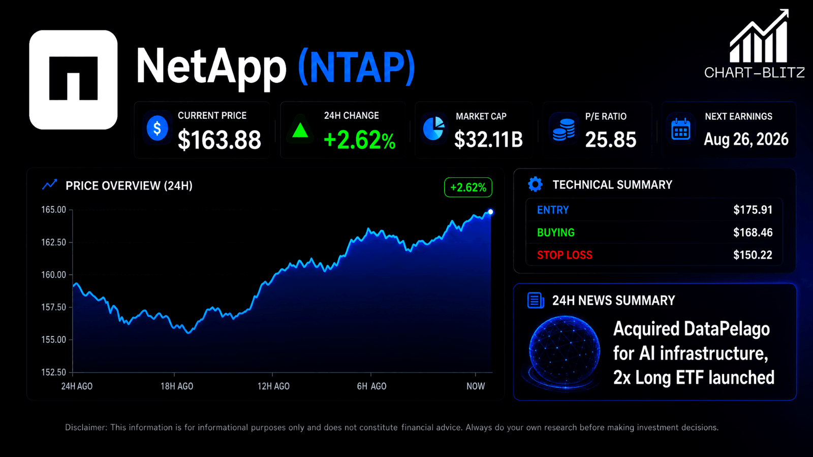
NetApp (NTAP) has recently been in the spotlight, particularly with the acquisition of DataPelago, interpreted by the market as a “nuclear-level” positive move into the AI data processing layer. Coupled with GraniteShares’ launch of the 2x leveraged NTAP ETF (NTAL), these developments have pushed retail FOMO to its peak. However, as a former trader with 20 years in the banking industry, I’ve seen this “news-first” drama play out countless times. In Wall Street, news is often a tool used by institutional players to create “Exit Liquidity.” They accumulate at lows and distribute at highs, timed with positive news releases. Earnings, Fed policies, and news only provide the subject of analysis, but only rigorous technical analysis can predict the “timing” and “manner” of future market movements. What you perceive as an opportunity might just be a hot potato ceremony prepared for you by institutions.
On the surface, it’s a positive acquisition, but if you look through the capital flows behind the charts, you’ll find that these news items are often released precisely when prices hit key resistance levels. Institutional players excel at exploiting retail investors’ blind worship of “AI transformation,” offloading shares at highs to retail buyers who think they’ve found a treasure. The real danger isn’t the decline; it’s that after the breakdown, people still think it’s an opportunity.
⚠️ Earnings Minefield Alert
According to the latest data, NetApp’s next earnings report is expected on August 26, 2026. Although it’s still about 38 days away—outside the high-risk 14-day window—remember: Implied Volatility (IV) Crush is a silent killer. As earnings approach, IV is pushed higher, making options premiums expensive. Once earnings are announced, regardless of the price move, IV typically collapses, causing option prices to plummet. If you plan to jump in just before earnings, position risk management is mandatory. Institutions love using IV shifts to harvest retail investors around earnings.
Analysis Baseline Statement: This price snapshot is locked at the closing price of $163.88 USD as of July 17, 2026, 16:00 EST (Regular Trading Hours), with after-hours trading captured at $163.00 USD (as of July 17, 2026, 19:47 EST).
📊 Multi-Timeframe Technical Indicator Breakdown
Weekly Chart: The Mother of Trends, The MACD Potential “Double Bull” Gambit
Weekly Chart – (NTAP) NetApp
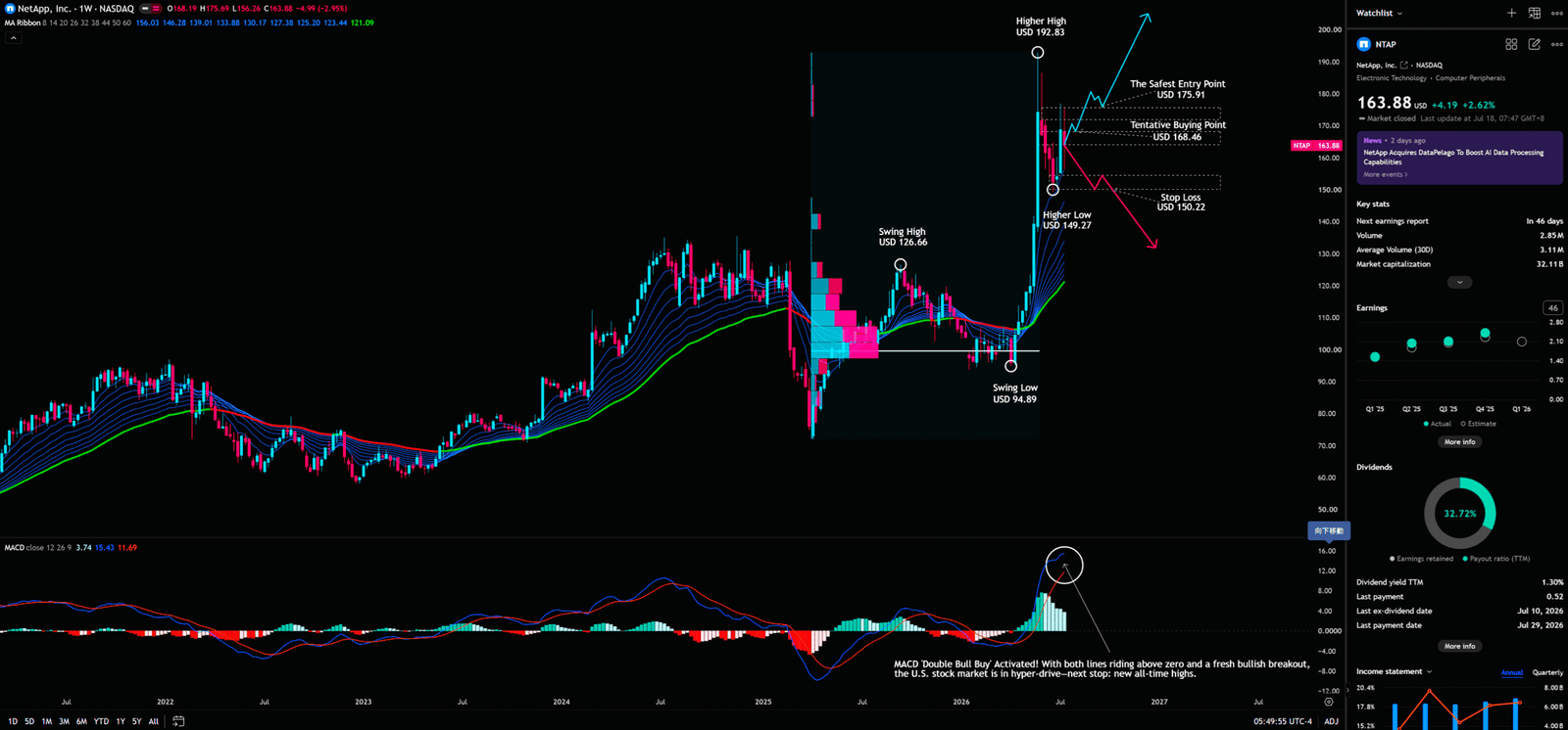
According to Chart-Blitz analysis team observations, the weekly chart is our core for determining the primary trend. It currently shows a clear Higher High (HH) and Higher Low (HL) structure, a classic confirmation of an uptrend in Dow Theory.
🛠️ EMA Ribbon: Navigating the Trend
The EMA Ribbon consists of a series of exponential moving averages of different periods. Compared to the Simple Moving Average (SMA), the EMA gives more weight to recent price data, making it more responsive and able to capture trend changes earlier. When multiple EMAs fan out upwards, it signifies strong consensus among short, medium, and long-term market participants, indicating powerful momentum. Currently, the EMA Ribbon on the weekly chart shows a perfect upward fanning pattern. Price remains stable above the Ribbon, indicating an extremely strong primary trend. Retail investors often feel the stock is “overextended” and are afraid to enter at highs, but institutional traders use pullbacks to the Ribbon as precise accumulation points. As long as the price doesn’t break below the bottom of the Ribbon, the bull structure remains intact.
🛠️ MACD: The Momentum Gambit
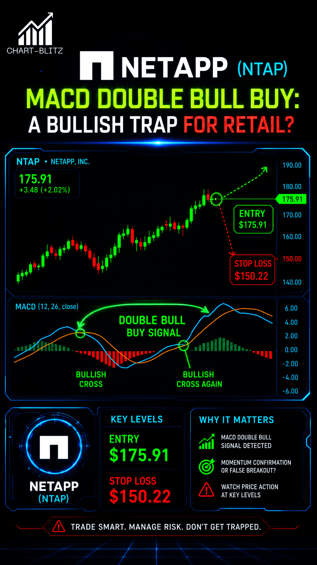
Created by Gerald Appel, the MACD measures market momentum by comparing the difference between two exponential moving averages (typically 12 and 26 periods). When the MACD line is above the Signal line and both are above the zero axis, it represents a bull market. Currently, on the weekly chart, both the MACD and Signal lines are trading above the zero line, indicating bullish dominance. However, the critical point is the “Double Bull Buy” signal currently marked. It must be clearly stated that this “Double Bull Buy” is still a potential signal. Only when the MACD line breaks above the Signal line again while above the zero axis will this advanced “Tailwind Thrust” signal truly trigger. Retail often thinks this is the top and rushes to sell, while institutions watch for this second cross, which often heralds an acceleration of the main wave.
🛠️ Dow Theory: Structural Support
Dow Theory is the bedrock of all technical analysis, focusing on defining trends through Higher Highs (HH) and Higher Lows (HL). The chart clearly marks Swing High ($126.66) and Swing Low ($94.89), followed by a Higher High ($192.83) and Higher Low ($149.27). This is a textbook uptrend. Capital behavior reflects institutions accumulating at the HL. Retail misinterpretation? They think the HL pullback is a reversal into a downtrend and panic-sell at the bottom. Institutional utilization? They take shares exactly at retail stop-loss levels and then use positive news to push prices higher, completing a harvest cycle.
| Key Levels (Weekly) | Value (USD) | Significance |
| The Safest Entry Point | $175.91 | Strong breakout confirmation point; breaking this means bulls have full control. This is the safest entry point. |
| Tentative Buying Point | $168.46 | A strategic point for short-term pullbacks, suitable for light-position testing. |
| Stop Loss | $150.22 | Breaking this completely invalidates the HH/HL structure; exit mandatory. |
Daily Chart: Fibonacci Gravity and Psychological Defenses
On the daily chart, the analysis focus shifts to the depth of pullbacks and psychological support.
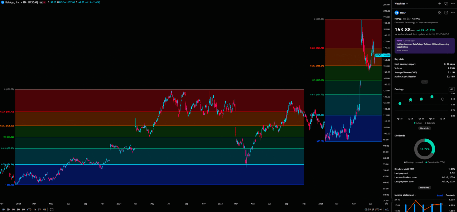
Daily Chart – (NTAP) NetApp
🛠️ Fibonacci Retracements: The Golden Gravity
Fibonacci retracements are based on natural ratios discovered by 13th-century mathematician Leonardo Fibonacci. In trading, ratios like 0.382, 0.5, and 0.618 are seen as critical potential support levels during pullbacks. NTAP shows strong Fibo gravity on the daily chart, with price finding balance between 0.382 ($155.24) and 0.5 ($131.73). The 0.382 level represents a shallow, strong pullback; if price holds here, the chance of challenging new highs is high. Retail panics when the price drops below previous highs, fearing a crash; but institutions place large buy orders in the Golden Pocket (0.5-0.618). A return to $131.73 is often when “smart money” re-enters.
Monthly Chart: Bollinger Band and KDJ Warnings in the Big Picture
The monthly chart is the “rear guard,” determining the fate of long-term investors.
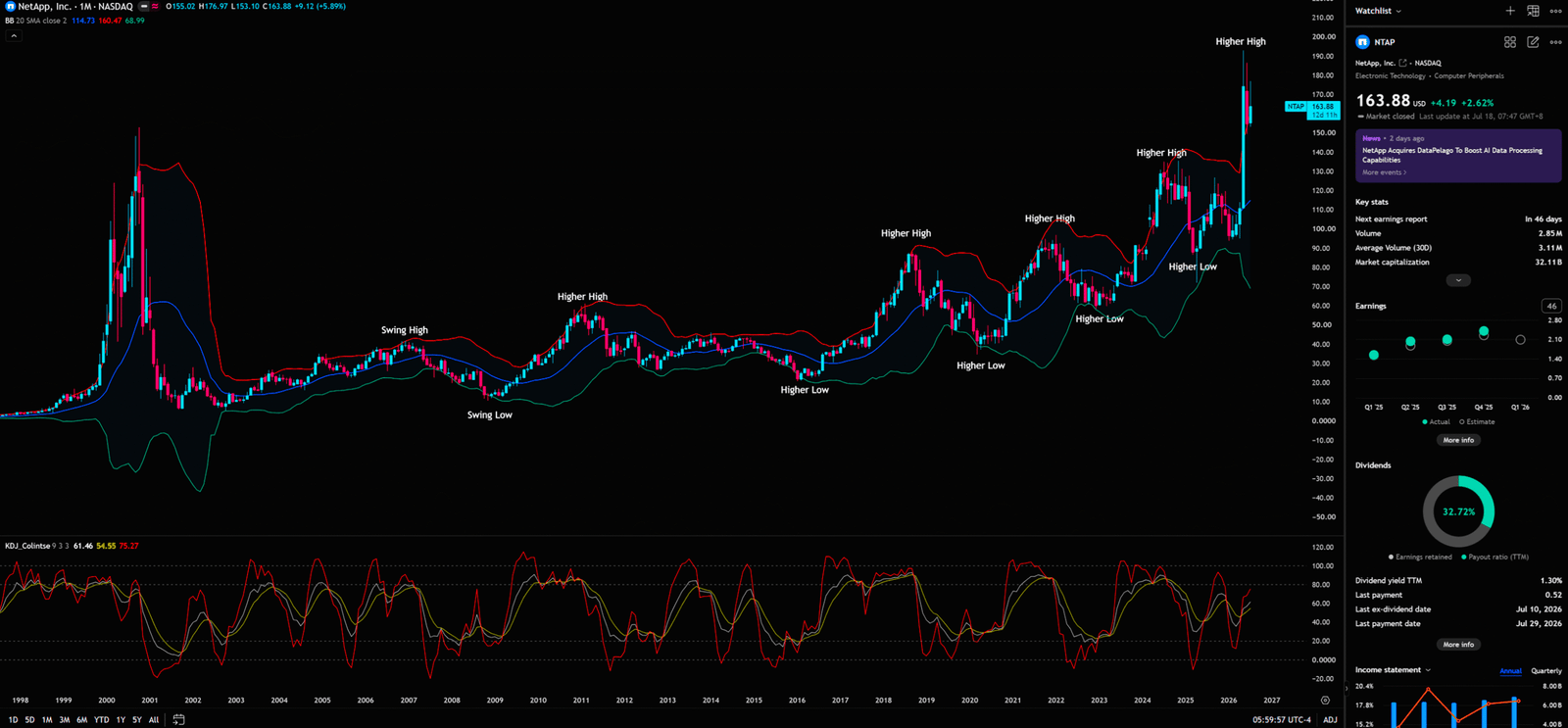
Monthly Chart – (NTAP) NetApp
🛠️ Bollinger Band: Volatility Limits
Developed by John Bollinger, the Bollinger Band consists of a 20-period SMA middle band and two standard deviation lines. It measures market volatility and relative price levels. Currently, NTAP’s monthly Bollinger Bands are “opening” and expanding, with price hugging the upper band. This is extremely bullish, indicating a full release of volatility. However, as a former banker, I must remind you: when price deviates significantly from the middle band, the pressure for a “mean reversion” increases. Retail thinks hugging the upper band is a buy signal, but institutions are already considering taking profits here.
🛠️ KDJ Indicator: Overbought Warnings
The KDJ indicator determines overbought or oversold conditions by comparing the high, low, and closing prices. ⚠️ Caution! Monthly KDJ is at an extreme high, with the J-value near 100. While KDJ can remain “blunted” at highs in strong trends—where the indicator stays in the overbought zone while the price keeps rising—once the J-line crosses below the D-line (Death Cross), it’s a strong signal of long-term trend weakening. Retail often FOMOs in here, just as a long-term correction begins.
4-Hour Chart: The Spacetime Weave of GMMA and Gann Fan
4-Hour Chart: The Spacetime Weave of GMMA and Gann Fan
The 4-hour chart is the battlefield for short-term traders, requiring finer tools to decipher institutional intent.
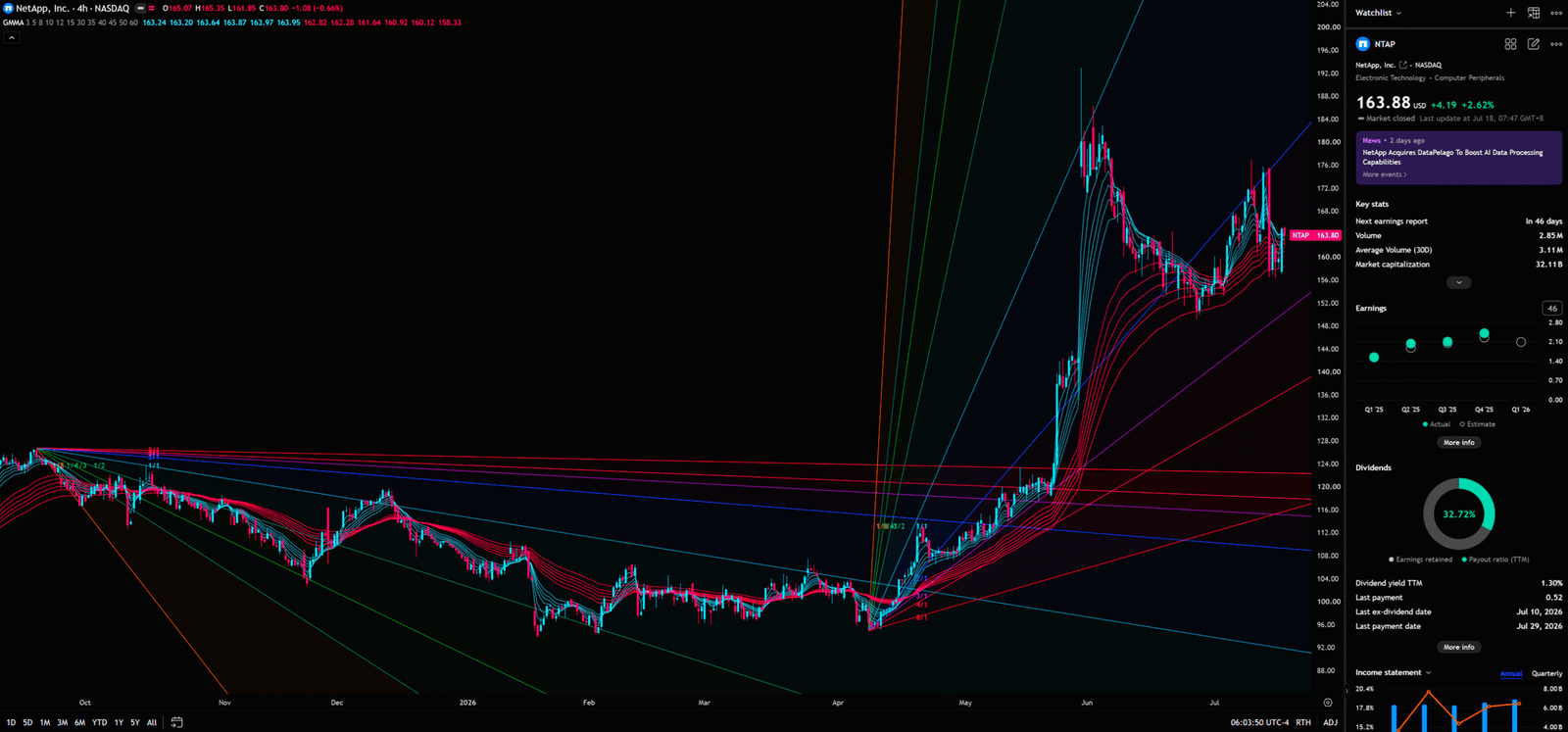
4-Hour Chart – (NTAP) NetApp
🛠️ GMMA: Crowd Psychology
Created by Australian trader Daryl Guppy, the GMMA consists of a short-term group and a long-term group. The short-term group represents trader sentiment and short-term momentum, while the long-term group represents investor consensus and trend stability. On the 4-hour chart, the short-term group (blue) is pulling back toward the long-term group (red) in a “Compression.” When the short and long-term groups move closer but don’t cross, it represents short-term sentiment returning to rationality. If the short-term group finds support near the long-term group and “Expands” again, it’s a prime trend-following buy opportunity.
🛠️ Gann Fan: Geometric Aesthetics
W.D. Gann believed in a mysterious geometric relationship between time and price. The core 1×1 line (45 degrees) represents 1 unit of time equaling 1 unit of price, the perfect balance. The Gann Fan shows the price trading above the 1×1 line, indicating bulls still hold the initiative. The 1×1 line is currently the strongest dynamic support. Breaking below it would suggest a significant slowing of the ascent rate, potentially testing the 2×1 line. The Gann Fan is like the market’s skeleton, showing how much “backbone” the rally truly has.
⚖️ Sector Relative Strength Comparison (US Stock Specific)
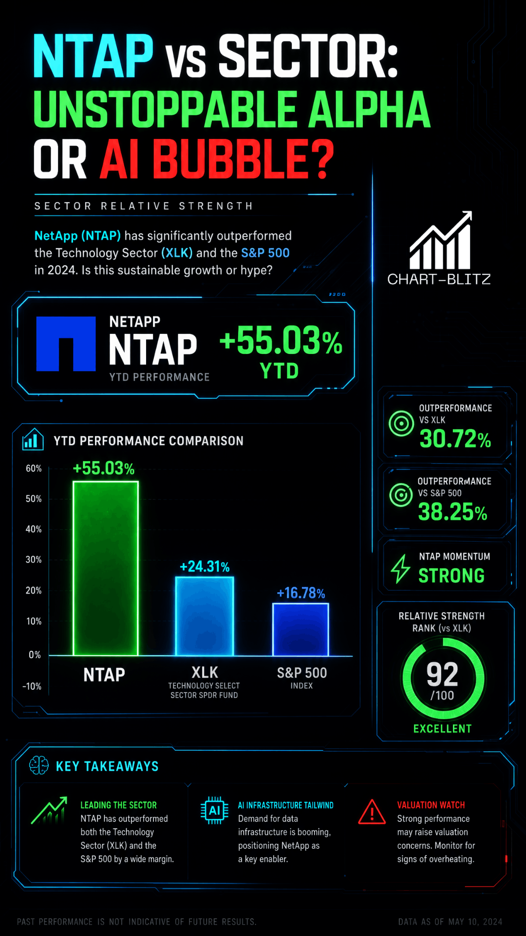
Comparing NTAP with the Tech Sector ETF (XLK) and the broader market (SPY) reveals that NTAP’s YTD return is approximately 55.03%, far outperforming XLK’s 32.67%. This strong relative strength shows NTAP is currently a sector leader, driven by “Stock Alpha.” However, if XLK begins a systemic correction, leaders like NTAP are often the first choice for institutional profit-taking. Retail chases the leader; institutions look to distribute it.
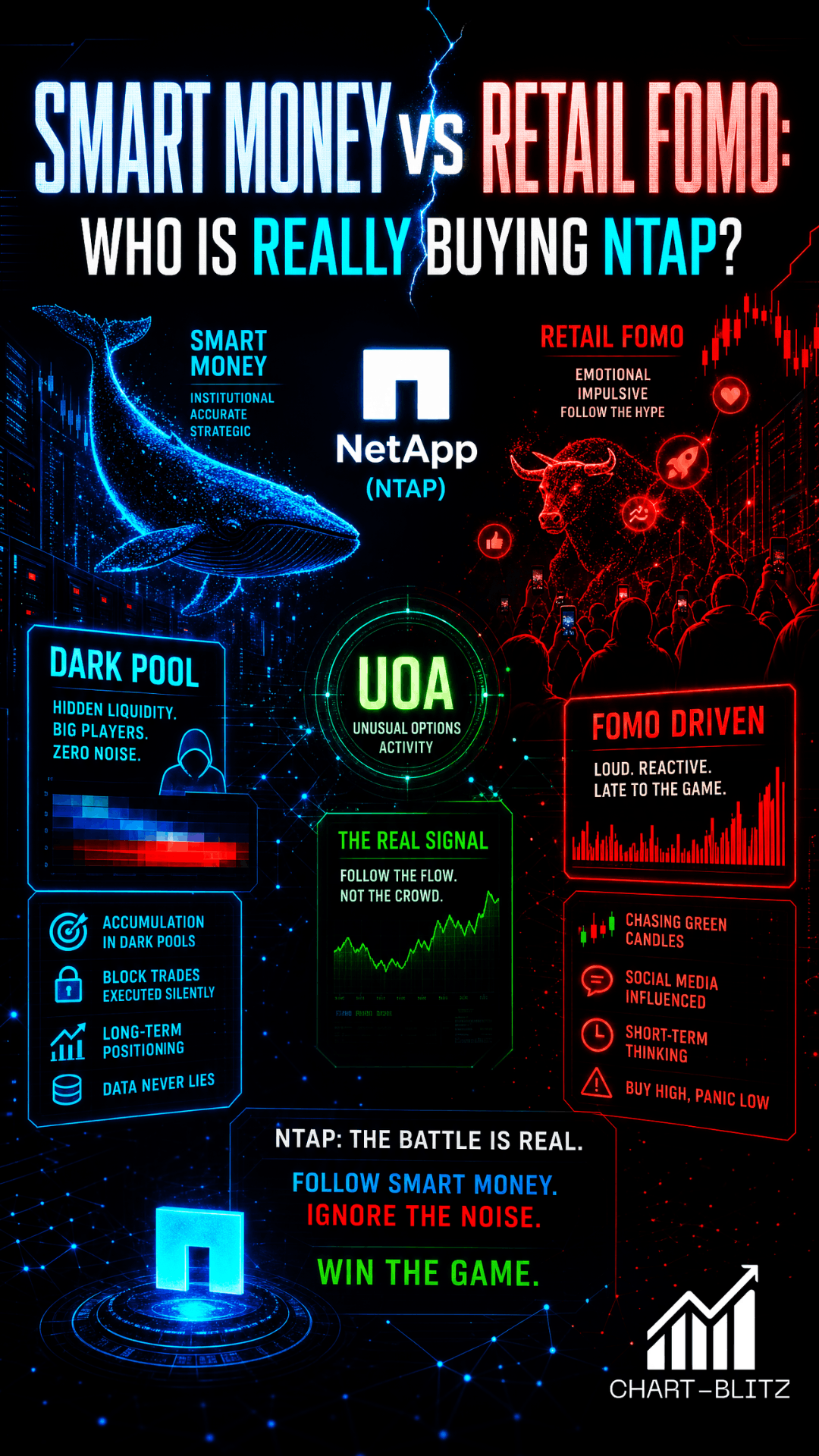
🕵️ Institutional Behavior Analysis (Smart Money)
Currently, Dark Pool volume is concentrated in the $160-$165 range, serving as the current consensus support for institutions. While no large-scale abnormal options activity (UOA) has been detected, suggesting institutions are relatively cautious and likely waiting for August earnings confirmation, 13F data shows stable institutional holdings with a slowing accumulation rate.
🔮 Multi-Scenario Projection & Trading Plan
Bullish Case: If price effectively breaks and holds above $175.91 (The Safest Entry Point), and the weekly MACD completes a true cross above the zero axis, the target will be to challenge $192.83 and beyond.
Bearish Case: If price falls below $150.22 (Stop Loss), and the monthly KDJ forms a death cross, the target will be a retrace to the daily Fibo 0.5 level at $131.73.
🛠️ Former Banker’s Trading Plan
- Position Management: Consider a light-position entry near $168.46, adding on a breakout of $175.91.
- Stop Loss Execution: Strictly adhere to $150.22; do not harbor any illusions.
- Core Mindset: Don’t be brainwashed by news; charts are the only truth.
📚Further Reading:
To help everyone gain a deeper understanding of the various technical indicators mentioned in this article, we have specially prepared the following further reading materials. These cover key analytical tools found across the weekly, daily, monthly, and 4-hour charts.
- Decoding Fibonacci Retracement: The Perfect Blend of Natural Law and Market Psychology — Fibonacci Retracement is not just a set of magical numbers; it is a manifestation of market psychology. Learning how to correctly draw and interpret Fibonacci levels is a required course for every serious trader.
- Elliott Wave Theory Practical Manual: Key Rules for Identifying Impulse and Corrective Waves — Elliott Wave Theory is one of the most complex yet powerful tools in technical analysis. Understanding how to identify impulse and corrective waves, along with the iron rules of Elliott Wave Theory, can help you find direction in the market.
- Understanding VPFR: Finding the Hidden Footprints of Market Makers — The Volume Profile Fixed Range (VPFR) is a powerful tool that tells us where the most trading occurred within a specific price range. This helps us identify true support and resistance levels, as well as potential ‘Vacuum Zones’.
- S/R Flip Support and Resistance Swap Strategy — S/R Flip is one of the most powerful concepts in technical analysis. This article uses real cases to teach you how to use S/R Flip to capture the highest win-rate trading opportunities.
- MACD Momentum Indicator Momentum First — What Does the MACD Line Crossing Above Zero Mean? Golden Cross & Divergence Signals!
- Gann Fan Masterclass — Deep dive into W.D. Gann’s angle theory to identify the geometric relationship between time and price in the market.
- Strategies for EMA Ribbon Bearish Alignment: Dead Cat Bounce or Real Reversal — Deep dive into the EMA Ribbon to understand the battle between short-term and long-term capital.
- Bollinger Band: Long-Term Repricing Zone — The Ultimate Tool to Capture Massive Market Moves Tired of getting shaken out of winning trades too early? Or buying right before a trend reverses? An ex-banker reveals how to use the Bollinger Band to filter out market noise and ride the big waves.
- KDJ Stochastic Indicator Bottom Confirmation — What is the implication of a downward-curving KDJ? Understand in one article how to use dynamic indicators to catch market turning points.
【Disclaimer】 The content herein is for educational purposes and reflects the author’s personal opinion only; it is not investment advice. All financial investments, including cryptocurrencies and stocks, carry significant risk, and you could lose your entire capital. To support this site, this article may contain affiliate links. While we strive for accuracy, we cannot guarantee all information is complete or error-free. Please conduct your own research and be fully responsible for your own investment decisions