Fetching Live Market Data...
When you make a trade, you should have a clear target of where you expect to get out
William Delbert Gann – 1949
🚨 Catalyst Deconstruction: News is Just Smoke and Mirrors for the Whales
Another day, another round of retail investors getting played by the headlines. For us ex-bankers, a “bullish” headline often signals a meticulously orchestrated “exit liquidity” play. The market is buzzing with talk of “ETF inflows” and “institutional confidence returning,” with major financial outlets reporting significant Bitcoin spot ETF inflows. To the uninitiated, these numbers might scream “bull market is back!” But to those of us who’ve spent two decades in the trading pits, it’s nothing more than a smokescreen, a diversion created by big players to facilitate their distribution. News merely provides the “object of analysis”; the “when” and “how” that truly dictate your account balance are always etched in the charts. If you’re only reading the news, you’re already a step behind, or worse, walking straight into the whale’s trap.
The real danger isn’t the fall itself, but believing it’s an opportunity after the breakdown. Retail sees ETF inflow figures; institutions see how to generate “exit liquidity” during this bounce. This fatal information asymmetry between the herd and the smart money means you might be buying the future, but you could just be taking the bag from a whale. The market is often most dangerous precisely when everyone feels safest.
【📊Analysis Baseline Statement】
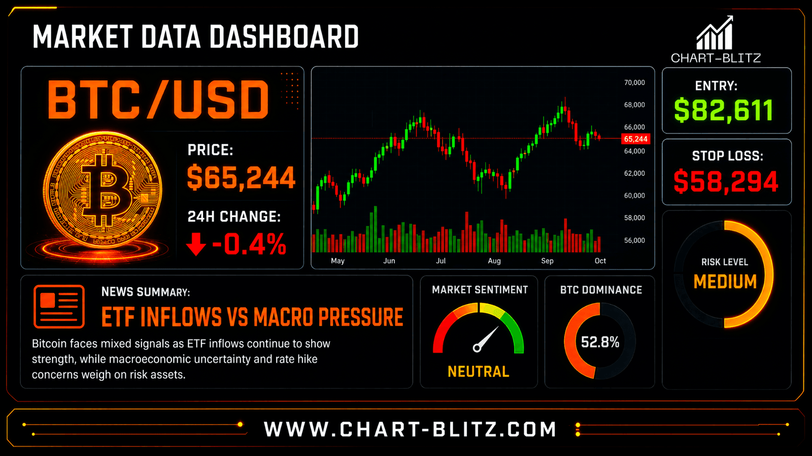
All technical analyses below are based on the price snapshot locked on July 24, 2026 (EST): 10:00 BTC = $65,244 USD. Please treat this report as an “analytical map” rather than a real-time quote.
🌊 Weekly Analysis: Major Structure Compromised, Is This Bounce Just “Empty Calories”?
In the grand scheme of things, any short-term positive news pales in comparison to the larger cycle. The weekly chart, much like a strategic battle map, reveals Bitcoin’s true predicament. Fixating on minor daily fluctuations is akin to a soldier seeing only the immediate skirmish, oblivious to larger troop movements.
Weekly Timeframe for BTC (Bitcoin)
MA Ribbon (Exponential Moving Average Ribbon): A Whale’s “Liferaft” or Retail’s “Shackles”?
The MA Ribbon is a band of multiple Exponential Moving Averages (EMAs) of varying periods. It visually represents the strength, direction, and dynamic support/resistance zones of a trend. An expanding, upward-sloping ribbon signals a robust uptrend; conversely, a narrowing or downward-sloping ribbon foreshadows weakening or reversal. Its genius lies in the interplay of multiple EMAs, offering a nuanced view of market shifts and filtering out noise.
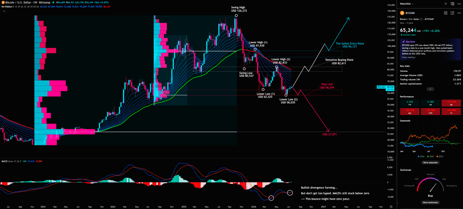
The Ex-Banker’s Read: On the weekly chart, BTC price is challenging the MA Ribbon from below. This is like a drowning man trying to swim to the surface, only to find a thick stack of “driftwood” (the Ribbon’s resistance) pressing down. This Ribbon represents the average cost basis of many traders. When price touches this zone from below, trapped traders might rush to break even, creating selling pressure. Institutions exploit such bounces to gauge retail’s willingness to buy. If price fails to break through and hold above the Ribbon with conviction (significant volume), it becomes an ideal distribution point. Retail often misinterprets this challenge as a “strong bounce,” but institutions see a prime opportunity to “manufacture liquidity.” If price succumbs to the Ribbon’s pressure, this bounce is an “empty calorie” struggle, destined to be swallowed by the larger trend. This reveals institutional capital distributing at higher levels, while retail blindly absorbs. Whales leverage retail’s hope for a bounce, creating an illusion at resistance to lure them in, completing their distribution.
FRVP (Fixed Range Volume Profile): Unmasking the Whale’s “Cost Basis” and the “Vacuum Zone”
Beyond Time, Into Price: The FRVP (Fixed Range Volume Profile) tells you at which price level the most volume was traded. It’s an X-ray of the market, distributing trading volume across price levels, forming a horizontal histogram. The POC (Point of Control) is the longest bar, representing the price level with the most intense market contention – the whale’s “average cost basis.” Areas with sparse volume are “Vacuum Zones,” implying price can move through them with minimal resistance or support.
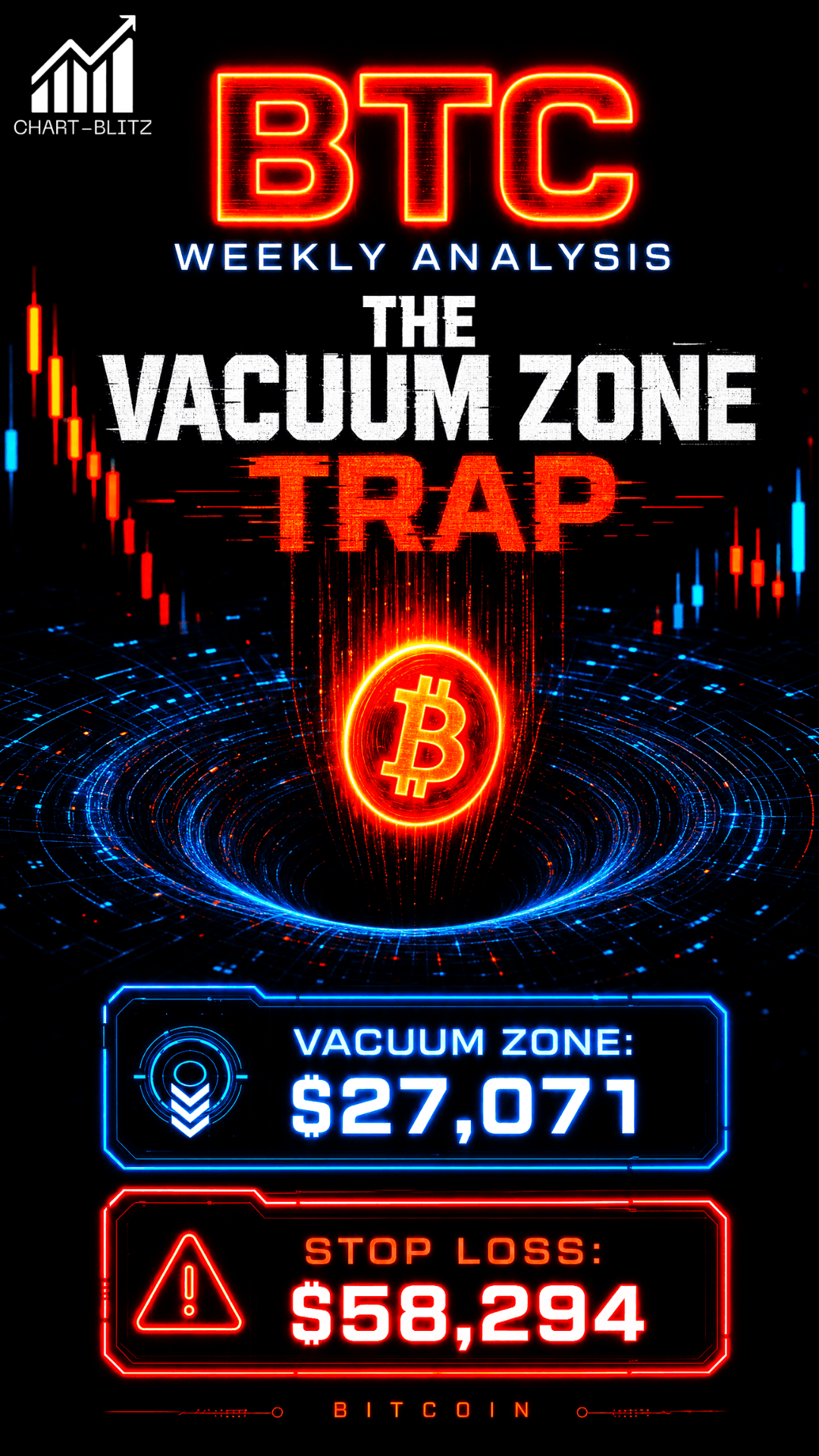
The weekly FRVP shows the area around $60,000 as a critical “battleground” with significant volume. More noteworthy is the distinct “Vacuum Zone” below the current price. Once the “line in the sand” at $58,294 is breached, there’s virtually no strong volume support below. It’s like a high-speed train entering a trackless cliff; price could plummet rapidly towards $27,071. Retail often overlooks deeper structural insights from volume distribution, assuming support will materialize. The FRVP warns that if price enters a vacuum zone, support is incredibly fragile. Institutional capital exploits these zones, accelerating selling once a breakdown is confirmed, knowing resistance is minimal, pushing price towards target levels.
MACD (Moving Average Convergence Divergence): The “Sugar-Coated Poison” of Bullish Divergence
The Pulse of Momentum: MACD (Moving Average Convergence Divergence) is a classic trend-following momentum indicator with two lines (MACD and Signal) and a histogram. It tracks the distance and crossovers between two moving averages to determine momentum direction and strength. MACD above Signal is bullish; the opposite is bearish. “Divergence,” where price makes a new high/low but MACD fails to confirm, suggests an impending trend reversal.
The weekly chart shows “Bullish divergence forming,” often interpreted as a buying opportunity. However, as an ex-banker, I caution: MACD is still below the zero line. This is like a sports car out of gas, coasting on inertia with no “fuel” for a prolonged rally. Retail investors are misled by “bullish divergence,” rushing to buy. Institutions use this psychology for final distribution. Divergence below zero often signals only a slowing of the downtrend, not a true reversal. Whales exploit these bounces, luring retail to provide liquidity for offloading holdings. By the time retail thinks they’ve found a treasure, whales have distributed at higher prices, preparing for the next leg down. This highlights retail’s superficial understanding and institutions’ precise manipulation of market psychology.


📊 Daily Analysis: The Golden Pocket’s Last Stand, a Bear’s “Waterloo”?
The daily chart reveals a more intense tug-of-war, where every critical price level represents a life-or-death struggle. This timeframe is like a close-quarters battle, where every tactical deployment influences the final outcome.
Daily Timeframe for BTC (Bitcoin)
Fibonacci Retracement: The “Curse” of the Golden Ratio
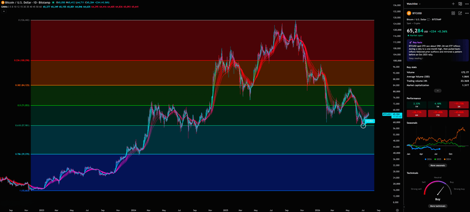
Nature’s Secret Code in Markets: Fibonacci Retracement (Fibo) is a horizontal line tool based on the golden ratio (1.618 or 0.618). Traders observe that market price retracements and bounces often find support or resistance near these golden ratio levels. 0.618 (61.8%) is the most crucial “golden ratio,” while 0.5 (50%) is a significant psychological threshold. The area between these two is the “Golden Pocket,” a popular zone for potential reversal points.
BTC price is hovering around $57,981 (0.618), within the “Golden Pocket” of the recent high’s retracement. This is the last bastion for bulls. If it fails to hold, it signifies the end of the rally and entry into a deeper correction. Retail often plays the bounce here, believing it’s strong support. Institutions, however, observe buying pressure, preparing for massive liquidation once it breaks. They know a breach triggers a cascade of stop-loss orders, creating a “waterfall effect.” This underscores retail’s blind faith in the golden ratio, while institutions exploit this belief, waiting for the opportune moment. Once breached, they push price towards lower targets. This Golden Pocket might just be the bulls’ “Waterloo.”
GMMA (Guppy Multiple Moving Average): The “Deep Sea Game” Between Institutions and Retail
Decoding Market Participants: The GMMA (Guppy Multiple Moving Average) consists of two sets of EMAs: a short-period group (speculative capital, often green) and a long-period group (institutional capital, often red). By observing their expansion, contraction, crossovers, and direction, one can discern short-term and long-term trends and the interplay between institutional and speculative capital. Short-term above long-term and fanning out indicates a strong uptrend; the opposite indicates a downtrend.
On the daily chart, the red long-term EMA group still presses down on the green short-term group, indicating a bearish larger trend. This is like a deep-sea game between big fish (institutional capital) and small fish (speculative capital). The big fish still control the flow. Short-term crossovers are noise; small fish darting around, unable to alter the big fish’s direction. Retail often sees green lines turn and rushes in, believing the trend reversed, but institutional big money (red lines) hasn’t shifted. Their capital is too vast; a reversal requires time and more confirmation. This reflects institutional patience; they aren’t swayed by short-term fluctuations. Retail, driven by FOMO, chases every small bounce, only to be swallowed by the larger trend. The GMMA clearly tells you the big players’ direction hasn’t changed; this bounce is merely a short-term “trap.”
🌙 Monthly Analysis: Long-Term Volatility at a Tipping Point, the “Prelude” to a Major Move?
The monthly chart reveals the market’s deepest pulsations, where whales orchestrate grand strategies. Subtle changes here can foreshadow major moves spanning months or years, akin to observing tides, not just ripples.
Monthly Timeframe for BTC (Bitcoin)
Bollinger Bands: The “Death Spiral” of Volatility Contraction?
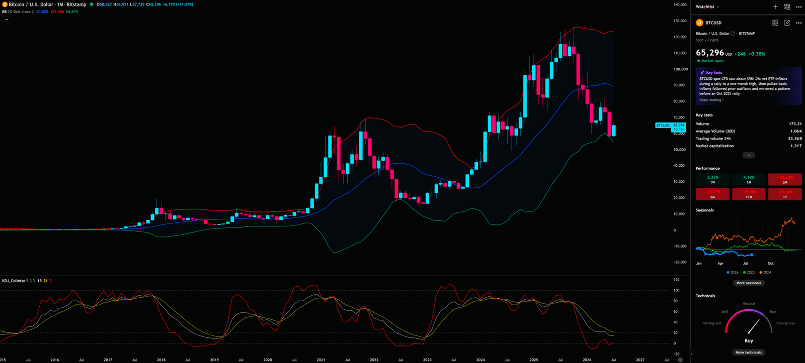
The Market’s Elasticity Gauge: Bollinger Bands (BB) are a volatility indicator with a middle band (20-period SMA) and two outer bands adjusting to price’s standard deviation. High volatility expands them; low volatility contracts. Price typically moves within the bands; touching outer bands may signal reversal. A “Squeeze” (contraction) indicates an imminent major price movement.
Price struggles between the middle and lower monthly Bollinger Bands – a critical position. A monthly contraction usually presages a major market move, like a compressed spring. If the monthly close falls below the middle band, the outlook is dire, potentially triggering a “death spiral.” Retail often feels lost during a squeeze, but institutional capital quietly positions, awaiting price direction. They know expanding bands signal clear, powerful trends. This reflects market hesitation and energy accumulation, exploited by institutions to collect or distribute chips, preparing for the next move. Failure to hold above the middle band means this contraction might be a “prelude” to an accelerated downtrend.
KDJ (Stochastic Oscillator): The “False Hope” of the Oversold Zone?
The Oscillator’s Nuance: The KDJ indicator, or Stochastic Oscillator, by George Lane, enhances responsiveness with a J line. It determines overbought/oversold conditions by calculating the closing price’s relative position within a price range. Values >80 are overbought, <20 are oversold. Crossover signals (e.g., K line above D line) identify buy/sell opportunities.
The monthly KDJ shows an oversold turn – the only slightly bullish signal. Textbooks interpret this as a buying opportunity. However, monthly indicators lag; they suggest a slowing downtrend, not an immediate “all-in.” It’s like a high-speed train braking near a cliff; it might not fall, but it won’t instantly reverse. Retail is misled by this “oversold turn,” rushing to enter. Institutional capital observes calmly, knowing monthly oversold conditions can persist. In a major trend, a short-term turn might be “false hope.” Whales use this signal to lure retail, providing liquidity for distribution during the bounce. This reflects retail’s over-interpretation and institutions’ profound understanding of large-cycle trends, knowing there’s ample time to position in a large-cycle oversold zone.
📐 4-Hour Analysis: The Spacetime Maze Under the Gann Fan, a “Death Warrant” for the Short-Term Bounce?
Short-term movements are strictly constrained by geometric rules. The 4-hour chart is a microscopic tactical sandbox, where every angle line could be a “lifeline” or “death line” for price. This timeframe combines price and time in a precise mathematical game.
4-Hour Timeframe for BTC (Bitcoin)
Gann Fan: The “Destiny” of Time and Price
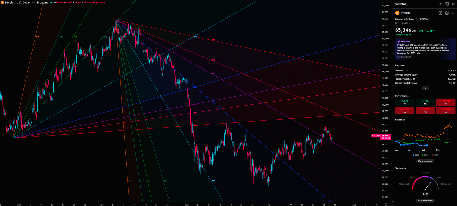
The Geometry of Markets: The Gann Fan, by W.D. Gann, is based on “time equals price.” Gann believed market price fluctuations are influenced by both price and time. Drawing angle lines with specific slopes (e.g., 1×1, 1×2, 1×4) from a significant high/low predicts dynamic support/resistance. These lines form a spacetime web, locking price’s trajectory. Price above an angle line indicates a strong trend; below it, weakening or reversal. Its essence is combining time and price for a comprehensive market perspective.
The 4-hour chart shows BTC struggling within the Gann Fan’s support web. These angle lines are an invisible net, locking price’s trajectory. Retail often buys at a line, thinking it’s support. Institutions see flattening slopes, indicating exhausting upward momentum. It’s like being trapped in a maze; every step is limited. If price falls below the current 1×1 line (balance of time and price), the short-term “artificial bounce” is over, potentially a “death warrant” for short-term bulls. This reflects institutional capital’s understanding of time and price; they know price bounce room is limited. Retail, ignoring time, may be trapped in the Gann Fan’s maze. Once price falls below a critical angle line, institutions accelerate selling, pushing price to lower targets.
🎭 Retail vs. Institutions: You Think It’s an Opportunity, It’s Actually “Exit Liquidity”
Let an ex-banker tell you a secret: on the trading floor, we love to distribute our holdings right when bullish news hits. Why? Because only then is there enough retail buying pressure (liquidity) to absorb our massive positions without instantly crashing the price. This is the “art” of institutions – quietly transferring chips to retail hands when the market is most euphoric. Retail calculates ETF inflows, but institutions stare at the “Vacuum Zone” on the weekly chart. This information asymmetry is why 90% lose money in Crypto. You see what whales want you to see. This market is a battle of information and psychology. To avoid becoming whales’ “exit liquidity,” see through the news facade and face the truth behind the charts.
🔮 Scenario Planning
In this uncertain market, single judgments are dangerous. As professional traders, we prepare for different scenarios. Here are two potential scenarios for BTC:
📈 Bullish Scenario
- Trigger Condition: BTC breaks weekly $82,833 (Lower High 2) with significant volume and holds for 2-3 days, showing strong buying support. Fleeting false breakouts are invalid.
- Target Price: Confirmed breakout targets $96,121 (The Safest Entry Point), a previous major resistance. If held, the next target challenges the all-time high.
- Invalidation Level: If price fails to hold $82,833 and rapidly falls below $60,000, closing there, the bullish scenario is invalidated. Market returns to downtrend, potentially accelerating.
📉 Bearish Scenario
- Trigger Condition: BTC falls below daily $58,294 (Stop Loss) critical defense line. This breakdown must be a solid candlestick close below this price with heavy volume selling. Brief wicks are invalid.
- Target Price: Confirmed breakdown targets the weekly “Vacuum Zone” bottom at $27,071. Due to sparse volume, price could fall rapidly. This is a previous major support, but if broken, becomes strong resistance.
- Invalidation Level: If price fails to continue falling after breaking $58,294 and rapidly reclaims $71,053 (0.5 Fibonacci Retracement) and holds, the bearish scenario is invalidated. Market might experience a “false breakdown,” requiring reassessment.
📝 Trading Plan
According to the Chart-Blitz analysis team’s observation, the market is at an extremely critical juncture; the superficial bounce might be a “bull trap.” Maintaining calm and discipline is paramount.
- Entry Strategy: Blindly chasing highs is not recommended. The safest approach is to wait for price to retest $82,611 (Tentative Buying Point) and confirm support before considering a light position. This retest must be accompanied by shrinking volume and a reversal candlestick pattern. If these signals are absent, it’s better to miss out.
- Stop-Loss Setting: Any spot or long positions must strictly set a stop-loss below $58,294. This is the critical daily defense line; once broken, decisively exit. Preserving capital is always the first priority. A stop-loss is your “lifeline,” not a decoration.
- Re-entry Strategy: If BTC falls below $58,294, I will wait near $27,071 for a large-cycle bullish divergence signal before accumulating in batches. Market sentiment will be pessimistic, but that’s often when whales quietly enter. Wait for a clear reversal signal, such as strong bullish divergence on the weekly level, with volume confirmation, before entry.
I will continue to closely monitor the price action of this Crypto. As soon as a critical reversal signal appears on the charts, I will update my analysis and insights right here immediately. Remember to Bookmark this page and come back often to check for the latest updates!
Want to see our full, interactive chart breakdown? If you want to learn how to draw weekly VPFR, Fibonacci, EMA Ribbon, MACD, Supertrend, and S/R Flip frameworks designed for real trading decisions. Please browse the following『Further Reading』links. Fundamental news tells you what happened. Technical analysis predicts what will happen. To master the professional framework that separates market signal from noise, explore our exclusive models at www.chart-blitz.com.
📚Further Reading:
To help everyone gain a deeper understanding of the various technical indicators mentioned in this article, we have specially prepared the following further reading materials. These cover key analytical tools found across the weekly, daily, monthly, and 4-hour charts.
- Decoding Fibonacci Retracement: The Perfect Blend of Natural Law and Market Psychology — Fibonacci Retracement is not just a set of magical numbers; it is a manifestation of market psychology. Learning how to correctly draw and interpret Fibonacci levels is a required course for every serious trader.
- Elliott Wave Theory Practical Manual: Key Rules for Identifying Impulse and Corrective Waves — Elliott Wave Theory is one of the most complex yet powerful tools in technical analysis. Understanding how to identify impulse and corrective waves, along with the iron rules of Elliott Wave Theory, can help you find direction in the market.
- Understanding VPFR: Finding the Hidden Footprints of Market Makers — The Volume Profile Fixed Range (VPFR) is a powerful tool that tells us where the most trading occurred within a specific price range. This helps us identify true support and resistance levels, as well as potential ‘Vacuum Zones’.
- S/R Flip Support and Resistance Swap Strategy — S/R Flip is one of the most powerful concepts in technical analysis. This article uses real cases to teach you how to use S/R Flip to capture the highest win-rate trading opportunities.
- MACD Momentum Indicator Momentum First — What Does the MACD Line Crossing Above Zero Mean? Golden Cross & Divergence Signals!
- Gann Fan Masterclass — Deep dive into W.D. Gann’s angle theory to identify the geometric relationship between time and price in the market.
- Strategies for EMA Ribbon Bearish Alignment: Dead Cat Bounce or Real Reversal — Deep dive into the EMA Ribbon to understand the battle between short-term and long-term capital.
- Bollinger Band: Long-Term Repricing Zone — The Ultimate Tool to Capture Massive Market Moves Tired of getting shaken out of winning trades too early? Or buying right before a trend reverses? An ex-banker reveals how to use the Bollinger Band to filter out market noise and ride the big waves.
- KDJ Stochastic Indicator Bottom Confirmation — What is the implication of a downward-curving KDJ? Understand in one article how to use dynamic indicators to catch market turning points.
【Disclaimer】 The content herein is for educational purposes and reflects the author’s personal opinion only; it is not investment advice. All financial investments, including cryptocurrencies, carry significant risk, and you could lose your entire capital. To support this site, this article may contain affiliate links. While we strive for accuracy, we cannot guarantee all information is complete or error-free. Please conduct your own research and be fully responsible for your own investment decisions.