When you make a trade, you should have a clear target of where you expect to get out
William Delbert Gann – 1949
🔥When News Creates Panic, Charts Reveal Truth
If you’ve been staring at news headlines over the past few days, your palms might be sweating.
In June 2026, U.S. spot Bitcoin ETFs recorded a record-breaking $4.5 billion in net outflows, their worst single-month performance since launching in early 2024. BlackRock’s IBIT fund alone shed $3.55 billion, accounting for nearly 80% of the total outflows. Meanwhile, BTC fell 20.48% in June, its steepest monthly drop since June 2022. Adding to the pressure, newly appointed Fed Chair Kevin Warsh’s mid-June meeting shifted the dot plot toward rate hikes, completely eliminating market expectations for rate cuts. The market is now flooded with panic narratives like “Crypto Winter Returns Early” and “Bitcoin Plunging to $40,000.”
Retail investors see these headlines and panic-sell.
But as a former trader who has survived in bank trading rooms for 20 years, I must tell you a brutal truth:
News is often just a smokescreen used by whales to create Exit Liquidity.
During my years in bank trading rooms, I personally witnessed this script play out countless times: when the market is flooded with panic-inducing bearish news, institutional funds are not panicking — they are secretly observing key support levels on charts, waiting for the “liquidity window” created by retail investors selling out of emotion. What appears bearish on the surface was actually foretold by technical charts weeks ago, predicting the depth of this correction and potential rebound opportunities.
Today, we skip the nonsense and directly use the weekly, daily, monthly, and 4-hour charts to perform a dimensional strike and see through the market makers’ hidden cards.
【📊Analysis Baseline Statement】
All technical analysis below is based on a price snapshot locked at July 1, 2026, 05:00 EST: BTC = $58,699 USD. Please treat this report as an “analysis map” rather than a real-time quote. Markets are constantly changing, and any technical analysis carries the risk of invalidation. Please conduct independent research.

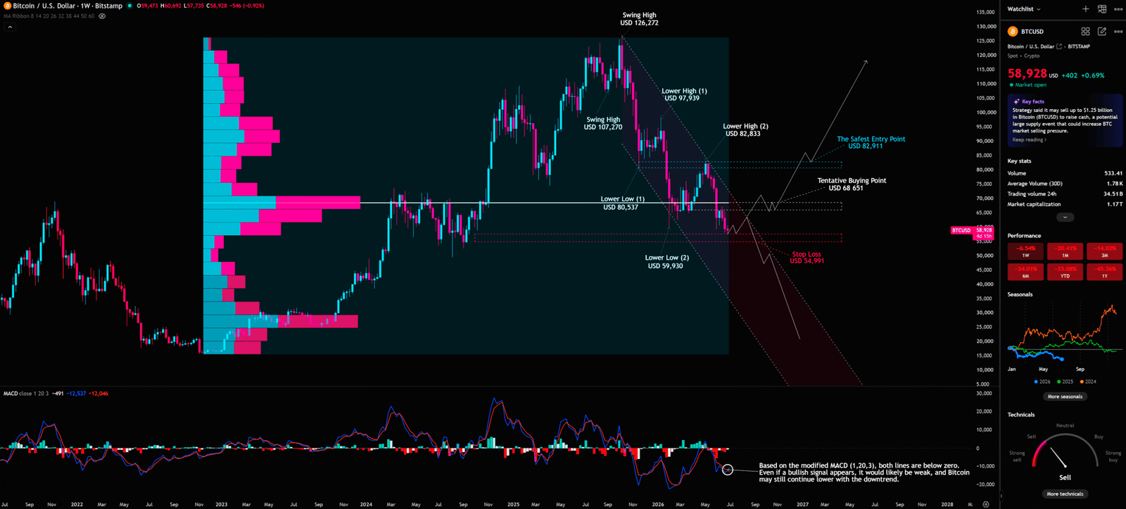
📊Chapter 1: Weekly Chart Deep Dive — VPFR Vacuum Zone and the Ultimate Test of Elliott Wave
We must start with the big picture: the weekly chart. This is the “main battlefield” for institutional fund deployment.
Weekly Timeframe for BTC (Bitcoin)
News First: The Double Blow of ETF Outflows and SpaceX IPO
Before diving into chart analysis, we must first understand the macro catalysts that triggered this sharp decline. According to CoinDesk, two events may have set the chain reaction in motion:
First, SpaceX debuted on June 12 and within days had absorbed billions in risk capital, with retail buying on its first trading day breaking all single-session records, and the offering raising $75 billion in total. This mega-IPO directly siphoned massive liquidity from the crypto market.
Second, Fed Chair Kevin Warsh’s June 17 meeting shifted the dot plot toward rate hikes and took rate cuts off the table, giving institutions a clear reason to reduce exposure to volatile assets.
These two events are the “news” that retail investors see. But what institutions see is the technical structure that had already formed on the charts.
VPFR Vacuum Zone: Where Retail Investors Fall into Traps
Volume Profile Fixed Range (VPFR) is a top-tier tool that reveals the market’s “true hidden cards.” Unlike ordinary volume bar charts that only show daily volume, it displays the historical volume distribution within a specific price range, allowing us to clearly see which price levels have large amounts of chip turnover (strong support) and which have almost no volume (vacuum zones).
From the weekly chart uploaded by the user, we can clearly see the VPFR histogram on the left side of the chart. In the $65,000 to $55,000 range, the volume histogram is extremely thin, almost blank. What does this mean? It’s a “Vacuum Zone.”
Without the support of strong historical volume, once the price drops below $65,000, it will slide rapidly like a free fall until it hits the next strong support area with large volume. This is exactly the reason for the sharp drop we are seeing now. Retail investors thought $65,000 was an “iron bottom,” but VPFR had already told us there wasn’t enough chip support there.
In the trading room, our favorite thing is seeing retail investors catching falling knives in the “Vacuum Zone.” They think they bought a bargain, not knowing there is absolutely no institutional buying support below. It’s like being in a building elevator, thinking you’ve stepped on the floor, but the floor beneath is hollow. The real smart money will patiently wait for the price to drop to the VPFR’s strong support area (High Volume Node) or wait for the trend structure to be broken before considering entry.
Descending Channel and Lower Highs Structure
From the weekly chart, we can clearly see that since BTC peaked at $126,272, the price has formed an obvious downtrend structure:
- Swing High: $107,270
- Lower High (1): $97,939
- Lower High (2): $82,833
- Lower Low (1): $80,537
- Lower Low (2): $59,930
This is a textbook “Lower Highs, Lower Lows” downtrend structure. Every rebound has failed to break through the previous high, and every decline has made a new low. Until this structure is broken, any rebound can only be viewed as a “Bear Market Rally.”
Elliott Wave Theory’s Life-or-Death Line
Based on the annotations on the chart, BTC’s price is currently testing a critical support zone. Here, we must invoke the iron rule of Elliott Wave Theory:
The bottom of Wave 4 must absolutely not overlap with the top of Wave 1.
If BTC falls below $54,991 (Stop Loss), the entire assumption of the 1-2-3-4-5 upward impulse wave will be completely shattered, and this might just be part of a larger degree corrective wave (A-B-C), meaning BTC’s long-term downside space will far exceed retail investors’ expectations.
Important Warning: We must never lightly conclude that the current decline position is “the bottom of Wave 4.” Without clear reversal signals (such as strong bullish candle closes, increased volume, key resistance breakouts), any “bottom-fishing” behavior is gambling, not trading.
MACD’s Deep Warning
The MACD (1,20,3) indicator at the bottom of the weekly chart shows that both the MACD line (blue) and signal line (orange) are below the zero axis and still trending downward. The chart annotation clearly states: “Based on the modified MACD (1,20,3), both lines are below zero. Even if a bullish signal appears, it would likely be weak, and Bitcoin may still continue lower with the downtrend.”
This is a very important warning. Even if a short-term rebound occurs, as long as both MACD lines remain below the zero axis, the strength of any rebound is limited and could turn down again at any time.
If you only read the news, you might already be half a step behind. The real danger isn’t the drop, but thinking it’s an opportunity after the support breaks.
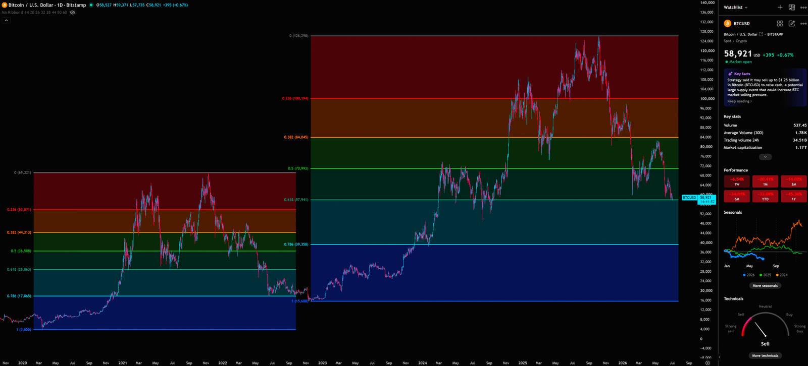
☀️ Chapter 2: Daily Chart Deep Dive — The Game of Fibonacci Retracement and S/R Flip
Having assessed the macro picture on the weekly chart, let’s narrow our focus to the daily chart. The daily chart helps us pinpoint short-term support and resistance with greater precision.
Daily Timeframe for BTC (Bitcoin)
News Background: The Chain Reaction of Institutional Retreat
BlackRock’s IBIT shed $3.55 billion in June alone, accounting for nearly 79% of the entire Bitcoin ETF category’s monthly outflows. This figure is staggering. But the more important question to consider is: If it’s truly so bearish, why is the price still struggling in the $57,000-$60,000 range instead of collapsing outright?
The answer might lie in the Fibonacci structure on the daily chart.
Fibonacci Retracement’s Key Battlefield
Fibonacci Retracement is one of the most widely used tools in technical analysis, with its design principle based on the golden ratio (1.618). Its core logic is: after a trend movement, markets tend to find support or resistance at specific ratio levels.
From the daily chart uploaded by the user, this is a complete Fibonacci retracement chart starting from BTC’s historical high of $126,298 and ending at the historical low of $3,855. BTC is currently struggling near the following key levels:
| Fibonacci Level | Price | Current Status |
| 0.236 | $100,194 | Already broken (former resistance) |
| 0.382 | $84,045 | Already broken (former support, now resistance) |
| 0.5 | $70,993 | Already broken (important midpoint) |
| 0.618 (Golden Ratio) | $57,941 | Current critical support |
| 0.786 | $39,358 | Next major support |
BTC is currently struggling near the 0.618 ($57,941) golden ratio level. This is a very sensitive position. If it holds, this might just be a deep, healthy correction; if it fails, the next target will point straight to 0.786 ($39,358).
S/R Flip (Support/Resistance Flip) Strategy
This is one of my most frequently used strategies during my banking days, and also the technical tool I believe best reveals institutional fund behavior.
The core logic of S/R Flip is: A support level that has been broken will transform into a resistance level; a resistance level that has been broken will transform into a support level.
Currently, theoretically the BTC downtrend should not be over yet, but if the BTC price does not continue to fall but instead turns upwards and explodes, it needs to be seen whether it can rise to the resistance zone (e.g., breaking the descending trendline and standing firm above $68,651 (Tentative Buying Point)). If it breaks above and holds, then enter the market; otherwise, it will reach the stop loss and sell off.
The Information Gap Between Retail and Institutions:
Retail investors see 0.618 and can’t wait to go All-in, thinking it’s an “iron bottom,” believing it’s a “once-in-a-lifetime bottom-fishing opportunity.” Their logic is: “It’s fallen so much, it can’t fall anymore!”
Institutions are completely different. They will observe the “Price Action” near 0.618. They will wait for a Fakeout — where the price briefly drops below 0.618, clearing retail stop-loss orders, then quickly rebounds — before truly entering the market. This “fakeout” move is a common tactic used by institutions to “harvest” retail stop-loss orders.
In the trading room, we have a saying: “Retail buys stories, institutions buy structure.” When retail buys because of the story that “it’s fallen so much,” institutions are waiting for a confirmation signal in the chart structure — i.e., the S/R Flip is established and supported by volume. Without this confirmation, any entry is just speculation, not trading.
🌙 Chapter 3: Monthly Chart Deep Dive — The Long-Term Warning of Bollinger Bands
The monthly chart provides a macro trend perspective and is the most important tool for judging long-term direction.
Monthly Timeframe for BTC (Bitcoin)
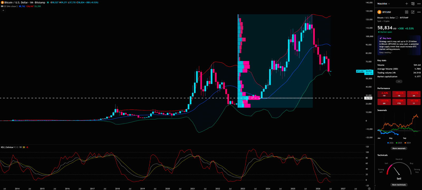
Bollinger Bands’ Long-Term Warning
Bollinger Bands were developed by John Bollinger in the 1980s, with their core design principle based on the statistical concept of standard deviation. Bollinger Bands consist of three lines: the middle band (20-period moving average), the upper band (middle band + 2 standard deviations), and the lower band (middle band – 2 standard deviations). When the price touches the upper band, it often indicates overbought conditions; touching the lower band often indicates oversold conditions.
From the monthly chart, BTC’s price touched the upper Bollinger Band during the bull market peak in late 2025 to early 2026, indicating extreme overbought conditions at the time. Now, BTC’s price has fallen significantly from the upper Bollinger Band and is approaching the middle band (20 SMA).
The 20 SMA on the monthly chart is currently around $53,358, which highly coincides with the weekly chart’s stop-loss level of $54,991. This “Multi-Timeframe Confluence” effect greatly increases the importance of this support zone.
KDJ Indicator’s Death Cross Warning
The KDJ indicator (KDJ_Colintse 9,3,3) on the monthly chart shows that the J line (red) has turned downward from the overbought high area (near 100) and is approaching the K line (yellow) and D line (green), forming the embryonic stage of a death cross.
A KDJ death cross at the monthly level is a very serious signal of weakening long-term momentum. Historically, every time a monthly KDJ death cross appears, it is often accompanied by months or even longer periods of downward correction.
If you only look at daily news, you might be deceived by short-term rebounds. But the monthly KDJ is telling you that the long-term correction might have just begun. The most dangerous time in the market is often the moment everyone thinks it’s safe.
⏱️ Chapter 4: 4-Hour Chart Deep Dive — The Dilemma of EMA Ribbon and Pitchfork
Finally, let’s look at the short-term battle on the 4-hour chart to formulate a more precise short-term trading plan.
4-Hour Timeframe for BTC (Bitcoin)
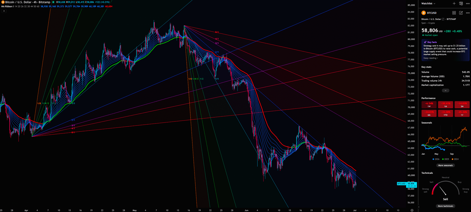
EMA Ribbon’s Bearish Alignment
EMA Ribbon is an indicator combination composed of multiple EMAs of different periods. By observing the arrangement of each EMA, we can quickly determine the direction of market momentum.
From the 4-hour chart, the EMA Ribbon presents a perfect bearish alignment: short-term moving averages (such as EMA 8, 14) are all below long-term moving averages (such as EMA 50, 60), and the entire Ribbon is pouring down like a waterfall. This indicates that short-term momentum is completely bearish, and every time a price rebound touches the EMA Ribbon, it is met with ruthless selling pressure.
Gann Fan’s Suppression
On the 4-hour chart, a clearly downward-sloping Gann Fan can be observed. The Gann Fan is a technical analysis drawing tool developed by William Delbert Gann (W.D. Gann). By combining time and price at specific geometric angles, the diagonal lines drawn represent dynamic support and resistance levels, which are used to forecast the potential range of price movement.
At present, BTC’s price is completely suppressed within the range between the downward Gann Fan’s 1×1 and 2×1 lines. Unless there is a strong breakout above the descending 2×1 Gann line, accompanied by significant trading volume, any short-term rebound should only be regarded as a “Dead Cat Bounce.”
If the whales truly intend to push the price higher, why is trading volume not confirming the move? This is the question we must ask when evaluating any rebound.
🎯 Chapter 5: Comprehensive Conclusion and Trading Plan
Synthesizing the deep analysis across multiple timeframes above, we arrive at the following complete trading plan:
🐂 Bullish Scenario
- Trigger : Daily close below $57,941 (Fibonacci 0.618), accompanied by increased volume; or weekly close below $54,991 (Stop Loss).
- Target : Test the weekly life-or-death line at $54,991. If this level is breached, the Elliott Wave upward impulse assumption fails, and the price will accelerate its slide toward $39,358 (Fibonacci 0.786) or even the $40,000 – $45,000 range
- Invalidation : Price rebounds strongly and breaks above $68,651, accompanied by increased volume.
- Action : Remain on the sidelines; do not blindly catch falling knives. If holding long positions, strictly execute stop-losses
🐻 Bearish Scenario (S/R Flip Logic)
- Trigger : Price rejects further decline, rebounds strongly, and breaks and holds above the descending trendline and $68,651 (Tentative Buying Point), accompanied by increased volume.
- Target : $82,911 (The Safest Entry Point). Breaking this level confirms a trend reversal, with the next target looking toward $97,939.
- Invalidation : After breaking $68,651, price falls back below $65,000.
- Action : Only consider a small exploratory position after confirming a firm hold above $68,651, placing a stop-loss at the bottom of the breakout candle. Never enter the market ahead of confirmation.
Ex-Banker’s Summary
The most dangerous time in the market is often the moment everyone thinks it’s safe; similarly, when the news is overwhelmingly negative, a fantastic S/R Flip opportunity might be brewing on the charts.
Don’t be swayed by emotions; let the charts guide your capital. Remember: Retail buys stories, institutions buy structure.
I will continue to closely monitor the price action of this Crypto. As soon as a critical reversal signal appears on the charts, I will update my analysis and insights right here immediately. Remember to Bookmark this page and come back often to check for the latest updates!
Want to see our full, interactive chart breakdown? If you want to learn how to draw weekly VPFR, Fibonacci, EMA Ribbon, MACD, Supertrend, and S/R Flip frameworks designed for real trading decisions. Please browse the following『Further Reading』links. Fundamental news tells you what happened. Technical analysis predicts what will happen. To master the professional framework that separates market signal from noise, explore our exclusive models at www.chart-blitz.com.
📚Further Reading:
To help everyone gain a deeper understanding of the various technical indicators mentioned in this article, we have specially prepared the following further reading materials. These cover key analytical tools found across the weekly, daily, monthly, and 4-hour charts.
- Decoding Fibonacci Retracement: The Perfect Blend of Natural Law and Market Psychology — Fibonacci Retracement is not just a set of magical numbers; it is a manifestation of market psychology. Learning how to correctly draw and interpret Fibonacci levels is a required course for every serious trader.
- Elliott Wave Theory Practical Manual: Key Rules for Identifying Impulse and Corrective Waves — Elliott Wave Theory is one of the most complex yet powerful tools in technical analysis. Understanding how to identify impulse and corrective waves, along with the iron rules of Elliott Wave Theory, can help you find direction in the market.
- Understanding VPFR: Finding the Hidden Footprints of Market Makers — The Volume Profile Fixed Range (VPFR) is a powerful tool that tells us where the most trading occurred within a specific price range. This helps us identify true support and resistance levels, as well as potential ‘Vacuum Zones’.
- S/R Flip Support and Resistance Swap Strategy — S/R Flip is one of the most powerful concepts in technical analysis. This article uses real cases to teach you how to use S/R Flip to capture the highest win-rate trading opportunities.
- MACD Momentum Indicator Momentum First — What Does the MACD Line Crossing Above Zero Mean? Golden Cross & Divergence Signals!
- Gann Fan Masterclass — Deep dive into W.D. Gann’s angle theory to identify the geometric relationship between time and price in the market.
- Strategies for EMA Ribbon Bearish Alignment: Dead Cat Bounce or Real Reversal — Deep dive into the EMA Ribbon to understand the battle between short-term and long-term capital.
- Bollinger Band: Long-Term Repricing Zone — The Ultimate Tool to Capture Massive Market Moves Tired of getting shaken out of winning trades too early? Or buying right before a trend reverses? An ex-banker reveals how to use the Bollinger Band to filter out market noise and ride the big waves.
【Disclaimer】 The content herein is for educational purposes and reflects the author’s personal opinion only; it is not investment advice. All financial investments, including cryptocurrencies, carry significant risk, and you could lose your entire capital. To support this site, this article may contain affiliate links. While we strive for accuracy, we cannot guarantee all information is complete or error-free. Please conduct your own research and be fully responsible for your own investment decisions.