When you make a trade, you should have a clear target of where you expect to get out
William Delbert Gann – 1949
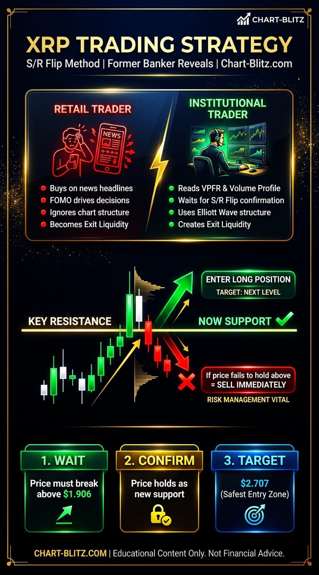
🚨 News First: While Retail is Blinded by ‘Bullish’ News, What are the Market Makers Doing?
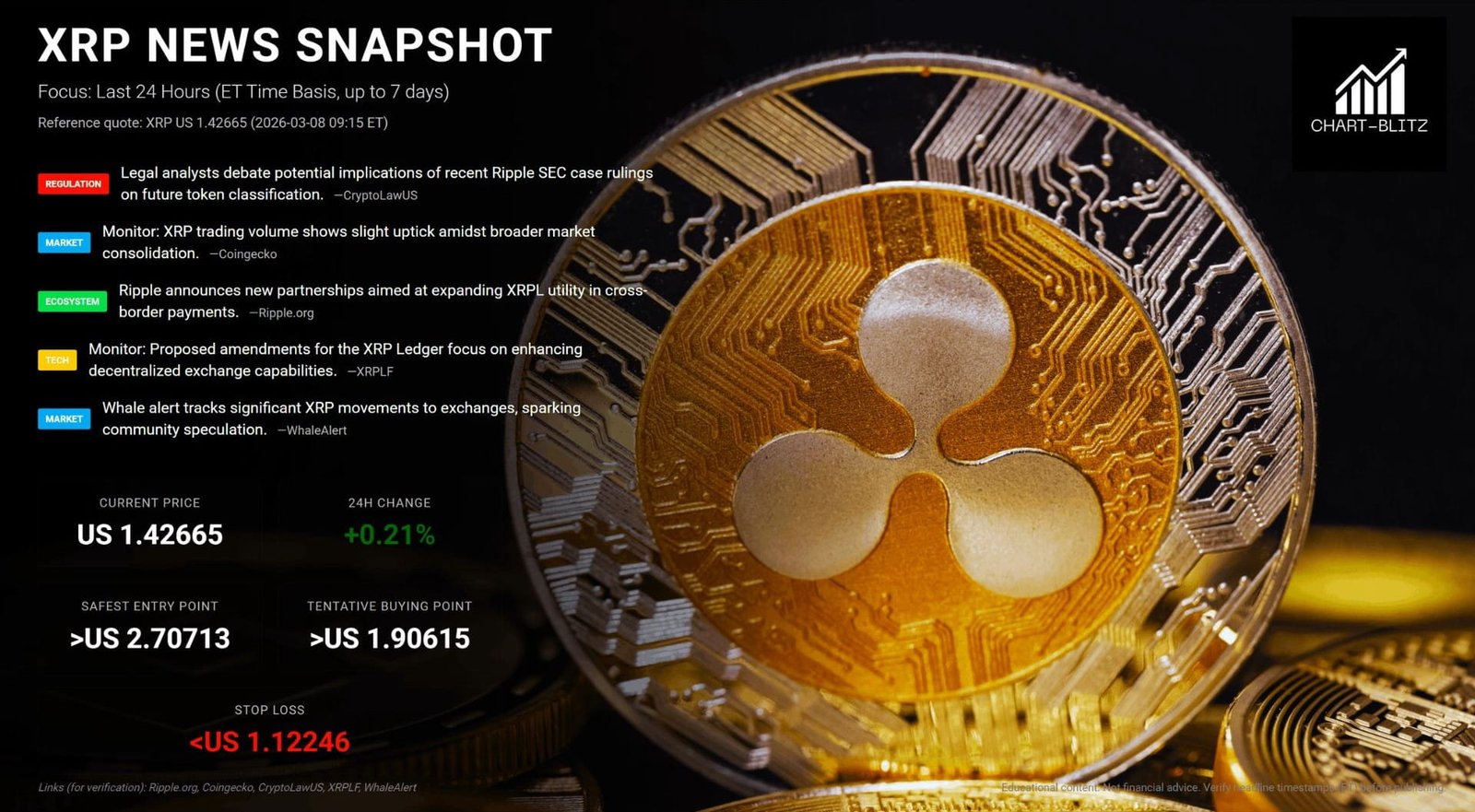
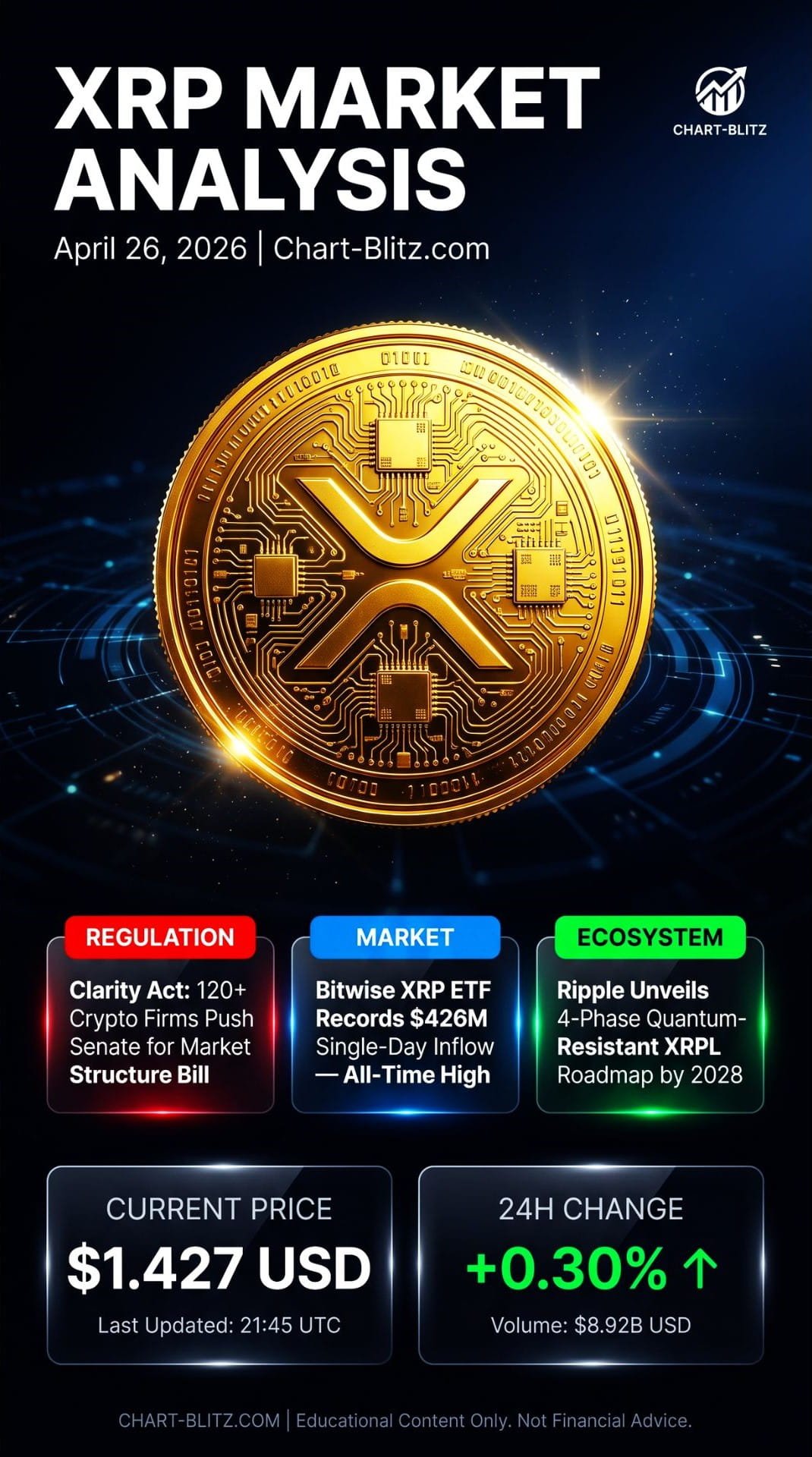
Over the past 24 hours, the XRP news cycle has been nothing short of explosive — arguably the most ‘bullish’ trading day in recent months. Let’s start with the most staggering development: Bitwise’s XRP ETF recorded a jaw-dropping $426 million in single-day inflows, setting an all-time record. This figure not only shattered every record since XRP ETFs were launched, but also sent the entire XRP community into a state of near-frenzied euphoria.
Simultaneously, over 120 cryptocurrency firms, including industry giants Coinbase and Ripple, have joined forces in a formal letter urging the U.S. Senate Banking Committee to expedite the markup of the CLARITY Act. The market consensus is that once this act passes, XRP’s regulatory status will be completely clarified, making a massive influx of institutional capital inevitable. Some analysts have even shouted targets of $5 to $10, with more aggressive voices predicting XRP will challenge $29 before the end of 2026.
Adding fuel to the fire, Ripple officially released a detailed four-phase roadmap planning to make the XRP Ledger (XRPL) ‘Quantum-Resistant’ by 2028. This means that even if quantum computers emerge in the future, the security of XRPL will be guaranteed — undoubtedly injecting a strong dose of confidence into XRP’s long-term technical value.
Furthermore, on-chain data reveals that a staggering 34.94 million XRP net flowed out of exchanges in the past 24 hours, marking the sixth-largest single-day outflow of 2026. Theoretically, tokens leaving exchanges suggest holders are opting for self-custody, reducing immediate selling pressure — a signal typically interpreted as bullish.
However, as you scroll through these exhilarating headlines on social media and prepare to go all-in on XRP, as a former banker with 20 years of trading experience, I must pour a bucket of cold water on you.
I remember my days working in the bank’s trading room. Whenever the market was flooded with this kind of overwhelmingly positive news, my old supervisor would walk over, pat me on the shoulder, and point to the chart on the screen: “Kid, the news you’re reading is what institutions want you to see. The real story is in the charts.”
That sentence stayed with me for twenty years.
In the bank’s trading room, we had an old saying: “News is for retail to read; charts are the true footprints of institutions.”
When market sentiment reaches extreme euphoria, when everyone believes XRP is about to moon, that is precisely the optimal moment for market makers to distribute their chips and create ‘Exit Liquidity’. You might think you’re buying at the starting line, but in reality, you might be catching the high-priced bags thrown by institutional whales.
To see through this illusion, we cannot merely stare at news headlines; we must delve deeply into XRP’s technical charts. You’ll be surprised to find that the charts have foreshadowed all of this long ago — and these signals formed weeks before the news broke.
【📊Analysis Baseline Statement】
All technical analysis below is based on the price snapshot locked at 2026-04-26 15:00 EST: XRP = 1.427 USD. Please treat this report as an ‘analysis map’ rather than real-time quotes. Data cross-referenced from CoinMarketCap ($1.43 USD) and CoinGecko ($1.427 USD); market average of $1.427 USD used as the sole analysis benchmark.
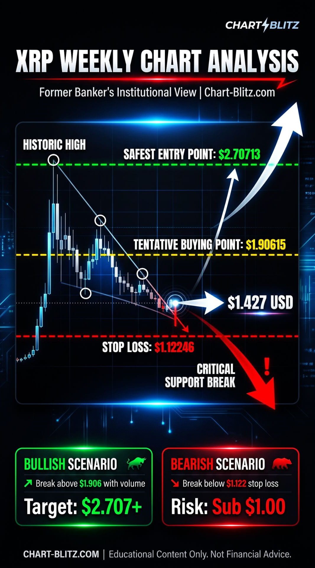
📈 Weekly Chart: The Core Battlefield and the Whales’ Bottom Line
Among all timeframes, the weekly chart is the absolute core of our analysis. It filters out short-term market noise and clearly reveals the medium-to-long-term trend structure and the movements of major capital. Any seemingly strong price action on the daily or shorter timeframes must be examined within the framework of the weekly chart.
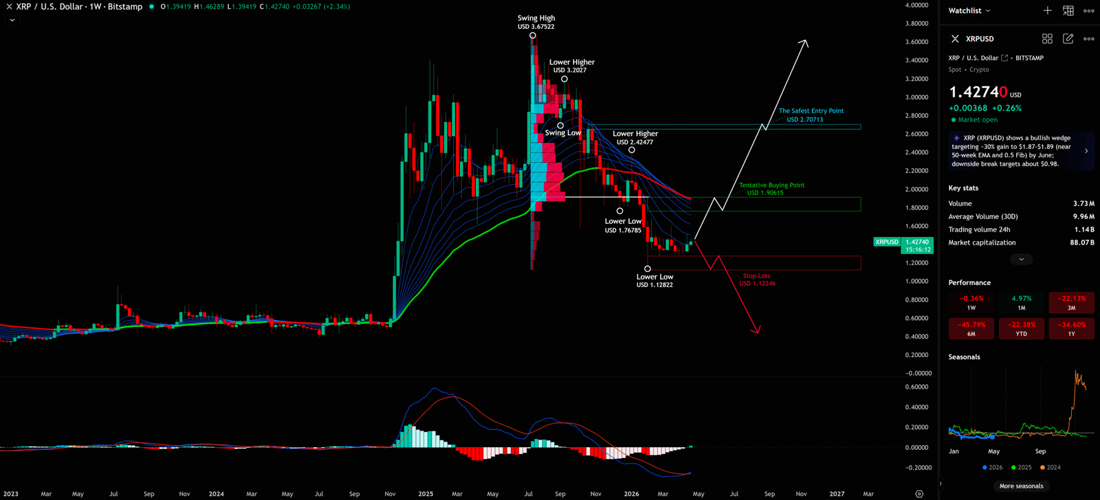
Weekly Timeframe for XRP (Ripple)
1. Resonance of News and Charts: A Premeditated Setup
As mentioned earlier, the massive inflows into the Bitwise XRP ETF and the push for the CLARITY Act have created strong bullish expectations on the news front. However, when we open XRP’s weekly chart, you’ll discover that all of this seems to have been premeditated.
Weeks before the news broke, subtle but critical signals had already appeared on XRP’s weekly chart. The MACD histogram had already begun to turn, and the EMA Ribbon arrangement showed clear signs of convergence. These signals didn’t attract retail attention at the time, but institutional quantitative models had already captured these changes.
This is the beauty of technical analysis: the charts had already issued clear warning signals weeks before the news broke.
2. Trend Structure: The ‘Lower Highs, Lower Lows’ Downtrend
Observing the user-provided weekly chart, we can clearly see the following key annotations:
| Annotation | Price (USD) | Significance |
| Swing High | 3.67522 | The peak of this bull cycle |
| Lower Higher | 3.0227 | First ‘Lower High’, confirming downtrend |
| Swing Low | ~2.00 | Brief support before further decline |
| Lower Higher | 2.42477 | Second ‘Lower High’, downtrend continues |
| Lower Low | 1.76785 | First ‘Lower Low’, confirming downtrend |
| Lower Low | 1.12822 | Second ‘Lower Low’, approaching stop loss |
This ‘Lower High, Lower Low’ structure is, according to Dow Theory, a definitive downtrend confirmation signal. This means that until a trend reversal appears, every bounce is a potential selling opportunity.
Currently, XRP’s price (1.427 USD) is sandwiched between the ‘Tentative Buying Point (USD 1.90615)’ and the ‘Stop Loss (USD 1.12246)’. This is an extremely dangerous position — still a considerable distance from a safe buying point, yet dangerously close to the stop loss.
3. Elliott Wave Deep Dive: Wave 4 or ABC Correction?
From the perspective of Elliott Wave Theory, the current XRP price action has two fundamentally different interpretations:
Interpretation 1 (Relatively Optimistic): If the massive rally from early 2024 to early 2025 is viewed as a complete 1-2-3 impulse wave, then the current decline might be a Wave 4 correction. Under this scenario, after Wave 4 completes, there would be a final Wave 5 upward push.
However, the Iron Rule of Elliott Wave Theory must be emphasized: The bottom of Wave 4 must absolutely not overlap with the top of Wave 1. If XRP’s price falls below the assumed Wave 1 top (i.e., the critical defense line near 1.122 USD), then the entire 1-2-3-4-5 upward impulse wave assumption will be completely shattered.
Interpretation 2 (Relatively Pessimistic): The current downward price action might just be part of a larger degree ABC corrective wave. Under this scenario, even if a brief bounce occurs, it would only be a Wave B rebound, followed by further decline to complete the Wave C correction.
We absolutely cannot hastily determine that a certain low point is the ‘bottom of Wave 4’ — doing so is extremely dangerous in trading. We must wait for clear reversal signals confirmed by volume before considering entry.
4. VPFR and the ‘Vacuum Zone’ Trap
The Volume Profile Fixed Range (VPFR) is a powerful tool widely used in traditional bank trading rooms, yet largely unknown in retail circles. It reveals the distribution of trading volume within a specific price range, helping us locate the Point of Control (POC) — the price area where the most trading activity occurred.
Currently, XRP’s price (1.427 USD) is at a relatively sensitive position. Below the POC, if there is a lack of strong volume support, this downward area can be described as a ‘Vacuum Zone’. In a vacuum zone, prices often fall at a surprising speed because there are almost no buy orders to absorb the selling pressure.
In this scenario, those seemingly bullish news events are likely just bait released by large players to create ‘Exit Liquidity’. They exploit retail’s FOMO sentiment to distribute chips above the vacuum zone. Once the buying pressure dries up, the price will quickly plummet through the vacuum zone, triggering a stampede-style sell-off.
5. EMA Ribbon and MACD Resonance Signals
The EMA Ribbon on the chart shows signs of convergence, usually implying the market is accumulating energy, preparing to choose a direction. Currently, the short-term EMAs are below the long-term EMAs, presenting a cautious bearish alignment.
The MACD indicator below shows a value of -0.17468, with the histogram still in negative territory and the fast line below the slow line. This indicates that the current momentum is still tilted downward. While the shortening of the histogram might foreshadow a slowdown in the decline, we cannot turn bullish until a clear golden cross signal appears.
Combining the key annotations on the weekly chart:
- “The Safest Entry Point (USD 2.70713)”: This is the safest entry point marked on the chart, still approximately 90% above the current price.
- “Tentative Buying Point (USD 1.90615)”: A tentative buying point, but only after price breaks above and holds.
- “Stop Loss (USD 1.12246)”: The absolute defense line that must not be broken; if breached, exit immediately
📊 Daily Chart: The Battle Between Fibonacci Support and EMA Ribbon
Having examined the macro setup on the weekly chart, we now zoom into the daily chart. The daily chart primarily helps us observe medium-to-short-term support and resistance, as well as price action near key levels.
Daily Timeframe for XRP (Ripple)
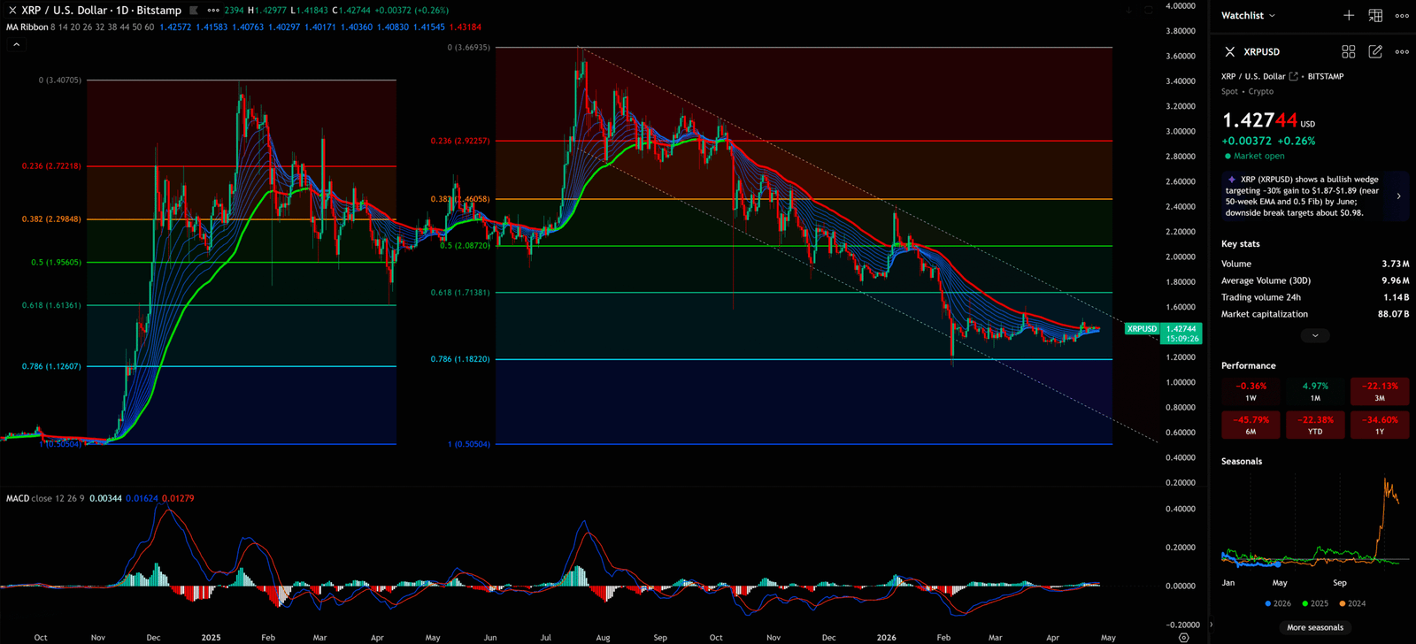
1. Precise Interpretation of Fibonacci Retracement Levels
On the daily chart, Fibonacci Retracement is a highly effective tool. The chart shows that XRP’s price is currently operating within a complex Fibonacci structure.
From the Fibonacci retracement of the most recent decline, the key levels are:
| Fibonacci Level | Price (USD) | Current Significance |
| 0 (Top) | 3.66935 | Previous high, strong resistance |
| 0.236 | 2.92257 | First resistance level |
| 0.382 | 2.46058 | Mid-term resistance |
| 0.5 | 2.08720 | 50% retracement, key gateway |
| 0.618 | 1.71381 | Golden ratio support, critical defense |
| 0.786 | 1.18220 | Deep retracement support, near stop loss |
| 1 (Bottom) | 0.50504 | Final support |
Currently, XRP’s price (1.427 USD) is sandwiched between the 0.618 (1.71381) and 0.786 (1.18220) levels. This position is very delicate — it has already broken below the golden ratio support (0.618), but has not yet reached the 0.786 deep retracement level.
In technical analysis, breaking below the 0.618 is generally viewed as a relatively pessimistic signal, suggesting that the rebound force may be insufficient to push the price back to previous highs.
2. Precise Application of the S/R Flip Rule
When formulating a trading plan, we must completely embed the S/R Flip logic:
Theoretically, the XRP downtrend should not be over yet, but if the XRP price does not continue to fall but instead turns upwards and explodes, it needs to be seen whether it can rise to the resistance zone. If it breaks above and holds, then enter the market; otherwise, it will reach the stop loss and sell off.
This seemingly simple statement contains profound trading wisdom. It requires us not to predict the market, but to follow its footsteps. When the price breaks through and stabilizes above a key resistance level, the original resistance turns into support — a strong buy signal.
Specifically for XRP, we need to closely monitor the S/R Flip situation at the following key resistance levels:
- 0.5 Fibonacci Level (2.087 USD): If the price can break above and hold this level, it will be an important bullish signal.
- Tentative Buying Point (1.906 USD): This is the tentative buying point marked on the chart and the key S/R Flip observation level.
3. EMA Ribbon Arrangement
The MA Ribbon on the daily chart shows the arrangement of 8, 14, 20, 26, 32, 38, 44, 50, and 60 moving averages. Currently, these moving averages present a clear bearish alignment (short-term MAs below long-term MAs), with the gap between them still relatively large, indicating that bearish forces still dominate.
Only when these moving averages begin to converge, and the short-term MAs cross above the long-term MAs (forming a ‘golden cross’), can we begin to confirm a trend change.
📅 Monthly Chart: Macro Guidance from Long-Term Indicators
Although the monthly chart updates slowly, it provides us with the most macro trend guidance and is an important reference for judging XRP’s long-term direction.
Monthly Timeframe for XRP (Ripple)
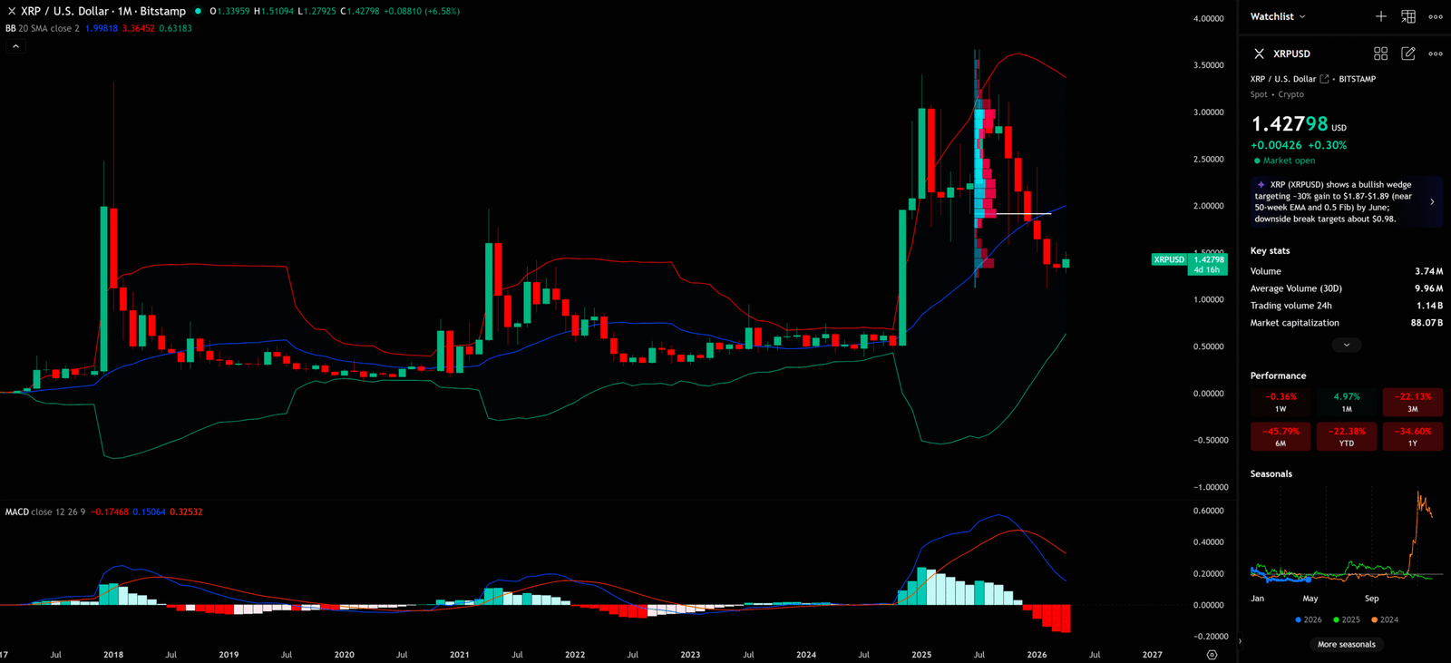
1. Insights from Bollinger Bands
Observing the Bollinger Bands (BB) on the monthly chart, we can see an important phenomenon: After the massive rally in early 2025, XRP’s price has fallen significantly from the upper BB band and is now approaching the middle band (20 SMA), with the risk of breaking below it.
The BB middle band (20 SMA) is currently around 1.998 USD, while the lower band is near 0.632 USD. This means that from a monthly perspective, XRP’s price still has considerable downside potential.
The monthly MACD value of -0.17468, with the histogram showing large negative values, further confirms that the long-term trend remains tilted downward.
2. Long-Term Significance of the Quantum-Resistant Roadmap
Ripple’s 2028 XRP Ledger quantum-resistant roadmap is a technically significant long-term upgrade. This upgrade will enable XRPL to resist attacks from future quantum computers, greatly enhancing its security and credibility.
However, from the monthly chart’s perspective, such technical upgrades often take a long time to be reflected in the price. Investors should not blindly turn bullish in the short term based solely on this news.
⏱️ 4-Hour Chart: Short-Term Patterns and Entry/Exit Timing
Finally, let’s look at the 4-hour chart — our battlefield for finding specific entry and exit timings.
4-Hour Timeframe for XRP (Ripple)
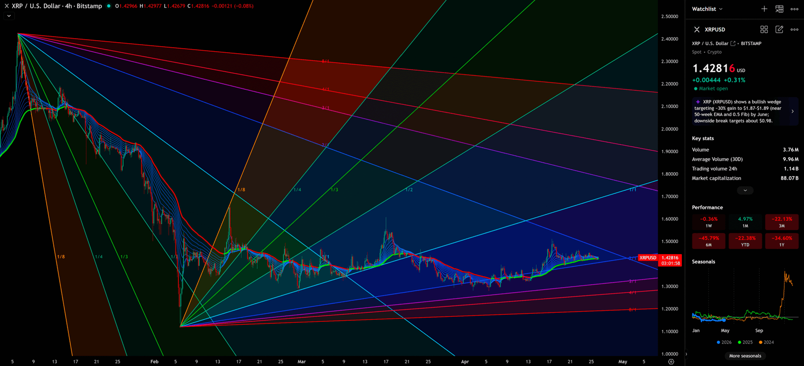
1. Multiple Trendline Convergence: A Gann Fan Perspective
On the 4-hour chart, we can observe multiple trendlines converging, forming a complex fan-shaped structure (similar to the concept of Gann Fan). These trendlines cut in from different angles, creating multiple potential support and resistance zones.
Currently, XRP’s price is consolidating within a relatively narrow range, approximately between 1.30 and 1.50 USD. This consolidation pattern may foreshadow an imminent directional breakout.
2. Short-Term Signals from the EMA Ribbon
On the 4-hour chart, the EMA Ribbon shows some positive signals: short-term moving averages are beginning to cross above long-term moving averages from below, forming a preliminary ‘golden cross’ pattern. This may foreshadow short-term rebound opportunities.
However, we must re-emphasize that short-term indicator signals must be subordinate to larger degree trends (like weekly and daily). Since both the weekly and daily charts are in a clear downtrend, the reliability of buy signals on the 4-hour chart is relatively limited..
💡 Comprehensive Conclusion and Scenario PlanningSynthesizing the analysis across these four timeframes, we formulate the following scenario planning for XRP:
Scenario 1: Bullish Scenario — ‘The Great Counterattack’
Trigger Condition: XRP price finds strong support above the 1.122 USD stop loss and breaks upward through the ‘Tentative Buying Point’ of 1.906 USD with massive volume. More importantly, it must stabilize above this level for at least 1-2 weekly candles, completing the S/R Flip.
Target Prices:
- First Target: 2.087 USD (Fibonacci 0.5 level)
- Second Target: 2.707 USD (‘The Safest Entry Point’)
- Third Target (if CLARITY Act passes): 3.675 USD (previous high)
Institutional Perspective: This would be a fierce offensive launched by market makers after shaking out all the weak-handed retail investors. Those who rushed in on bullish news will have been shaken out during the washout, ultimately missing the real upward move.
Scenario 2: Bearish Scenario — ‘Plunge into the Abyss’
Trigger Condition: XRP price fails to break upward and, lacking volume support, falls through the critical defense line of 1.122 USD (the ‘Stop Loss’ level).
Target Prices:
- First Target: 1.00 USD (psychological level)
- Second Target: 0.786 Fibonacci level (0.505 USD)
Institutional Perspective: This means the recent bullish news (like ETF inflows) was merely ‘Exit Liquidity’ created by market makers to distribute chips. Retail investors who caught the falling knives will face a long and painful period of being trapped.
🧠Retail vs. Institutions: The Information Gap That Never Closes
In the wild and greedy cryptocurrency market, there is always a massive information gap between retail investors and institutions.
The retail decision process typically looks like this: See bullish news → Feel FOMO → Rush to enter → Become institutional ‘Exit Liquidity’. The institutional decision process is entirely different: Analyze chart structure → Identify key support/resistance → Wait for S/R Flip confirmation → Quietly exit while retail is FOMOing in.
This is why, every time the market is flooded with overwhelmingly positive news, it is often also the most dangerous time. Because institutions need retail’s buying pressure to absorb their selling, and bullish news is the best bait to attract retail into the market.
In the bank’s trading room, I’ve witnessed this scene too many times: while retail investors were cheering and celebrating, my colleagues were quietly pressing the ‘sell’ button. This isn’t a conspiracy theory — it’s the operating law of the market.
I will continue to closely monitor the price action of this Crypto. As soon as a critical reversal signal appears on the charts, I will update my analysis and insights right here immediately. Remember to Bookmark this page and come back often to check for the latest updates!
Want to see our full, interactive chart breakdown? If you want to learn how to draw Fibonacci Retracement Ratio yourself, identify S/R Flips, and stop trading blind. Please browse the following『Further Reading』links. Fundamental news tells you what happened. Technical analysis predicts what will happen. To master the professional framework that separates market signal from noise, explore our exclusive models at www.chart-blitz.com.
📚Further Reading:
To help everyone gain a deeper understanding of the various technical indicators mentioned in this article, we have specially prepared the following further reading materials. These cover key analytical tools found across the weekly, daily, monthly, and 4-hour charts.
- Decoding Fibonacci Retracement: The Perfect Blend of Natural Law and Market Psychology — Fibonacci Retracement is not just a set of magical numbers; it is a manifestation of market psychology. Learning how to correctly draw and interpret Fibonacci levels is a required course for every serious trader.
- Elliott Wave Theory Practical Manual: Key Rules for Identifying Impulse and Corrective Waves — Elliott Wave Theory is one of the most complex yet powerful tools in technical analysis. Understanding how to identify impulse and corrective waves, along with the iron rules of Elliott Wave Theory, can help you find direction in the market.
- Understanding VPFR: Finding the Hidden Footprints of Market Makers — The Volume Profile Fixed Range (VPFR) is a powerful tool that tells us where the most trading occurred within a specific price range. This helps us identify true support and resistance levels, as well as potential ‘Vacuum Zones’.
- S/R Flip Support and Resistance Swap Strategy — S/R Flip is one of the most powerful concepts in technical analysis. This article uses real cases to teach you how to use S/R Flip to capture the highest win-rate trading opportunities.
- MACD Momentum Indicator Momentum First — What Does the MACD Line Crossing Above Zero Mean? Golden Cross & Divergence Signals!
- Gann Fan Masterclass — Deep dive into W.D. Gann’s angle theory to identify the geometric relationship between time and price in the market.
- Parallel Channel Short-Term Game — How to Use Parallel Channels to Find Precise Entry/Exit Points for BTC short-term opportunities.
- EMA Ribbon Practical Guide: Catching Early Trend Signals — Through the arrangement of multiple exponential moving averages, the EMA Ribbon intuitively displays the strength and changes of market trends. Learning to interpret the convergence and divergence of the EMA Ribbon allows you to spot trading opportunities ahead of others.
- Bollinger Bands Deep Dive: The Prophet of Volatility and Extreme Market Conditions — Combining moving averages and standard deviation, Bollinger Bands are an excellent tool for measuring market volatility. When the price touches the band boundaries, it often foreshadows a potential reversal or breakout.
【Disclaimer】 The content herein is for educational purposes and reflects the author’s personal opinion only; it is not investment advice. All financial investments, including cryptocurrencies, carry significant risk, and you could lose your entire capital. To support this site, this article may contain affiliate links. While we strive for accuracy, we cannot guarantee all information is complete or error-free. Please conduct your own research and be fully responsible for your own investment decisions.