When you make a trade, you should have a clear target of where you expect to get out

William Delbert Gann – 1949

The Surface Story Is a Bounce; the Real Story Is a Liquidity Test

Bitcoin’s latest market narrative is almost perfectly designed to trap emotional traders. Price dropped toward $59,500, rebounded toward the $63K-$64K zone, and social media immediately split into two camps. One side declared that the bottom was in; the other warned that the final capitulation had not arrived. Yet the crucial question is not what the crowd feels. The crucial question is what the chart structure is confirming.

CryptoPotato reported that Bitcoin remains under pressure after losing several key support levels, with the breakdown pushing BTC into a major demand region around $60K-$62K. The same analysis noted that BTC still needs to reclaim $66K-$67K before the broader structure begins to improve, while $72K-$74K remains a higher supply zone. That aligns closely with the uploaded charts.

CoinMarketCap Academy added the fundamental layer: Strategy’s sale of just 32 BTC helped trigger a fear narrative, nearly $5 billion in futures liquidations occurred, spot Bitcoin ETFs recorded more than $4.33 billion in outflows, and Mt. Gox transferred 10,422 BTC worth about $739 million on June 2. These headlines matter, but they are not trading instructions. They are the noise that moves retail attention toward areas where institutional liquidity decisions may already be waiting.

In a bank trading room, headlines move the crowd; charts reveal where the crowd is being moved to.

If the news is so bullish, why is BTC still unable to reclaim key resistance? If large players truly want to mark price higher, why is the volume structure not yet confirming a clean regime shift? Could the most dangerous moment be precisely when everyone believes the danger has passed? This report is built around that tension.

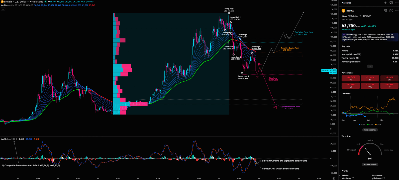
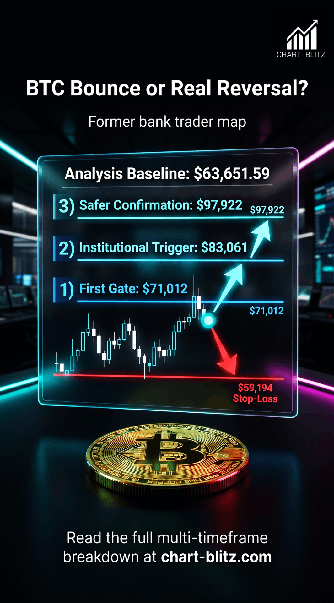
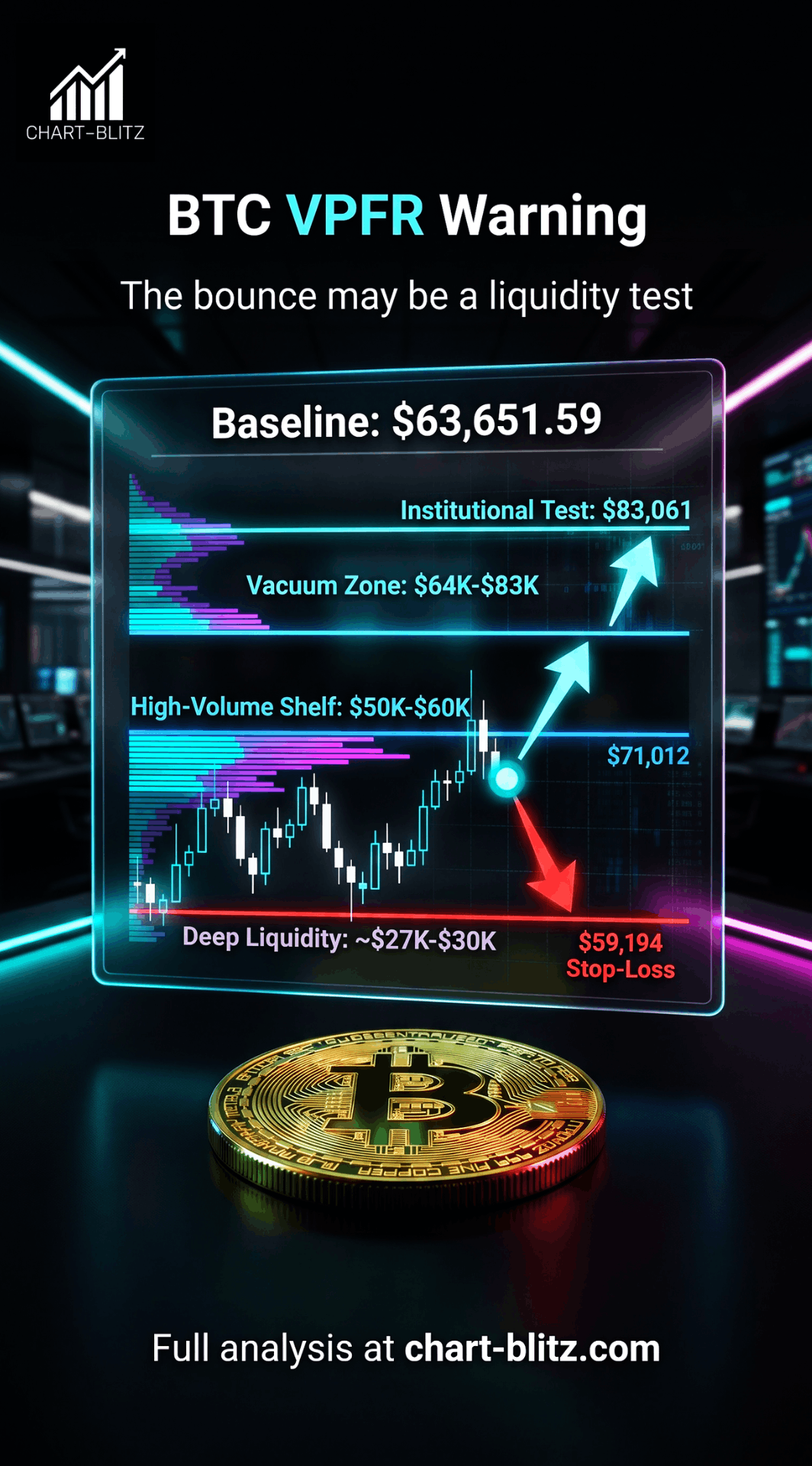
【📊Analysis Baseline Statement】

All technical analysis below is based on the price snapshot locked at June 8, 2026, 10:04 PM HKT / 10:04 AM EDT: BTC = 63,651.59 USD. This reference price is the average of cross-checked quotes from CoinGecko, Binance BTCUSDT and Coinbase Spot API. At approximately the same time, Binance’s API showed a 24-hour range of roughly $64,234.68 / $61,184.00 and a 24-hour gain of about +2.98%. Treat this report as an analysis map, not a real-time quote.

📈The Weekly Chart Is the Battlefield: $83,061 and $97,922 Matter More Than $64K

The weekly chart must dominate the analysis. The market is not defined by one relief bounce; it is defined by the sequence of highs and lows. On the uploaded weekly BTC/USD Bitstamp chart, the user’s annotations show a clear deterioration from a former uptrend into a Dow Theory downtrend.

Weekly Timeframe for BTC (Bitcoin Coin)

BTC formed a major Swing High at $126,272, then printed Lower High (1) at $115,381. It then slipped through the $107,370 swing low area and marked $101,530 as a lower low. The next rebound failed at Lower High (2): $97,999. Price then broke lower to Lower Low (2): $80,537, rebounded only to Lower High (3): $83,833, and later collapsed toward Lower Low (3): $59,930. This is not random volatility. It is a sequence of failed recoveries and lower acceptance.

The marked levels are the core of the trading map. $59,194 is the stop-loss line. $83,061 is the Tentative Buying Point. $97,922 is The Safest Entry Point. The red bearish projection also points to an Ultimate Bottom Point at $27,071. These are not decorative labels; they define where the analysis must be anchored.

Weekly VPFR: The Vacuum Zone Is the Real Risk

The weekly chart includes a Volume Profile Fixed Range. VPFR is useful because it does not merely show when volume traded; it shows at which price levels the market accepted volume. In institutional analysis, this often matters more than a moving average, because it identifies where large players have historically been willing to transact.

The weekly chart shows the largest visible volume cluster around the high-$20K to low-$30K region, closely aligned with the $27,071 ultimate downside reference. A secondary high-volume region appears around the $50K-$60K zone. Between the current price and the $83K-$98K resistance zones, volume support looks thinner. That creates a Vacuum Zone: price can move quickly through it, but it can also fail sharply if there is no genuine demand behind the bounce.

Retail traders see the bounce from $59K to $64K and assume buyers are in control. Institutions ask a different question: is this long-term accumulation, or short-covering and emotional dip-buying? If price cannot reclaim $83,061, bullish news could become exit liquidity for stronger hands rather than confirmation of a new bull phase.

Weekly MACD: A Death Cross Below Zero Is Not a Small Warning

The weekly MACD on the user chart uses non-default parameters (2,20,3), clearly designed to capture faster medium-term momentum changes. The chart annotation states that both the MACD line and signal line are below the zero line and that a death cross has occurred below zero. That is materially different from a shallow pullback above zero. A death cross below the zero line suggests weakness is occurring inside an already negative momentum regime.

A bank desk would describe this as capital cost withdrawing from the asset. When momentum turns down above zero, traders may still treat it as a pullback. When momentum turns down below zero, the default assumption becomes defensive until structure proves otherwise.

Elliott Wave: Do Not Declare Wave 4 Complete Too Early

If one tries to interpret the decline as a Wave 4 correction within a larger impulse, one rule is non-negotiable: the bottom of Wave 4 must not overlap the top of Wave 1. If the relevant Wave 1 top is violated, the entire 1-2-3-4-5 impulse thesis is invalidated, and the market may instead be forming a larger A-B-C corrective structure.

The weekly chart already marks an A-B-C style bearish path. Therefore, the $59K bounce should not be casually labelled as a completed Wave 4 bottom. If the $59,194 stop-loss line and the daily 0.618 level at $57,938 fail, the bearish path toward deeper levels becomes more relevant, not less.

📊Daily Chart: The 0.5 Fibonacci Level at 71,063 USD Is a Psychological Trap Disguised as Support

The daily chart translates the weekly risk map into tactical levels. The Fibonacci retracement uses the move toward the $126,472 high and marks 0.236 at $100,361, 0.382 at $84,087, 0.5 at $71,012, 0.618 at $57,938, and 0.786 at $39,324. The locked reference price of $63,651.59 sits between the 0.5 and 0.618 levels, closer to the 0.618 support.

Daily Timeframe for BTC (Bitcoin Coin)

This matters because the $71,012 0.5 level has become a key S/R flip candidate. Once price trades below it, that level is no longer support; it becomes overhead supply until reclaimed. The $84,087 0.382 level is even more important because it overlaps with the weekly $83,061 Tentative Buying Point and the $83,833 Lower High 3. This creates a powerful multi-timeframe resistance cluster.

Fibonacci retracement is not magic. It is a way to measure how deeply a trend has corrected. Once a market loses the midpoint of a major move and begins testing the 0.618 zone, traders must stop treating the decline as a normal pullback unless price quickly reclaims the lost levels.

The daily EMA ribbon supports the same message. The bullish ribbon that carried the earlier advance has rolled into resistance. In a strong bull trend, pullbacks into the ribbon are often bought. In a weakening trend, rebounds into the ribbon are often sold. That is why a bounce to $64K is not enough. BTC must reclaim $71K, then $83K-$84K, before the daily chart can be read as structural repair.

📅Monthly Chart: The Long-Term Trend Has Not Collapsed, but Expansion Has Turned Into Contraction

The monthly chart is slower, but it filters out emotional noise. The chart shows Bollinger Bands with an upper band around $120,776, a middle band around $73,596, and a lower band around $45,918. BTC has fallen below the monthly mid-band after a major advance into the 2025 peak. That means the market is no longer in clean upside expansion mode.

Monthly Timeframe for BTC (Bitcoin Coin)

Bollinger Bands measure deviation around a moving average. When price rides the upper band, trend expansion is healthy. When price loses the middle band, the market often shifts into mean reversion, contraction, or a deeper volatility phase. The monthly MACD panel also shows negative momentum, while the user’s A-B-C projection warns that a rebound may simply become the B-wave before a further C-wave decline.

This is where the retail versus institutional gap becomes obvious. Retail asks whether the $59K low was the bottom. Institutions ask whether the monthly structure has regained acceptance above its mid-band. Retail reacts to candles. Institutions react to acceptance.

⏱️4-Hour Chart: The Bounce Is Still Inside a Descending Structure

The 4-hour chart gives the tactical execution map. The chart shows a previous rising channel from late March and April into early May. That structure then gave way to a descending parallel channel from the May high into June. Price rejected within that descending structure, sold off sharply toward the $59K region, and has since bounced toward $63K-$64K.

4-Hour Timeframe for BTC (Bitcoin Coin)

CryptoPotato’s 4-hour analysis also notes that BTC lost the $72K-$74K supply region, broke below $65K, and then accelerated toward the $60K demand zone. The current rebound appears corrective unless BTC recovers $65K first and then rebuilds above the higher supply zones.

Short-term momentum tools such as KDJ can identify oversold or overbought rhythm, but they cannot override structure. A bullish cross inside a descending channel is only a tactical bounce signal. It becomes meaningful only if price also breaks the channel, reclaims the EMA ribbon, and holds above former support.

Scenario Planning: The Trade Plan Must Begin With Invalidation

The bullish case begins only if BTC first reclaims $65K, then the $71,012 Fibonacci 0.5 level. That would open a move toward $72K-$74K, but it still would not prove a full trend reversal. The stronger bullish trigger is a reclaim and hold above $83,061-$84,087. That would complete the first major S/R flip and suggest that the market is no longer merely bouncing. The highest-quality confirmation remains $97,922-$100,361, where the user’s safest entry point overlaps with the daily 0.236 Fibonacci zone.

The bearish case is equally clear. If BTC fails at $65K or $71K and rotates back into the $60K area, the bounce becomes a standard descending-channel retracement. If $59,194 and $57,938 fail, the next long-term references are the monthly lower band near $45,918, the daily 0.786 level at $39,324, and, in an extreme scenario, the weekly VPFR downside target around $27,071.

Final Takeaway: The Bounce Is Not the Signal; the S/R Flip Is the Signal

Bitcoin’s current setup is psychologically difficult because the news flow gives both bulls and bears enough evidence to argue their case. Strategy’s 32 BTC sale may have been overblown. ETF outflows and capital rotation into AI have pressured sentiment. The $60K-$62K zone has produced a bounce. But the chart remains disciplined: weekly lower highs and lower lows are intact, the daily 0.5 retracement has not been reclaimed, the monthly mid-band is lost, and the 4-hour descending structure has not fully broken.

The most important question is not whether BTC can bounce. It already has. The real question is whether BTC can transform former resistance into new support. Until $83,061 and later $97,922 are reclaimed and held, the $59K-to-$64K rebound remains a relief move, not a confirmed regime change.

The Key Chart-Blitz takeaway: BTC’s danger is not the absence of a bounce. The danger is that the bounce looks convincing enough to make retail forget that the real entry triggers are still above the market

I will continue to closely monitor the price action of this Crypto. As soon as a critical reversal signal appears on the charts, I will update my analysis and insights right here immediately. Remember to Bookmark this page and come back often to check for the latest updates!

Want to see our full, interactive chart breakdown? If you want to learn how to draw weekly VPFR, Fibonacci, EMA Ribbon, MACD, Supertrend, and S/R Flip frameworks designed for real trading decisions. Please browse the following『Further Reading』links. Fundamental news tells you what happened. Technical analysis predicts what will happen. To master the professional framework that separates market signal from noise, explore our exclusive models at www.chart-blitz.com.

📚Further Reading:

To help everyone gain a deeper understanding of the various technical indicators mentioned in this article, we have specially prepared the following further reading materials. These cover key analytical tools found across the weekly, daily, monthly, and 4-hour charts.

  1. Decoding Fibonacci Retracement: The Perfect Blend of Natural Law and Market Psychology Fibonacci Retracement is not just a set of magical numbers; it is a manifestation of market psychology. Learning how to correctly draw and interpret Fibonacci levels is a required course for every serious trader.
  2. Elliott Wave Theory Practical Manual: Key Rules for Identifying Impulse and Corrective WavesElliott Wave Theory is one of the most complex yet powerful tools in technical analysis. Understanding how to identify impulse and corrective waves, along with the iron rules of Elliott Wave Theory, can help you find direction in the market.
  3. Understanding VPFR: Finding the Hidden Footprints of Market MakersThe Volume Profile Fixed Range (VPFR) is a powerful tool that tells us where the most trading occurred within a specific price range. This helps us identify true support and resistance levels, as well as potential ‘Vacuum Zones’.
  4. S/R Flip Support and Resistance Swap StrategyS/R Flip is one of the most powerful concepts in technical analysis. This article uses real cases to teach you how to use S/R Flip to capture the highest win-rate trading opportunities.
  5. MACD Momentum Indicator Momentum First — What Does the MACD Line Crossing Above Zero Mean? Golden Cross & Divergence Signals!
  6. Gann Fan MasterclassDeep dive into W.D. Gann’s angle theory to identify the geometric relationship between time and price in the market.
  7. EMA Ribbon Practical Guide: Catching Early Trend SignalsThrough the arrangement of multiple exponential moving averages, the EMA Ribbon intuitively displays the strength and changes of market trends. Learning to interpret the convergence and divergence of the EMA Ribbon allows you to spot trading opportunities ahead of others.
  8. Bollinger Band: Long-Term Repricing ZoneThe Ultimate Tool to Capture Massive Market Moves Tired of getting shaken out of winning trades too early? Or buying right before a trend reverses? An ex-banker reveals how to use the Bollinger Band to filter out market noise and ride the big waves.

【Disclaimer】 The content herein is for educational purposes and reflects the author’s personal opinion only; it is not investment advice. All financial investments, including cryptocurrencies, carry significant risk, and you could lose your entire capital. To support this site, this article may contain affiliate links. While we strive for accuracy, we cannot guarantee all information is complete or error-free. Please conduct your own research and be fully responsible for your own investment decisions.

Leave a Reply

Your email address will not be published. Required fields are marked *