When you make a trade, you should have a clear target of where you expect to get out

William Delbert Gann – 1949

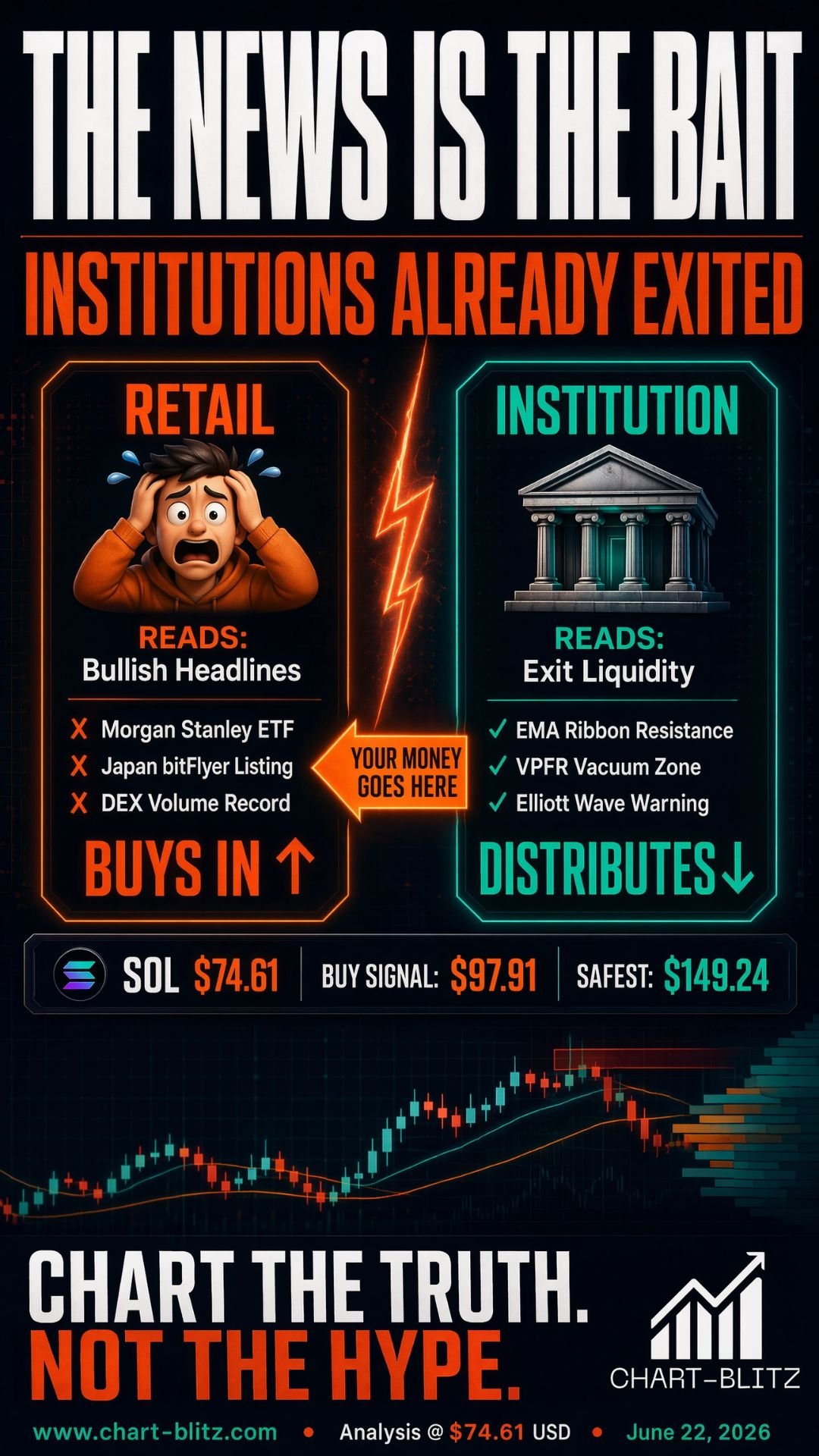
🌪️ News Flying High: Retail Sees Opportunity, Institutions See Liquidity

Over the past 24 hours, Solana (SOL) news has dominated the headlines. Morgan Stanley announced its application for a spot Solana ETF, proposing a globally competitive low fee of 0.14%, directly challenging all rivals in the space. Japan’s FSA-licensed exchange, bitFlyer, announced the listing of SOL on June 24, marking a significant breakthrough for Solana in Japan’s strictly regulated market. Furthermore, Solana’s DEX trading volume briefly surpassed that of Ethereum, making it the most active decentralized exchange ecosystem globally. Simultaneously, Bitcoin ETFs recorded six consecutive weeks of net outflows, while SOL funds continued to attract fresh capital, signaling a quiet rotation of market funds.

Following these announcements, retail trading groups exploded with FOMO (Fear Of Missing Out), with many believing “the good news is out, a massive rally is imminent.” Social media was flooded with “SOL To the Moon” calls. On the surface, these are indeed positive catalysts. However, as an ex-banker with 20 years of experience on the trading floor, I have seen this “good news paired with chart distribution” playbook play out far too many times.

Recall November 2021, when SOL surged to its all-time high of $254 amid a wave of bullish news, with headlines proclaiming “Solana is the Ethereum Killer.” Retail investors poured in. But at that very same moment, the weekly MACD had already displayed a clear bearish divergence at the top, and trading volume was beginning to contract. Institutions quietly completed their distribution while retail was at its most euphoric, and SOL subsequently plummeted from $254 all the way down to $9. This is the quintessential case study of “bullish news = institutional Exit Liquidity.”

Think about it: if the news is genuinely that bullish, why is the price still struggling to hold above key resistance levels? If large players truly want to push the price up, why isn’t the trading volume supporting the move? What retail investors see is news; what institutions see is liquidity. Whales love it when retail is overly optimistic, using these “good news” events to create Exit Liquidity, slowly offloading their holdings to unsuspecting retail buyers.

The real answers are never found in news headlines; they are hidden within the intricate details of the candlestick charts. News only provides the “subject of analysis,” but only rigorous technical analysis can predict the “timing” and “manner” of future market movements. Today, we will filter out the noise of the news and look directly at the charts to see what the market makers are truly plotting.

【📊Analysis Baseline Statement】

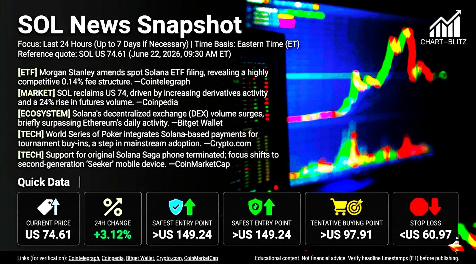
All technical analysis below is based on the price snapshot locked on June 22, 2026 (EST 09:30): SOL = 74.61 USD. Please treat this report as an “analysis map” rather than real-time quotes..

📈Weekly Chart: The Life-or-Death Watershed

The weekly chart is the soul of all analysis. If you only focus on the short term, it’s like navigating a maze with a magnifying glass—you will never see the big picture. On the trading floor, there was an unwritten rule: “Never fight the weekly trend.” This was a lesson learned through countless losses.

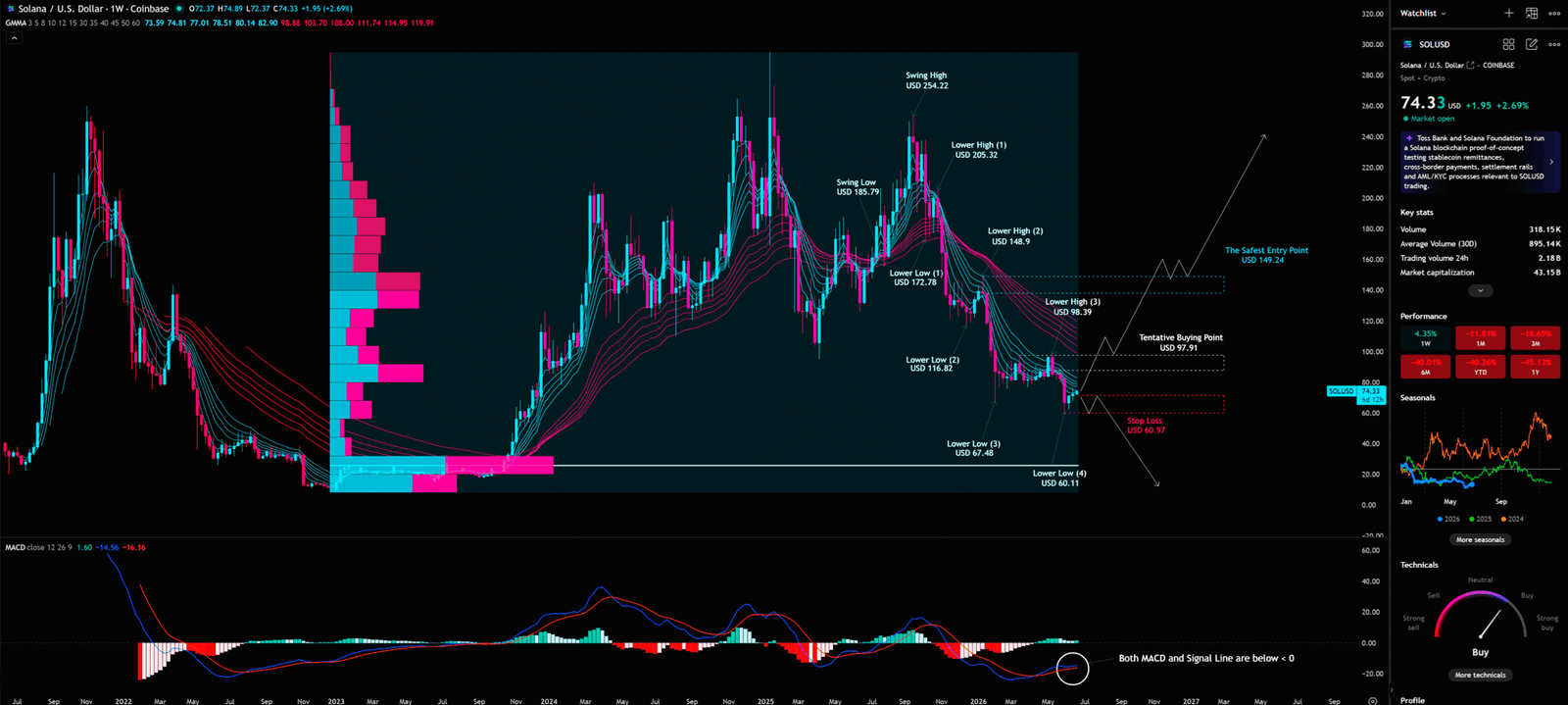
Weekly Timeframe for SOL (Solana)

1. The Iron Rule Test of Elliott Wave Theory

As seen on the weekly chart, SOL previously experienced a clear 1-2-3-4-5 upward impulse wave, rallying from the lows of late 2022 all the way to the Swing High of $254.22 in late 2024. However, the current price action is situated at a highly sensitive juncture.

The chart clearly marks a series of Lower Highs (LH) and Lower Lows (LL), forming a distinct descending channel: Lower High (1) $205.32 → Lower High (2) $148.90 → Lower High (3) $98.39; Lower Low (1) $172.78 → Lower Low (2) $116.82 → Lower Low (3) $67.48 → Lower Low (4) $60.11. This “lower highs, lower lows” structure is a textbook descending trend.

At this moment, we must remember an iron rule of Elliott Wave Theory: The bottom of Wave 4 must never overlap with the top of Wave 1. If the price of SOL continues to decline and breaks below the top of the previous Wave 1 (the critical defense line), the entire assumption of the 1-2-3-4-5 upward impulse wave will be completely invalidated. In that case, this decline is not merely a correction but likely part of a larger degree A-B-C corrective wave, implying a deeper and more prolonged downturn.

Therefore, one must never prematurely conclude that a certain drop marks the “bottom of Wave 4.” Retail investors love to catch falling knives at these levels, often with disastrous results. Could the most dangerous moment in the market be precisely when everyone believes it’s safe?

2. VPFR Vacuum Zone and the Market Maker Trap

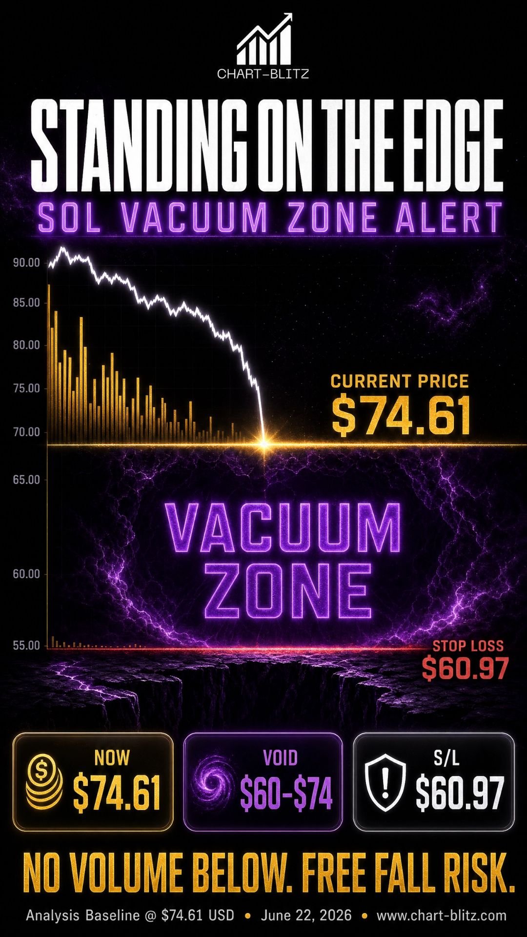
Let’s look at the Volume Profile Fixed Range (VPFR) indicator on the left side of the chart. VPFR is one of the most utilized tools by institutional traders, revealing which price levels have the highest concentration of trading volume, thereby identifying genuine support and “vacuum zones.”

VPFR differs from standard time-based volume; it displays volume distribution across “specific price ranges.” On the SOL weekly chart, you can clearly see that in the $60 to $75 range, the volume histogram is exceptionally short. This is known as a “Vacuum Zone.” Within a vacuum zone, due to a lack of sufficient buying support, once the price breaks below the upper POC (Point of Control, the price level with the highest volume), the descent can be extremely rapid, akin to a free fall.

Coupled with the aforementioned news, it is highly probable that whales are utilizing these bullish catalysts to generate liquidity and distribute their holdings at elevated levels. Once the distribution is complete, the price will naturally slide into this vacuum zone, triggering a cascade of stop-loss orders and inciting panic selling. This highlights the profound information asymmetry between retail and institutions: retail buys based on news, while institutions sell based on VPFR. If large players truly want to push the price up, why isn’t the trading volume supporting the move?

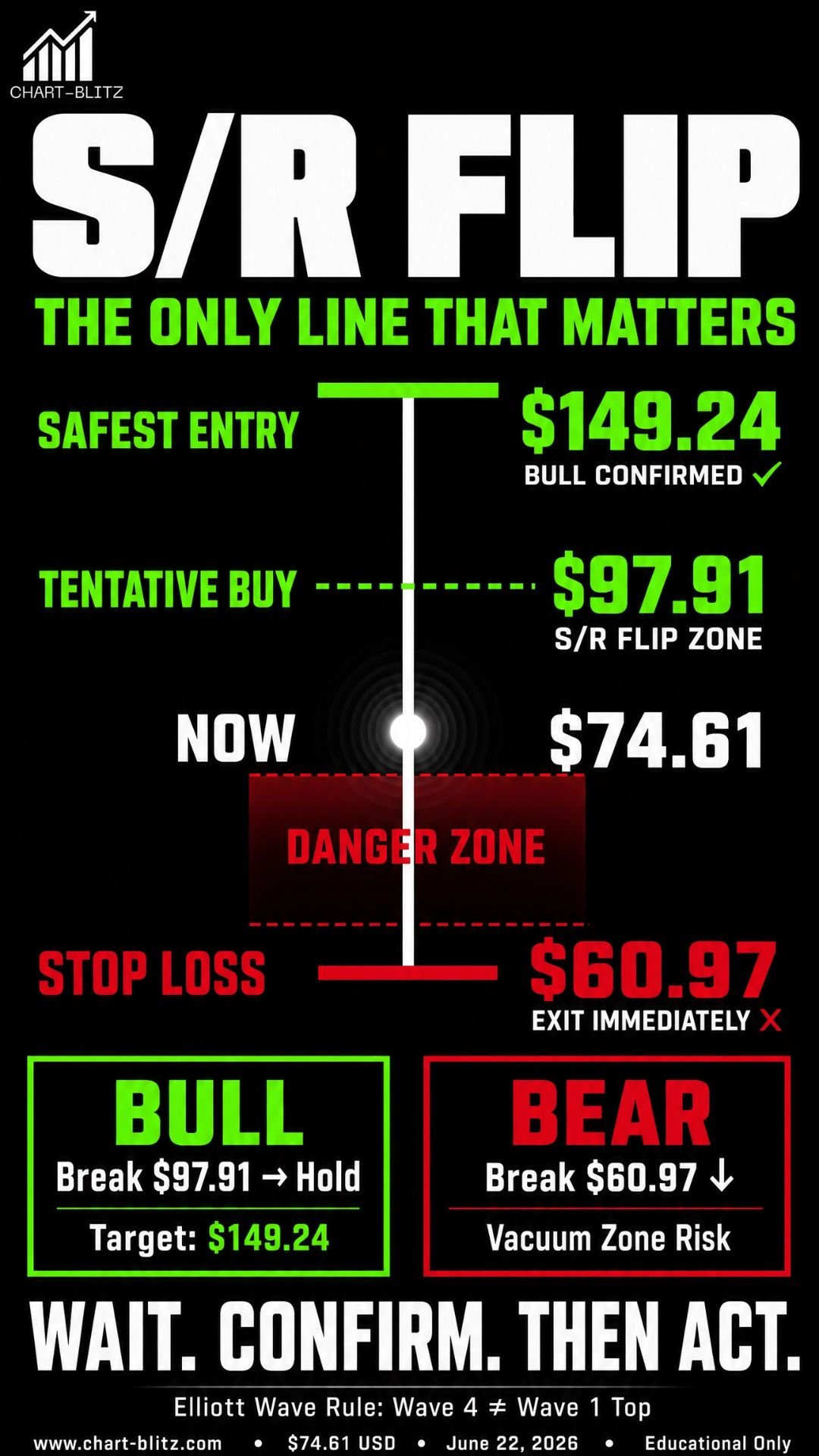
3. The Entry Logic of S/R Flip (Support/Resistance Interchange)

The chart clearly indicates several critical price levels, personally annotated by the analyst—these are the skeleton of the entire analysis:

Key LevelPriceSignificance
The Safest Entry Point> $149.24Break and hold confirms bull market return
Tentative Buying Point> $97.91S/R Flip triggered, tentative entry
Current Price$74.61Analysis baseline
Stop Loss< $60.97Break below = exit immediately, no exceptions

This brings us to a core trading logic: The S/R Flip (Support and Resistance Interchange Rule).

Theoretically, the SOL downtrend should not be over yet, but if the SOL price does not continue to fall but instead turns upwards and explodes, it needs to be seen whether it can rise to the resistance zone. If it breaks above and holds, then enter the market; otherwise, it will reach the stop loss and sell off.

If the price can break through and stabilize above $97.91 (Tentative Buying Point), this former resistance level will transform into a new support level (S/R Flip). At this point, a small, tentative buy can be considered. However, true confirmation of a trend reversal requires the price to break through and hold above $149.24 (The Safest Entry Point). This is the moment for a more substantial commitment. Conversely, if the price drops below $60.97 (Stop Loss), it signifies a complete collapse of the defense line, and one must exit decisively without hesitation.

📊Daily Chart: The Gravity of Fibonacci and the Suppression of EMA

Having assessed the macro picture on the weekly chart, let’s narrow our focus to the daily chart. The daily chart helps us pinpoint short-term support and resistance with greater precision.

Daily Timeframe for SOL (Solana)

The most striking feature on the daily chart is undoubtedly the horizontal lines of the Fibonacci Retracement. The Fibonacci sequence was discovered by the 13th-century Italian mathematician Leonardo Fibonacci. It is a mathematical pattern widely found throughout nature — and, rather remarkably, financial markets often appear to respect this very same rhythm.

The current price, US$74.31, is sitting right around the 0.786 Fibonacci level at US$73.52 — an absolutely critical area. The 0.786 level is often regarded as the market’s last line of defence. If this level is decisively broken, there is a strong chance that price could go on to test the bottom at 1.000, around US$13.21 — effectively moving close to zero.

This figure is not intended to frighten anyone. It is simply the objective reality being presented by the chart. At the same time, pay close attention to the GMMA — the Guppy Multiple Moving Average. The GMMA is not just a single moving average line. Rather, it is made up of two major groups of EMAs — Exponential Moving Averages. It was developed by the highly respected Australian full-time trader Daryl Guppy. His concept was both simple and powerful: the market is not a single, unified entity. It is made up of different groups of participants with very different mindsets.

Short-term traders / speculators:
These participants react quickly. They are highly sensitive to news, market rumours and short-term price fluctuations. They move in and out of positions rapidly and mainly influence short-term price action.

Long-term investors:
These are the bigger players with a longer-term perspective. They focus on fundamentals and major market trends. Their capital flows ultimately help determine the market’s longer-term direction.

The GMMA is designed to visually capture the behaviour of these two groups — and the relationship between them — in order to assess the strength, stability and possible turning points of a trend. At present, the GMMA is showing a downward expansion, with price continuing to be capped beneath the long-term GMMA cluster. This is a very strong bearish signal, suggesting that selling pressure remains heavy in the near term.

If the outlook is truly so bullish, why is price still unable to break above the GMMA? That is the warning the technical chart is giving us.

📅Monthly Chart: The Hidden Concerns of Long-Term Indicators

The monthly chart dictates the long-term destiny of an asset. Let’s examine the Bollinger Bands and the Stochastic Oscillator on the monthly chart.

Monthly Timeframe for SOL (Solana)

Bollinger Bands, developed by statistician John Bollinger in the 1980s, is a dynamic channel indicator based on standard deviations. The current price is positioned between the middle and lower bands of the Bollinger Bands, and the middle band is beginning to curve downwards, signaling a weakening long-term trend. When the price persistently trades below the middle band, it is a classic characteristic of a long-term bear market.

Looking at the Stochastic Oscillator below, the K and D lines are hovering near the oversold region. While there hasn’t been a further significant drop, there is also no clear golden cross reversal signal. An oversold Stochastic does not guarantee a bounce; in a strong downtrend, the indicator can remain in oversold territory for extended periods.

These long-term indicators suggest that SOL’s prolonged correction may not yet be over, requiring more time to digest previous gains. Until the long-term trend becomes clear, any short-term bounce should be viewed as an “escape hatch” rather than a “boarding opportunity.”.

⏱️4-Hour Chart: Short-Term Games and Channel Battles

Finally, let’s look at the 4-hour chart, the battlefield for short-term traders.

4-Hour Timeframe for SOL (Solana)

The 4-hour chart is laden with trendlines and channels of various angles, including multiple Gann Fan lines. The Gann Fan, developed by legendary trader W.D. Gann, uses geometric angles to predict support and resistance. The price currently appears to have found minor support at the bottom of a short-term descending channel, exhibiting a slight bounce.

While the EMA Ribbon below shows signs of a short-term oversold bounce, these short-term indicators are easily manipulated by market makers. Without corresponding trading volume, this short-term bounce can easily morph into a “Dead Cat Bounce.” The real danger is not the decline itself, but the illusion of opportunity after the support is broken.

🎯 Comprehensive Conclusion and Trading Plan

Synthesizing the analysis across these multiple timeframes, we can conclude: Although the news is bullish, the chart structure remains bearish, and market makers are likely using the news to generate liquidity for distribution.

🐂 Bullish Scenario

  • Trigger Condition: The price strongly breaks above and stabilizes over $97.91 (Tentative Buying Point), confirming the S/R Flip.
  • Target Price: Looking up towards $149.24 (The Safest Entry Point). If this level is also breached, the return of the bull market can be confirmed.
  • Invalidation: Price falls back below $97.91 after the breakout, indicating a false breakout; exit immediately.
  • Institutional Perspective: Institutional capital begins re-accumulating, gathering the previously distributed chips in preparation for the next markup phase.

🐻 Bearish Scenario

  • Trigger Condition: The price drops below $73.52 (Daily 0.786 Fibonacci) and continues downward, breaking the $60.97 (Stop Loss).
  • Target Price: Testing the vacuum zone at $60 or lower, seeking the next POC support.
  • Invalidation: A strong bounce near $60 that breaks back above $73.52 may signal a potential bottom.
  • Institutional Perspective: Distribution is complete, allowing the price to fall into the vacuum zone, triggering retail stop-losses and inciting panic selling, preparing for the next round of low-level accumulation.

As a mature investor, your task is not to guess the bottom, but to formulate a robust strategy. If you already hold SOL, strictly enforce the $60.97 stop loss; if you wish to enter the market, wait patiently for the price to break and hold above $97.91.

I will continue to closely monitor the price action of this Crypto. As soon as a critical reversal signal appears on the charts, I will update my analysis and insights right here immediately. Remember to Bookmark this page and come back often to check for the latest updates!

Want to see our full, interactive chart breakdown? If you want to learn how to draw weekly VPFR, Fibonacci, EMA Ribbon, MACD, Supertrend, and S/R Flip frameworks designed for real trading decisions. Please browse the following『Further Reading』links. Fundamental news tells you what happened. Technical analysis predicts what will happen. To master the professional framework that separates market signal from noise, explore our exclusive models at www.chart-blitz.com.

📚Further Reading:

To help everyone gain a deeper understanding of the various technical indicators mentioned in this article, we have specially prepared the following further reading materials. These cover key analytical tools found across the weekly, daily, monthly, and 4-hour charts.

  1. Decoding Fibonacci Retracement: The Perfect Blend of Natural Law and Market Psychology Fibonacci Retracement is not just a set of magical numbers; it is a manifestation of market psychology. Learning how to correctly draw and interpret Fibonacci levels is a required course for every serious trader.
  2. Elliott Wave Theory Practical Manual: Key Rules for Identifying Impulse and Corrective WavesElliott Wave Theory is one of the most complex yet powerful tools in technical analysis. Understanding how to identify impulse and corrective waves, along with the iron rules of Elliott Wave Theory, can help you find direction in the market.
  3. Understanding VPFR: Finding the Hidden Footprints of Market MakersThe Volume Profile Fixed Range (VPFR) is a powerful tool that tells us where the most trading occurred within a specific price range. This helps us identify true support and resistance levels, as well as potential ‘Vacuum Zones’.
  4. S/R Flip Support and Resistance Swap StrategyS/R Flip is one of the most powerful concepts in technical analysis. This article uses real cases to teach you how to use S/R Flip to capture the highest win-rate trading opportunities.
  5. MACD Momentum Indicator Momentum First — What Does the MACD Line Crossing Above Zero Mean? Golden Cross & Divergence Signals!
  6. Gann Fan MasterclassDeep dive into W.D. Gann’s angle theory to identify the geometric relationship between time and price in the market.
  7. GMMA Application Tips: Accurately Capturing Trend ChangesDeep dive into the Guppy Multiple Moving Average to understand the battle between short-term and long-term capital.
  8. Bollinger Band: Long-Term Repricing ZoneThe Ultimate Tool to Capture Massive Market Moves Tired of getting shaken out of winning trades too early? Or buying right before a trend reverses? An ex-banker reveals how to use the Bollinger Band to filter out market noise and ride the big waves.

【Disclaimer】 The content herein is for educational purposes and reflects the author’s personal opinion only; it is not investment advice. All financial investments, including cryptocurrencies, carry significant risk, and you could lose your entire capital. To support this site, this article may contain affiliate links. While we strive for accuracy, we cannot guarantee all information is complete or error-free. Please conduct your own research and be fully responsible for your own investment decisions.

Leave a Reply

Your email address will not be published. Required fields are marked *