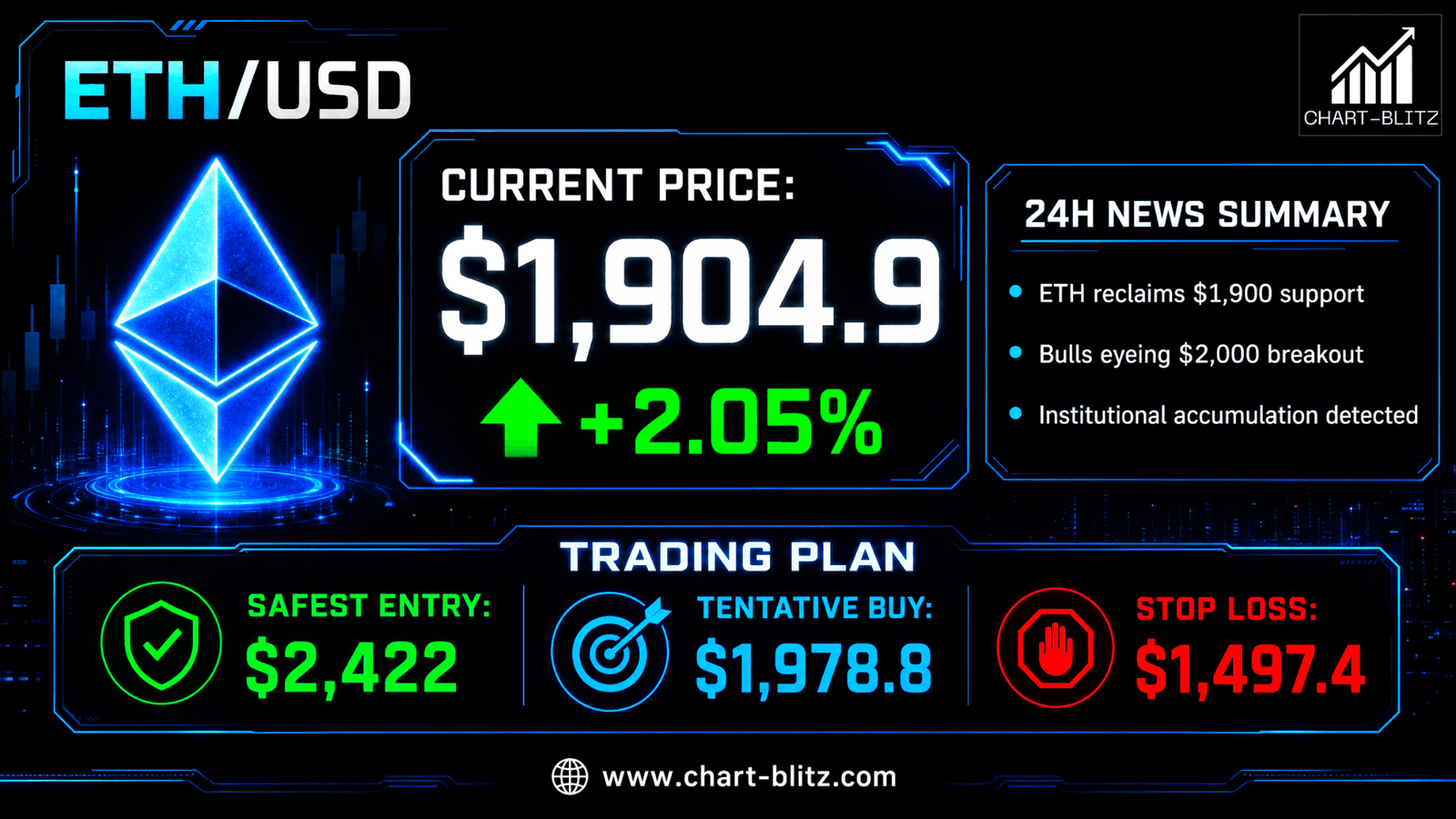
Fetching Live Market Data...
When you make a trade, you should have a clear target of where you expect to get out
William Delbert Gann – 1949
🚀Catalyst Deconstruction: When News Becomes the Market Maker’s Smokescreen.
The crypto sphere is perpetually flooded with macroeconomic noise and regulatory headlines, designed to whip retail sentiment between blind euphoria and paralyzing panic. However, having spent over 20 years on institutional trading desks, I have witnessed countless retail investors slaughtered simply because they traded the headlines. News never drives price action; it is merely a smokescreen orchestrated by Smart Money to align with underlying chart structures.
💡 Ex-Banker’s Note: “On Wall Street, retail rushes to FOMO-buy at 3 AM on breaking bullish news, completely oblivious to the algorithmic distribution happening right above their heads. Fundamental news provides the ‘object of analysis,’ but only rigorous technical analysis can predict the ‘timing’ and ‘method’ of future market movements.”
While the masses chatter, the Chart-Blitz analysis team utilizes rigorous chart architecture to reveal that the battle for the Ethereum (ETH) $1,900 handle was scripted months ago within the technical framework. Today, we dismantle this liquidity game with a top-tier institutional perspective.
【📊Analysis Baseline Statement】
All technical analyses below are based on the price snapshot locked on August 7, 2026 (EST): 02:40 Ethereum (ETH) = $1,904.9 USD. Please treat this report as an “analytical map” rather than a real-time quote.
📈 Weekly Chart: Dow Theory Structure and the Ultimate VPFR Battle
On the weekly chart, the layout incorporates the EMA Ribbon, Dow Theory annotations, Volume Profile Fixed Range (VPFR), and the MACD indicator at the base.
- EMA Ribbon maps macro trend expansion and contraction cycles. The alignment of multiple exponential moving averages provides a visual heatmap of market consensus.
- Dow Theory is the bedrock of technical analysis. By identifying Swing Highs and Swing Lows, we define the macro “skeleton” of the market, distinguishing between primary and secondary trends.
- VPFR acts as an X-ray machine exposing institutional cost zones. It reveals where the most significant volume was traded at specific price levels, rather than just when.
- MACD combines trend-following and momentum. The distance between the fast and slow lines reflects the true acceleration or deceleration of market forces.
Weekly Timeframe for ETH (Ethereum)
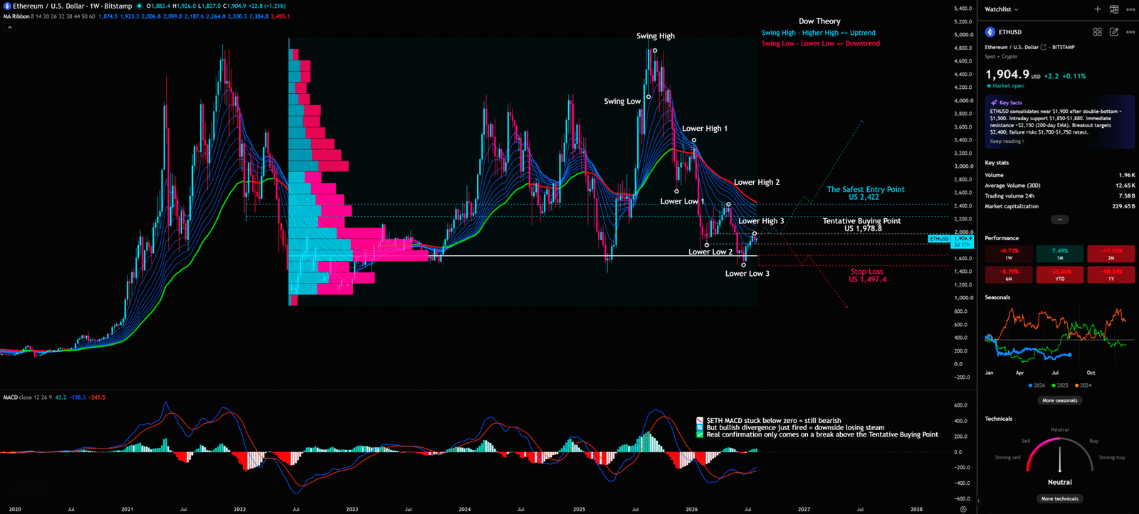
Per Dow Theory tenets, a trend persists until a definitive reversal signal occurs. The weekly chart clearly marks the Lower High (LH) and Lower Low (LL) sequence from macro all-time highs, a standard descending channel. Price is currently stabilizing near Lower Low 3. Is this a bottom or a bearish continuation?
Dow Theory teaches us that primary trends are like the tides of the ocean—unstoppable. Currently, the macro tide is receding. Every Lower High is evidence of institutional distribution during relief rallies. Retail often gets lost in these secondary trends, mistaking a temporary bounce for a permanent reversal of the tide.
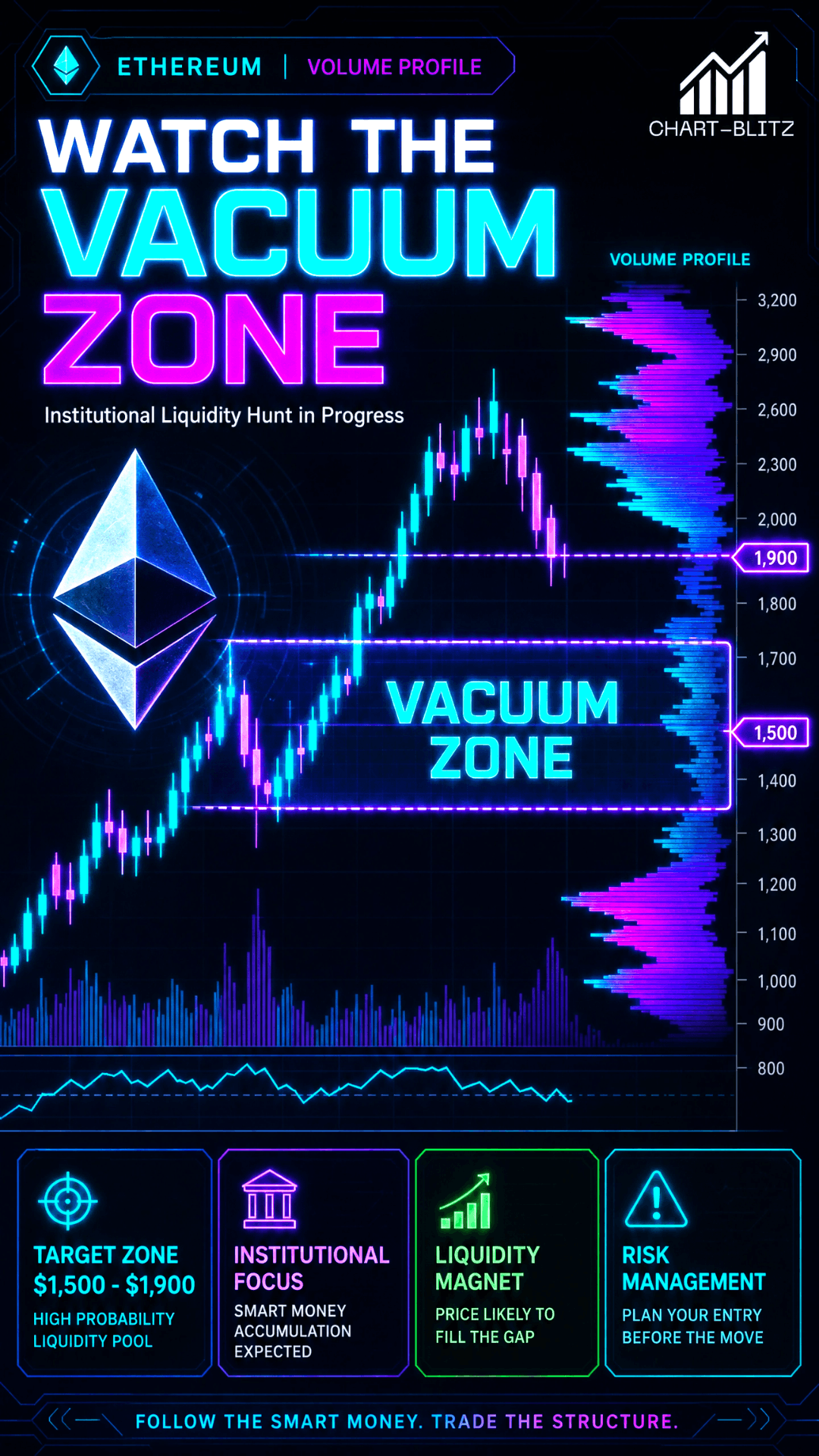
From a VPFR (Volume Profile Fixed Range) standpoint, current prices rest at the base of a massive high-volume cluster. The Point of Control (POC) marks the ultimate historical consensus—the “heart” of the market. If price fails to hold the POC, we enter the “Vacuum Zone”. In VPFR logic, Low Volume Nodes (LVN) represent a lack of market agreement; price in these zones drops like a stone into an abyss without any structural support.
- Capital Behavior: Institutions are utilizing this high-volume range for “inventory exchange.” They accumulate quietly at the base while stacking massive sell orders at overhead resistance, creating a solid ceiling.
- Retail Misinterpretation: Retail sees stabilization at Lower Low 3 and assumes a “Wave 4 bottom,” ignoring the reality that the LH sequence remains unbroken. They forget that in Dow Theory, a trend is down until Higher Highs and Higher Lows are established.
- Smart Money Exploitation: Pumping price via bullish catalysts to induce retail FOMO, successfully distributing inventory at the top. This is the classic generation of “Exit Liquidity.” When retail rushes to buy, institutions can close massive positions without crashing the price instantly.
🚨 Ex-Banker’s Analogy: “Institutional positioning is like a massive net cast in the deep sea. News is the bait, and the POC on the VPFR is the center of that net. Retail swims toward the bait, unaware they have entered the ‘kill zone’ pre-set by market makers.”
Furthermore, the MACD (Moving Average Convergence Divergence) at the base shows a weak histogram recovery, but the lines remain buried deep below the zero line. In institutional eyes, this isn’t a reversal; it’s merely temporary exhaustion of selling pressure. The MACD is a trend-following momentum indicator that shows the relationship between two exponential moving averages of a security’s price. A true “Tailwind Thrust” buy signal—a high-conviction institutional entry—requires the MACD lines to cross above the zero axis alongside a structural Dow Theory flip.
Institutional traders use the zero line as a filter: if MACD is below zero, the “ship is sinking,” and any bullish cross is just a temporary relief bounce. Current golden crosses beneath the surface are merely short-term drainage on a sinking vessel. Without the momentum shifting to the positive side of the zero line, the risk of a “Sinking Ship” acceleration remains extremely high.
🚨 “Retail sees news; institutions see liquidity bait. If you only follow the headlines, you’re already late. What you perceive as a golden opportunity is often the funeral institutions have prepared for your capital.”
To truly understand why $1,900 is such a psychological battlefield, we must look at the EMA Ribbon on the weekly timeframe. The Ribbon, consisting of a stack of multiple moving averages, acts as a heatmap of market sentiment. When the averages are widely spaced and fanning downward, it indicates that institutional selling is systematic and coordinated. Currently, the Ribbon is beginning to compress slightly, suggesting that the “tide” of selling might be losing its initial ferocity, but the overall slope remains bearish. A break above the entire Ribbon stack would be the first sign that the macro tide is actually turning. Until then, any bounce into the Ribbon should be viewed as a “sell the rally” zone for smart money.


📊 Daily Analysis: The Golden Pocket’s Last Stand, a Bear’s “Waterloo”?
The daily chart deploys a sophisticated Fibonacci Retracement matrix alongside the EMA Ribbon.
- Fibonacci segments psychological defense lines through key ratios like 0.618 and 0.5. These ratios reflect the natural limits of human crowd psychology in financial markets.
- EMA Ribbon provides dynamic support and resistance. By using a stack of averages, it filters out noise and provides a clearer picture of trend consensus than any single line.
Daily Timeframe for ETH (Ethereum)
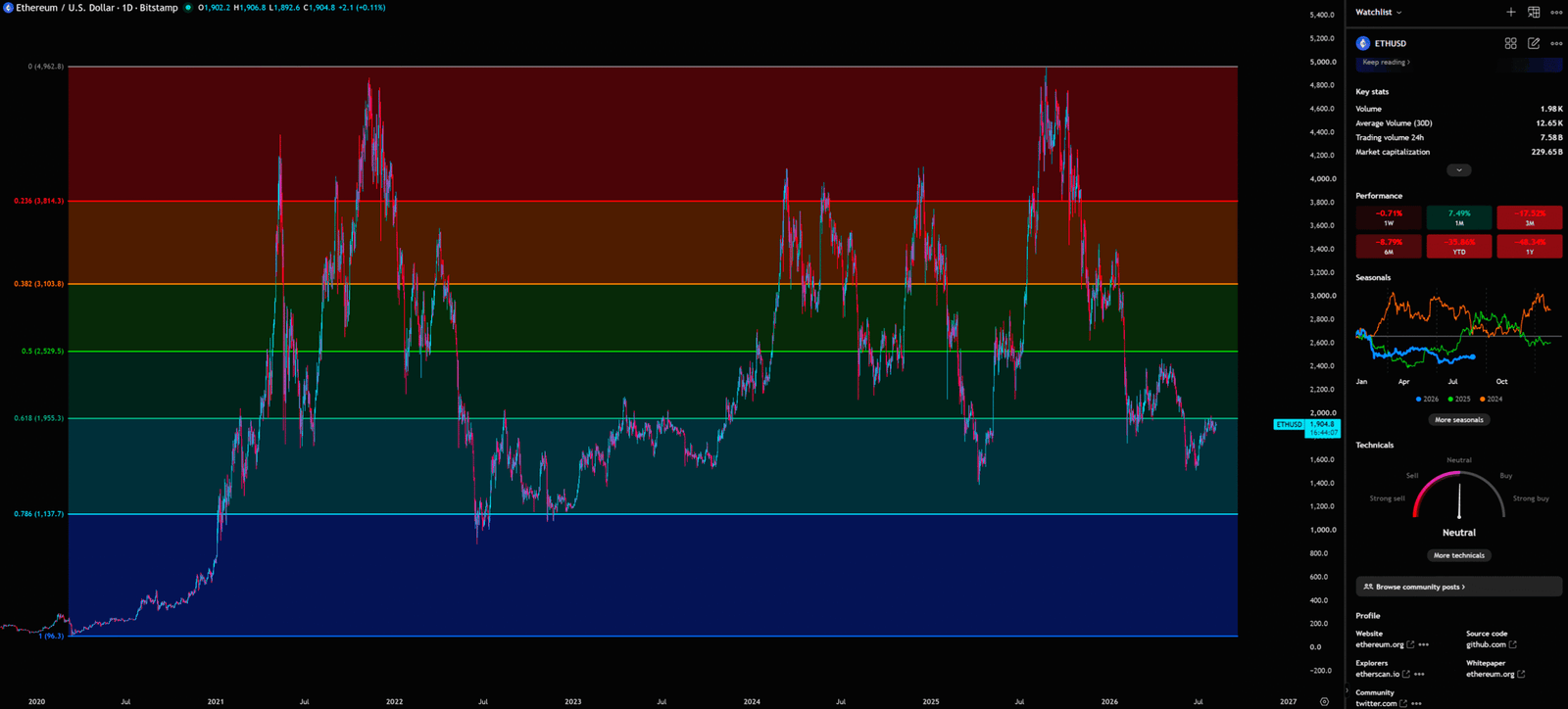
The Fibonacci 0.618 Golden Pocket ($1,955.3 USD) is currently ETH’s do-or-die line. According to Chart-Blitz’s advanced reading, when price retraces to the 0.618 and the EMA Ribbon begins to twist, it signals momentum exhaustion.
The EMA Ribbon consists of multiple averages across different periods. It shows not just direction, but the “consistency” of market opinion. When lines fan out in parallel, consensus is strong. Currently, the daily Ribbon is compressing, indicating a fierce battle between bulls and bears where the previous trend has stalled into consolidation.
⚠️ Ex-Banker’s Analogy: “The EMA Ribbon is like the guardrail on a highway. When price rides the rail, momentum is strong. But when price repeatedly crosses the rail and the rail itself begins to twist, you know a crash is inevitable. Institutional traders stay on the sidelines during Ribbon compression, waiting for the next ‘charge’ to build up.”
- Capital Behavior: Bulls and bears wage war across the 0.618 support band. Institutions utilize algorithms for frequent two-way shakeouts, designed to wipe out weak-handed leveraged positions.
- Retail Misinterpretation: Retail often treats Fibonacci levels as sacred, unbreakable floors, assuming a touch of 0.618 guarantees a massive pump. They ignore that Fibonacci is a probabilistic tool that must be confirmed by volume and moving average systems.
- Smart Money Exploitation: Institutions love “Liquidity Hunts” beneath these consensus levels. They intentionally drive price through the 0.618 to trigger retail stop-loss orders. As market sell orders flood in, institutional limit orders “absorb” the liquidity at a lower cost.
We must also note the shrinking daily price range, which statistically signals a drop in standard deviation—often a precursor to a Bollinger Squeeze. A Squeeze occurs when volatility drops to extreme lows, coiling the market like a spring. However, on the daily chart, the threat of an EMA Ribbon “death cross” looms. This happens when the short-term group of moving averages pierces through the long-term group, signaling that the immediate trend has turned so bearish that even the macro investors are starting to lose faith. If this cross completes, it will be the starting gun for a new wave of systematic selling.
In the institutional world, the daily 0.618 level is often referred to as the “Golden Pocket.” It is the last line of defense for a bullish structure. If ETH fails to reclaim this pocket decisively, the probability of a move toward the 0.786 retracement level ($1,137.7) increases exponentially. Smart money knows that retail traders have their stops clustered just below $1,900. By driving the price briefly through this level, institutions can trigger a cascade of sell orders, which they then use to fill their own large buy orders without moving the market against themselves.
💡 Reflective Question: “If the outlook is truly as bullish as the news suggests, why can’t price hold above the 0.618 resistance for more than a few hours? Why does every surge come with declining volume and rising skepticism from the tape?”
Professional trading is about reading the “tape”—the actual flow of orders. When price hits a Fibonacci level and volume dries up, it means there is no “follow-through.” Without new buyers stepping in to support the breakout, the price will naturally fall back under the weight of its own gravity. Institutions use this lack of momentum to initiate “short-squeeze” traps, where they briefly pump the price to force late-shorters to cover, only to slam the price back down once the liquidity is harvested.
📉 Monthly Chart: Long-Term Cycle Resonance via Bollinger Bands & KDJ
The monthly chart pairs Bollinger Bands with the KDJ oscillator.
- Bollinger Bands measure volatility via standard deviation. John Bollinger designed them to measure “relative high and low.” When the bands contract (Squeeze), it signals that market energy is being coiled to the limit.
- KDJ is a hyper-sensitive stochastic variant. The J-line, by magnifying the difference between K and D, provides the earliest possible warning of macro exhaustion.
Monthly Timeframe for ETH (Ethereum)
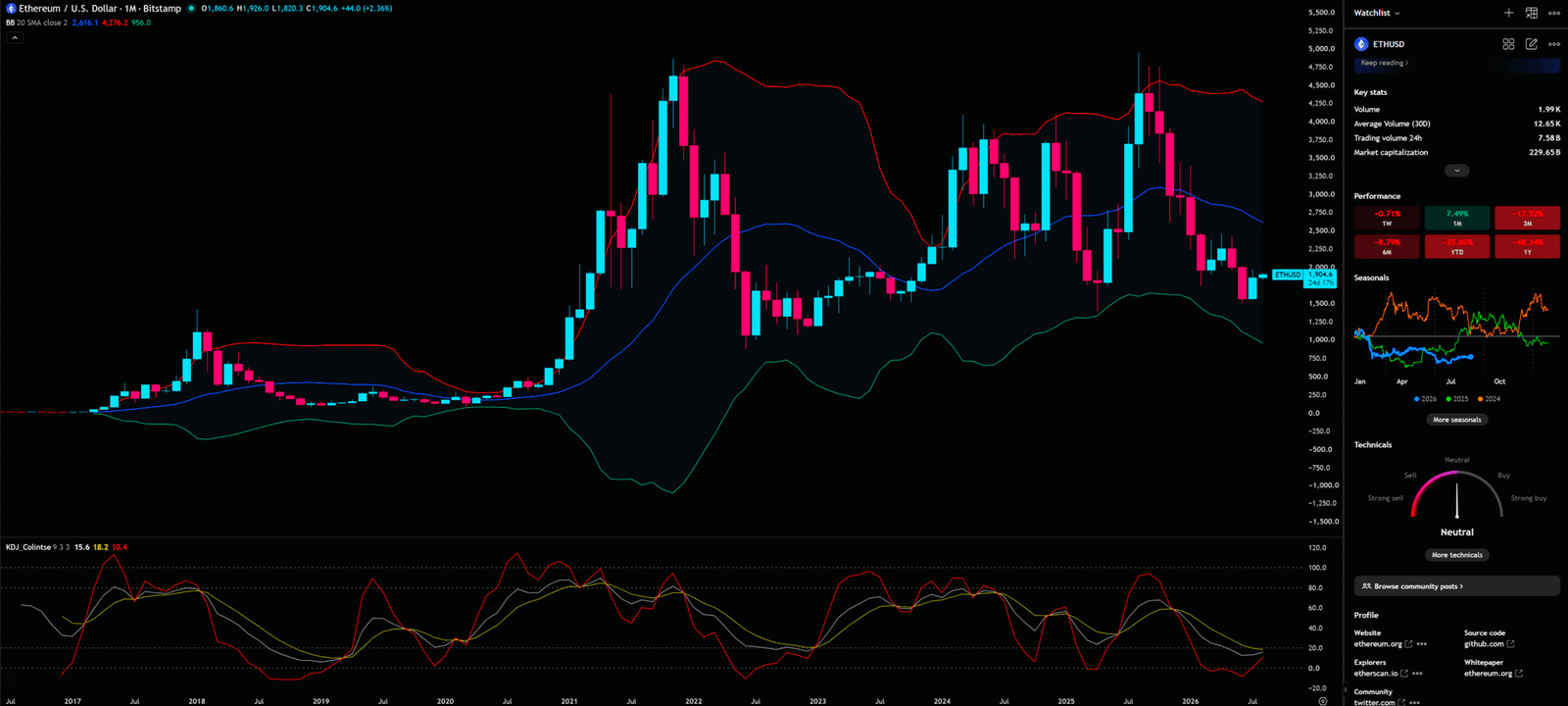
Monthly Bollinger Bands are currently in an “Extreme Squeeze”. Volatility is cyclical: from contraction to expansion and back again. ETH’s current monthly contraction is a rare multi-year event. Like a spring compressed to its limit, the eventual release will be explosive and potentially devastating.
Simultaneously, the KDJ at the base provides sensitive cues. The J-line has entered the oversold floor (<0) and is coiling into a “hook” upward. On a monthly timeframe, this typically heralds a long-term relief opportunity or a structural bottom.
- Capital Behavior: Long-term capital (Smart Money) is building structural positions. This isn’t day-trading; it’s strategic allocation by hedge funds and family offices. they utilize the “dead silence” of the Squeeze to patiently absorb remaining market supply.
- Retail Misinterpretation: Retail participants are ground down by the monthly consolidation. Seeing price move nowhere for months, they assume ETH is “dead” and capitulate right before the breakout, moving into the latest hype-driven meme coins.
- Smart Money Exploitation: Using J-line sensitivity to engineer “fake bounces.” They pump price mid-month to turn the J-line bullish, inducing retail entry, only to suppress price before the monthly close, leaving a long upper wick and forcing retail into despair.
⚠️ Ex-Banker’s Story: “In the trading room, we loved monthly Squeezes. It meant the ‘powder keg’ was full. We didn’t need to predict the direction; we just waited for the break of the upper or lower band. That explosion provides enough momentum to make a year’s profit in a few days.”
We must be vigilant: if the bands open downward, the macro downtrend will persist. Whether the current J-line hook can pull the K and D lines into a golden cross is the ultimate test for the monthly bottom. Without K/D confirmation, the J-line hook is often just a “dead cat bounce.”
📐 4-Hour Analysis: GMMA Channels, Gann Fan, and the S/R Flip Lifeline
The 4-hour chart is the “sniper zone,” featuring GMMA (Guppy Multiple Moving Average), Gann Fan, and KDJ.
- GMMA separates the behaviors of short-term speculators and long-term investors. When the long-term group (blue) fans out downward, the macro bears are in control.
- Gann Fan uses geometric angles to find equilibrium. W.D. Gann believed the 1×1 line (45 degrees) represents the perfect balance of time and price.
- KDJ captures short-term extremes, especially J-line spikes above 100 or below 0.
4-Hour Timeframe for ETH (Ethereum)
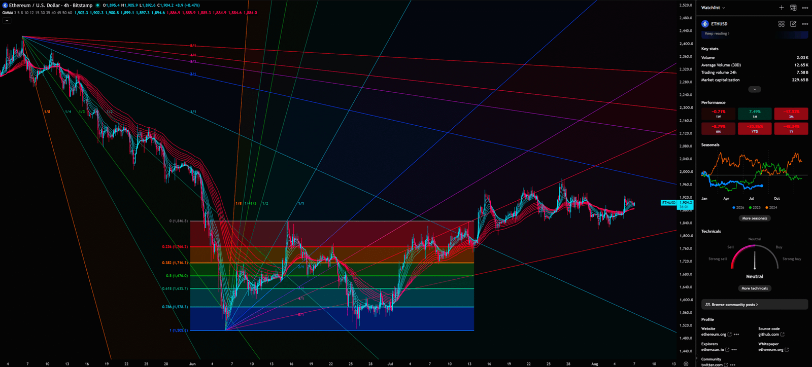
Price is currently facing severe rejection from the Gann Fan 1×1 line. In Gann theory, the 1×1 line is the ultimate watershed. Trading below it means downward momentum is far outpacing the passage of time—the bears are dominant.
Furthermore, the GMMA reveals deeper structural issues. the long-term averages remain fanned out downward, and price rejections at the blue band’s edge are frequent. This indicates that “long-term investors” are still selling into every bounce created by short-term speculators’ FOMO.
- The Safest Entry Point: US $2,422
- Tentative Buying Point: US $1,978.8
- Stop Loss: US $1,497.4
Applying the Support/Resistance Flips (S/R Flips) principle, we must wait for a “polarity shift.” The previous support at $1,978.8 has flipped into a major resistance level.
“Theoretically, ETH’s downtrend is not over yet, but if price reverses into a powerful surge, watch whether it breaks resistance ($1,978.8) and holds; enter if it stabilizes; otherwise, exit immediately upon hitting stop-loss ($1,497.4).”
- Capital Behavior: Short-term speculative capital churns between $1,900 and $1,978, generating noise. High-frequency algorithms execute precision scalping at the GMMA boundaries.
- Retail Misinterpretation: Retail over-trades minor 4-hour swings, suffering death by a thousand cuts. they ignore the heavy overhead resistance of the Gann 1×1 line and try to catch falling knives in a clear downtrend.
- Smart Money Exploitation: Setting hidden resistance clusters near $1,978. They use brief volume spikes to lure retail in, then pull the rug to create a “Deviation,” trapping all FOMO longs at the peak.
Additionally, the 4-hour KDJ frequently death-crosses in resonance with the weekly downtrend. The KDJ is a stochastic-based oscillator with an added “J” line that magnifies price movements. When the J-line reaches extreme levels above 100 and then “hooks” downward, it provides a high-frequency signal that the short-term pump is over. In the current environment, any breakout without massive, sustained volume confirmation is simply a lie—a “Bull Trap” designed to lure in the final remnants of retail capital.
The GMMA long-term group (the blue band) represents the “investor” sentiment. When price is below this band, the investors are not buying; they are either holding or distributing. The short-term group (the red band) represents the “traders.” Currently, the red band is struggling to even touch the blue band, showing that even the aggressive traders are losing confidence. This lack of “convergence” between traders and investors is a massive red flag for anyone looking to go long.
💡 Reflective Question: “If whales and institutional giants truly wanted to pump Ethereum back to its highs, why hasn’t volume expanded during these critical touches of the GMMA long-term group? Does this mean the big money simply isn’t interested in buying at these prices, or are they waiting for a much deeper ‘liquidity sweep’ before they step in?”
True market turns happen in silence, not with a headline. They happen when the last retail bull has capitulated and the chart has been scrubbed clean of leveraged positions. Until we see that “clean” structure, we remain in a defensive posture, protecting capital and waiting for the market to prove its strength through price action, not through the empty promises of the 24-hour news cycle. Professional trading is the art of waiting for the market to come to you, rather than chasing the market into a trap.
🎯 Multi-Scenario Projections & Professional Trading Plan
Professional traders never guess; they execute strict probabilistic contingency frameworks.
📈 Bullish Scenario
- Trigger Conditions: ETH must break Tentative Buying Point ($1,978.8 USD) with volume on the 4-hour chart, closing above the Gann 1×1 line to confirm an S/R Flip.
- Target Prices: Initial target at daily Fibonacci 0.5 ($2,529.5), ultimately challenging The Safest Entry Point ($2,422 USD).
- Invalidation: Failure to hold the retest, dropping back below $1,880, marks a “Bull Trap.”
📉 Bearish Scenario
- Trigger Conditions: Rejection near $1,950 followed by a breakdown of the weekly POC, triggering Stop Loss ($1,497.4 USD).
- Target Prices: Backfilling the weekly VPFR Vacuum Zone down toward $1,200-$1,300.
- Invalidation: Massive volume pin-bar rejection above $1,500 signals successful institutional defense.
I will continue to closely monitor the price action of this Crypto. As soon as a critical reversal signal appears on the charts, I will update my analysis and insights right here immediately. Remember to Bookmark this page and come back often to check for the latest updates!
Want to see our full, interactive chart breakdown? If you want to learn how to draw weekly VPFR, Fibonacci, EMA Ribbon, MACD, Supertrend, and S/R Flip frameworks designed for real trading decisions. Please browse the following『Further Reading』links. Fundamental news tells you what happened. Technical analysis predicts what will happen. To master the professional framework that separates market signal from noise, explore our exclusive models at https://www.chart-blitz.com/fxcx-app/omni-chart.html?symbol=ETH.
📚Further Reading:
To help everyone gain a deeper understanding of the various technical indicators mentioned in this article, we have specially prepared the following further reading materials. These cover key analytical tools found across the weekly, daily, monthly, and 4-hour charts.
- Decoding Fibonacci Retracement: The Perfect Blend of Natural Law and Market Psychology — Fibonacci Retracement is not just a set of magical numbers; it is a manifestation of market psychology. Learning how to correctly draw and interpret Fibonacci levels is a required course for every serious trader.
- GMMA Application Tips: Accurately Capturing Trend Changes — Deep dive into the Guppy Multiple Moving Average to understand the battle between short-term and long-term capital.
- Understanding VPFR: Finding the Hidden Footprints of Market Makers — The Volume Profile Fixed Range (VPFR) is a powerful tool that tells us where the most trading occurred within a specific price range. This helps us identify true support and resistance levels, as well as potential ‘Vacuum Zones’.
- S/R Flip Support and Resistance Swap Strategy — S/R Flip is one of the most powerful concepts in technical analysis. This article uses real cases to teach you how to use S/R Flip to capture the highest win-rate trading opportunities.
- MACD Momentum Indicator Momentum First — What Does the MACD Line Crossing Above Zero Mean? Golden Cross & Divergence Signals!
- Gann Fan Masterclass — Deep dive into W.D. Gann’s angle theory to identify the geometric relationship between time and price in the market.
- Strategies for EMA Ribbon Bearish Alignment: Dead Cat Bounce or Real Reversal — Deep dive into the EMA Ribbon to understand the battle between short-term and long-term capital.
- Bollinger Band: Long-Term Repricing Zone — The Ultimate Tool to Capture Massive Market Moves Tired of getting shaken out of winning trades too early? Or buying right before a trend reverses? An ex-banker reveals how to use the Bollinger Band to filter out market noise and ride the big waves.
- KDJ Stochastic Indicator Bottom Confirmation — What is the implication of a downward-curving KDJ? Understand in one article how to use dynamic indicators to catch market turning points.
【Disclaimer】 The content herein is for educational purposes and reflects the author’s personal opinion only; it is not investment advice. All financial investments, including cryptocurrencies, carry significant risk, and you could lose your entire capital. To support this site, this article may contain affiliate links. While we strive for accuracy, we cannot guarantee all information is complete or error-free. Please conduct your own research and be fully responsible for your own investment decisions.