Fetching Live Market Data...
When you make a trade, you should have a clear target of where you expect to get out
William Delbert Gann – 1949
Having spent two decades inside the trading rooms of investment banks, I have witnessed countless retail investors making fatal mistakes driven by headlines, ultimately becoming liquidity for the whales. When the entire market’s attention is fixated on superficial bullish news, the true Smart Money has often already laid out an inescapable net deep within the charts. Today, employing an ex-banker’s perspective, we will deconstruct TRON (TRX)—currently the most controversial yet strongest public chain token in the market.
📰 News First: The “Open Conspiracy” of Institutional Capital vs. Retail FOMO
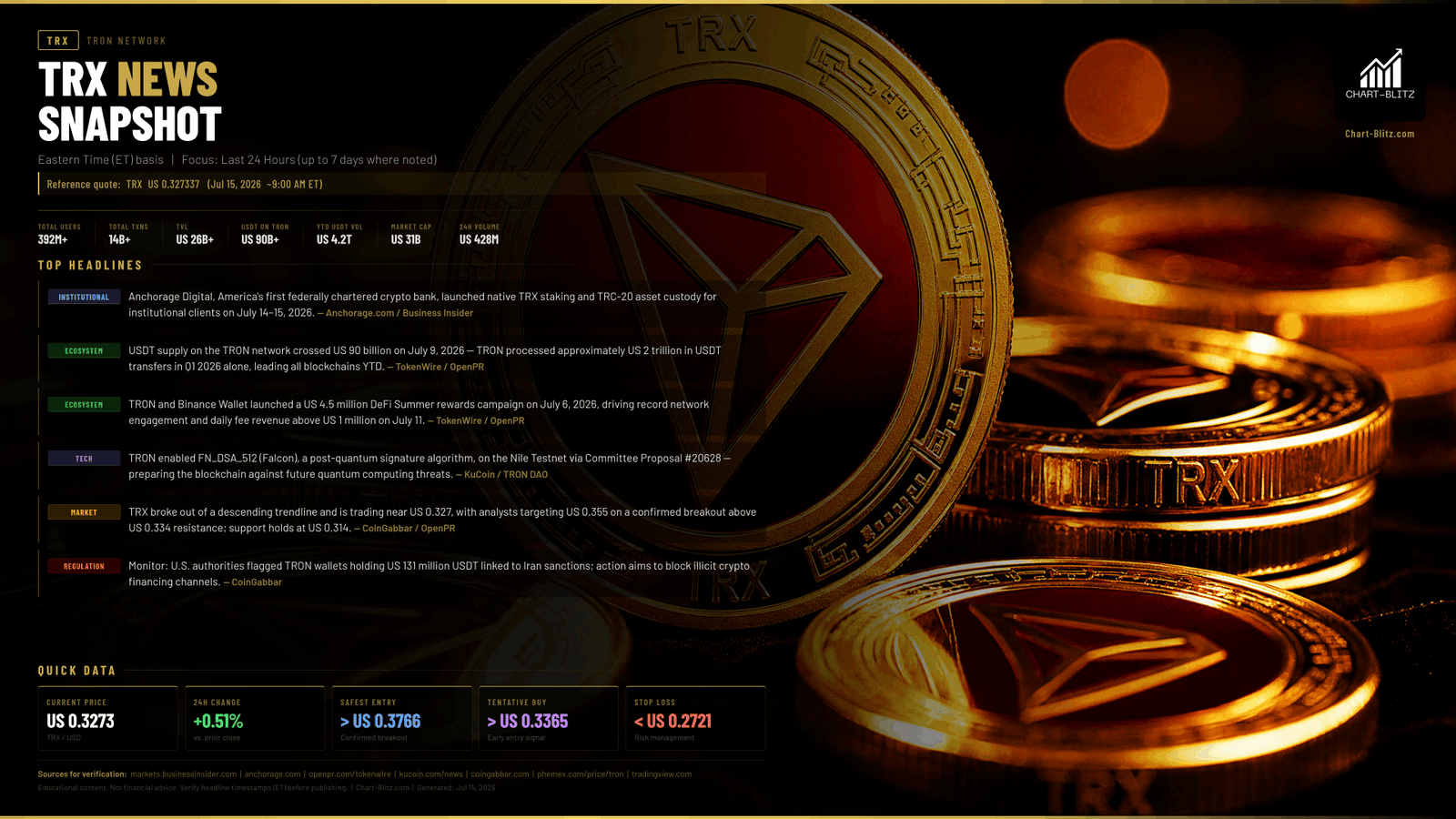
If you are only reading the news, you are already half a step behind. Over the past 24 hours, TRX has welcomed several fundamental catalysts that can only be described as explosive. First, Anchorage Digital, America’s first federally chartered crypto bank, officially announced support for the TRON network, rolling out native TRX staking and TRC-20 asset custody services. What does this mean? It signifies that Wall Street’s institutional capital finally has a compliant, secure channel to directly penetrate the TRX staking market and harvest yields. Anchorage Digital carries a valuation of $4.2 billion and is backed by top-tier institutions including Andreessen Horowitz (a16z), Goldman Sachs, KKR, and Visa—an endorsement that no ordinary crypto project can match.
Simultaneously, the USDT supply on the TRON network historically breached the $90 billion milestone, with Q1 2026 transfer volumes reaching a staggering $2 trillion, leading all blockchains year-to-date. Coupled with the $4.5 million DeFi Summer campaign launched jointly by TRON and Binance Wallet, TRX’s daily network fee revenue hit an all-time high, surpassing $1 million. TRON currently boasts over 392 million user accounts, 14 billion transaction records, and over $26 billion in TVL (Total Value Locked), representing a genuinely operational financial ecosystem rather than a mere speculative concept.
On the surface, these are overwhelmingly bullish headlines, more than enough to trigger retail FOMO (Fear Of Missing Out) and blind trend-chasing. However, if the whales genuinely intended to pump the market, why is the price still hovering around $0.327 instead of instantly exploding to $0.40? What retail investors see is news; what institutions see is liquidity. News is often just a smokescreen released by market makers to complement chart movements, designed to create “Exit Liquidity.” To see through this charade, we must return to the most rigorous technical charts
【📊Analysis Baseline Statement】
All technical analyses below are based on the price snapshot locked on July 15, 2026 (EST): 04:19 TRX = $0.3273 USD. Please treat this report as an “analytical map” rather than a real-time quote.
📈 Weekly Chart: The Skeleton of the Trend and the Lure of the “Vacuum Zone”
In the eyes of institutional traders, the weekly chart is the ultimate battlefield that dictates life and death.
Weekly Timeframe for TRX (TRON)
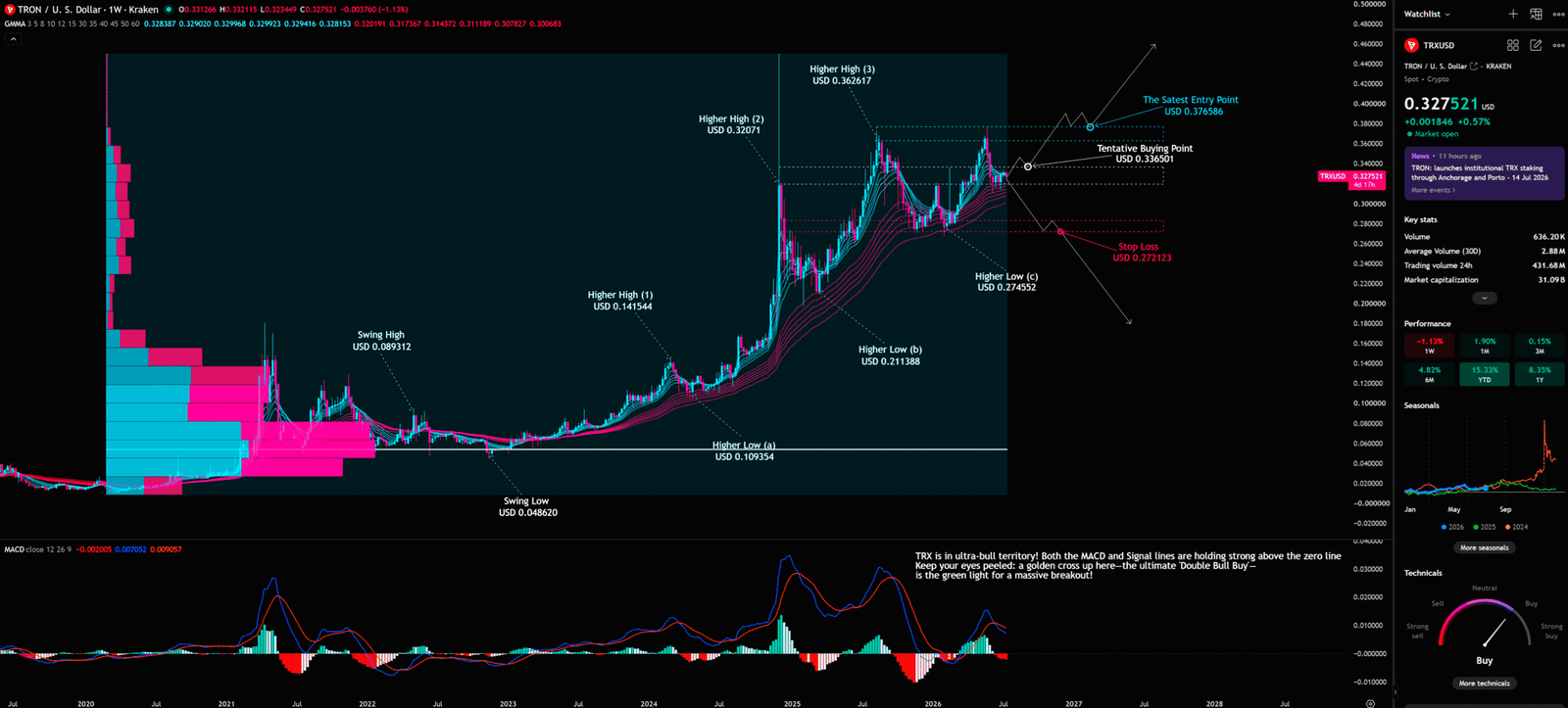
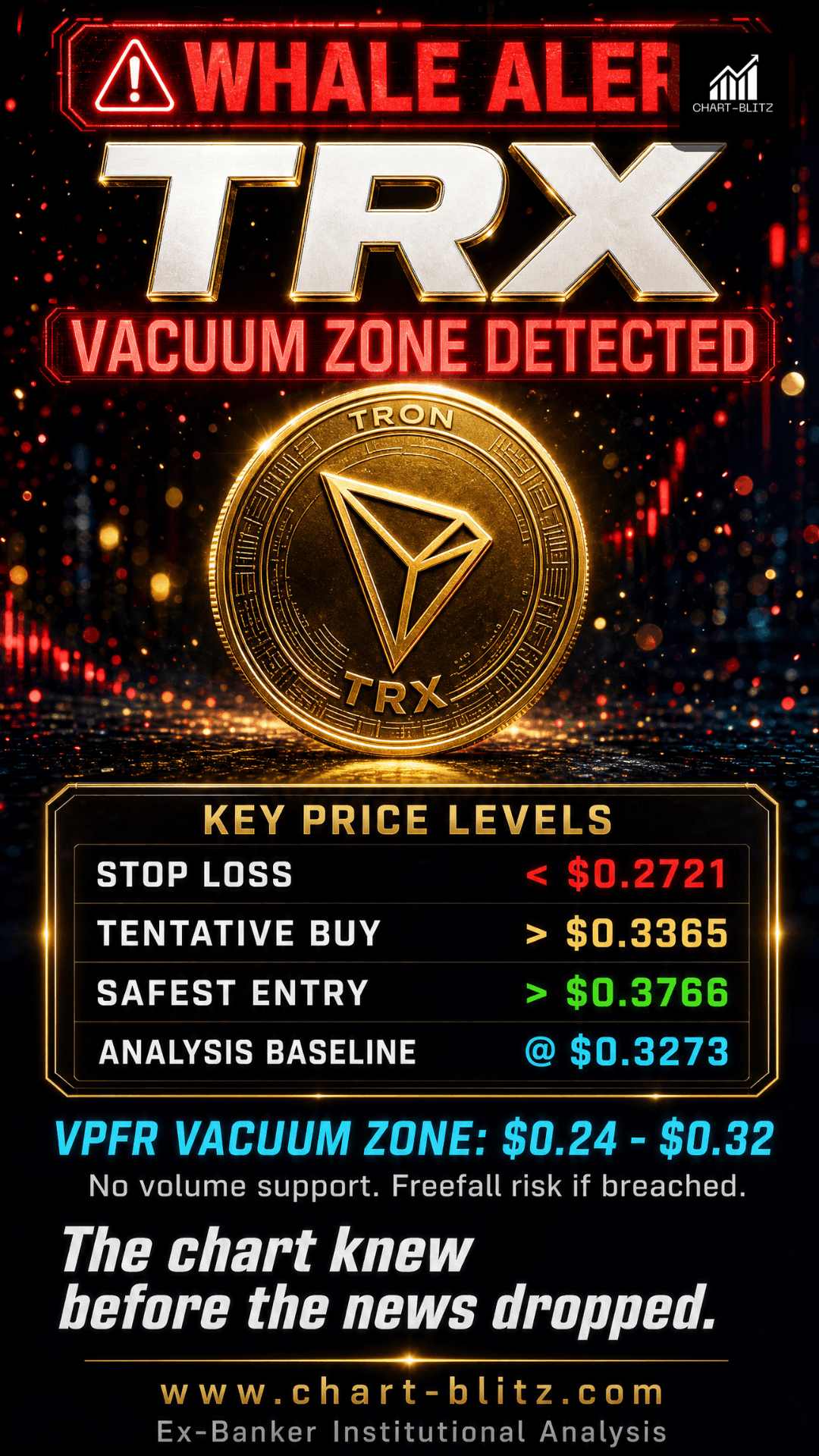
Taking the stage first is the VPFR (Volume Profile Fixed Range). Originating from the Market Profile of the 1980s futures market, its core principle is to distribute trading volume along the price axis, revealing the POC (Point of Control) and liquidity vacuum zones. As seen on the chart, there is a massive high-volume cluster between $0.16 and $0.24, establishing an absolute ironclad bottom. However, between $0.24 and $0.32, the VPFR reveals a relatively thin “Vacuum Zone.” This vacuum zone is like a superhighway; once the price breaches key support, it will slide rapidly without resistance. Conversely, if it holds, it becomes an area where whales can effortlessly push prices higher.
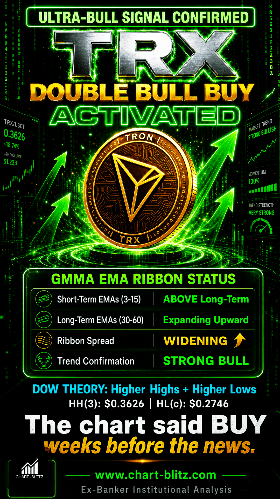
The chart clearly marks the classic structure of Dow Theory: Higher High (1) $0.141544, Higher Low (b) $0.211388, Higher High (2) $0.32071, Higher Low (c) $0.274552, leading up to the recently established Higher High (3) $0.362617. This pattern of “higher highs and higher lows” confirms that TRX is entrenched in a powerful uptrend. Each “higher low” represents institutional capital absorbing at progressively higher levels, refusing to let the price retrace to prior lows—a classic hallmark of institutional accumulation.
Coupled with the GMMA (Guppy Multiple Moving Average / EMA Ribbon), a ribbon indicator composed of multiple EMAs of varying periods (short-term group: 3, 5, 8, 10, 12, 15; long-term group: 30, 35, 40, 45, 50, 60), it currently exhibits a perfect bullish alignment. The short-term EMA group completely dominates the long-term EMA group, and the spread is widening, indicating immensely strong upward momentum. In the traditional bank trading room, we regard the long-term GMMA group as the “institutional cost line.” When the short-term group consistently holds above the long-term group, it indicates that the average buy-in cost of short-term market participants (including retail) is already higher than the institutional holding cost, giving institutions no incentive to rush to sell.
Finally, let’s look at the MACD (12, 26, 9). Invented by Gerald Appel in the 1970s, its core design principle uses the difference between two EMAs of different periods to measure trend momentum and direction. Currently, both the MACD line and the Signal line of TRX are holding strong above the zero line, positioned in the “ultra-bull territory” as annotated on the chart. More notably, the two lines are brewing a potential Golden Cross, where the MACD line crosses above the Signal line from below. This signal, dubbed the “Double Bull Buy,” is often the final green light before a massive breakout. When a Golden Cross forms above the zero line, it signals that trend momentum is accelerating, not decelerating—a rare and powerful bullish signal.
Ex-Banker Perspective: During my years as a bank trader, whenever I saw a weekly MACD Golden Cross form above the zero line, our strategy was simply “don’t ask why, just follow the trend.” This signal implies that big money’s momentum is self-reinforcing, and retail chasing in only accelerates the process. The question is not “should I buy,” but “where should I buy.”
📊 Daily Chart: The Precision Calculation of the Golden Ratio
Dropping down to the daily chart, we need a more precise scalpel to dissect the price action. Here, we deploy the Fibonacci Retracement. Derived from the sequence discovered by 13th-century Italian mathematician Leonardo Fibonacci, it is widely used in the market to identify potential support and resistance levels. The golden ratios 0.618 and 0.382 are considered the most critical retracement levels in technical analysis, as extensive historical data shows that markets frequently exhibit strong reversals at these levels.
Daily Timeframe for TRX (TRON)
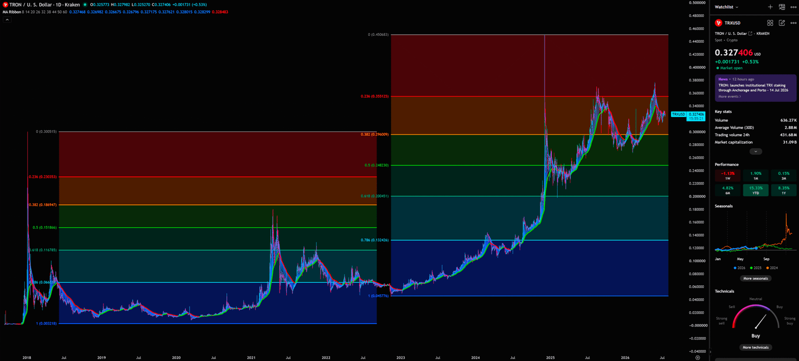
From the daily chart, TRX retraced from the top of $0.450683 and is currently consolidating between the 0.236 ($0.359129) and 0.382 ($0.296009) levels. Combined with the daily MA Ribbon, which also maintains a bullish alignment, we can observe that a formidable support zone has formed around the $0.30 mark (the 0.382 Fibonacci level).
Here, we must introduce the logic of the S/R Flip (Support and Resistance Interchange). Former resistance, once broken, becomes support; former support, once breached, becomes resistance. Theoretically, the TRX downtrend should not be over yet, but if the TRX price does not continue to fall but instead turns upwards and explodes, it needs to be seen whether it can rise to the resistance zone at $0.359 (the 0.236 resistance zone). If it breaks above and holds, then enter the market; otherwise, it will reach the stop loss and sell off immediately.
The Retail vs. Institutional Information Gap: Retail habitually looks at the “current price”; institutions habitually look at “cost zones.” When retail chases in at $0.327, institutions’ cost basis might be below $0.20. In institutional eyes, $0.327 is merely a “transit stop,” not the destination. Institutions’ goal is to let retail absorb shares at the transit stop, then continue pushing higher to $0.376 or beyond, finally distributing at the top. This is the essence of “Retail vs. Institutions”: retail chases highs, institutions distribute; retail panics, institutions accumulate.
📉 Monthly Chart: The Cold Gaze of Long-Term Capital
Many retail investors only watch minute charts to scalp in and out, but the true big money that dictates the market always keeps its eyes fixed on the monthly chart.
Monthly Timeframe for TRX (TRON)
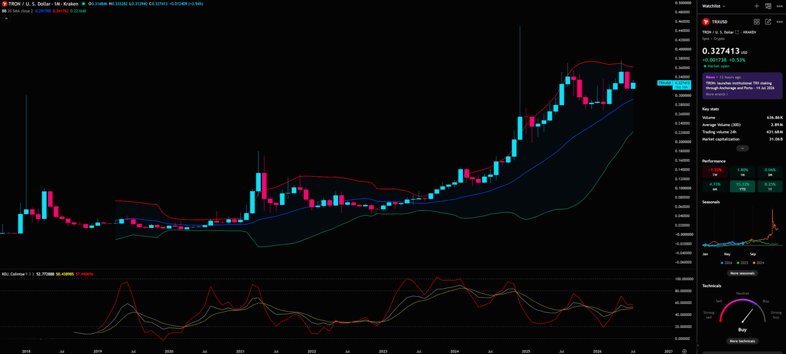
On the monthly chart, we observe the resonance of the Bollinger Bands (BB 20 SMA) and the KDJ indicator. Invented by John Bollinger in the 1980s, Bollinger Bands measure volatility using standard deviation, with the upper and lower bands representing statistically overbought and oversold zones. Currently, the TRX price is hugging the upper band of the BB, displaying extreme strength, but simultaneously hinting at short-term overbought pullback pressure. On the monthly chart, a breakout above the BB upper band is often the starting point of a long-term bull market, not the top. Historically, BTC climbed along the monthly BB upper band throughout the 2020-2021 bull market.
At the bottom, the KDJ indicator (invented by George Lane in the 1950s as a derivative of the Stochastic indicator, using three-line crossovers to judge overbought/oversold conditions and momentum shifts) currently shows values (K=52.77, D=50.44, J=57.45) in a neutral-to-bullish zone. The three lines have not yet flashed extreme overbought signals (e.g., J value > 100), implying that long-term capital is not in a rush to take profits, and TRX still has further upside potential on the macro timeframe. If the KDJ’s J value breaks above 80 and continues upward, it will be a powerful monthly-level bullish signal.
📐 4-Hour Chart: The Geometric Mystery of Gann Fan Lines
Finally, we utilize the 4-hour chart to pinpoint short-term entry and exit timing. Here appears a very rare yet highly precise tool: Gann Fan Lines.
4-Hour Timeframe for TRX (TRON)
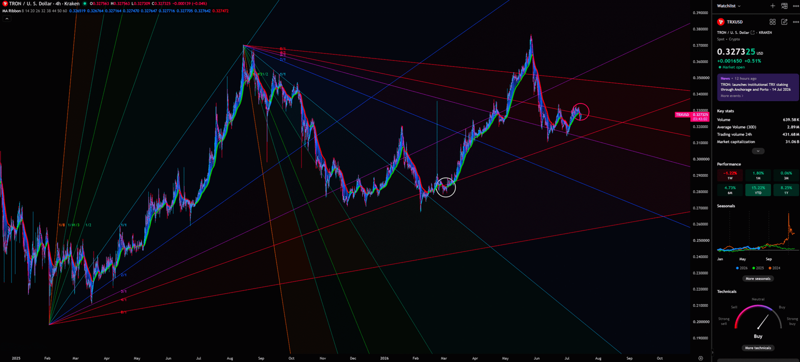
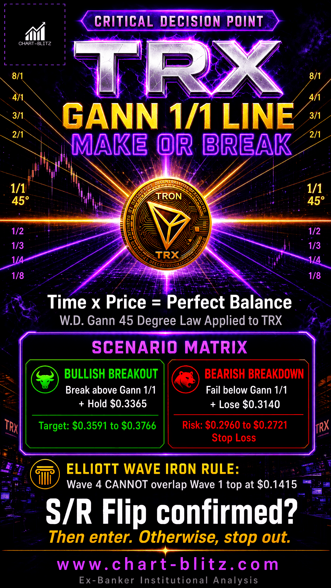
Invented by W.D. Gann in the early 20th century, Gann Fan Lines seek the perfect balance between time and price. Gann believed that market movements follow geometric laws, and the 1/1 line (representing a 45-degree angle of equilibrium movement) is the most critical reference line. The multiple rays (1/8, 1/4, 1/3, 1/2, 1/1, 2/1, etc.) extending from pivot points on the chart slice the price space into distinct geometric zones. Currently, the TRX price is undergoing convergent consolidation near the 1/1 line.
The pink circle marker on the chart indicates that the price is at a critical decision point. If the price can break upward along the 1/1 line, it will trigger a rapid short-term surge; conversely, if it falls below this lifeline, it will seek support at lower angle lines (such as the 1/2 or 2/1 lines).
Ex-Banker Perspective: In the bank trading room, we had a saying: “Geometry is God’s language, and Gann was the first to learn to listen.” The brilliance of Gann Fan Lines lies in the fact that they don’t just look at “price” but simultaneously look at “time.” When a critical time point (such as quarter-end or mid-year) converges with a critical angle line, it often marks the market’s most important turning point. TRX is currently at precisely such a convergence of time and price, and any directional breakout could trigger significant volatility.
Here, we must remember the iron rule of Elliott Wave Theory: The bottom of Wave 4 must absolutely not overlap with the top of Wave 1. If TRX drops below $0.141544 (Higher High 1), the entire assumption of a 1-2-3-4-5 upward impulse wave will be completely shattered, revealing it to likely be just a part of a larger degree corrective wave (A-B-C). The current price is still far from this danger zone, but we must absolutely not lower our guard.
🎯 Comprehensive Conclusion and Trading Plan
Combining the fundamental news of institutional entry with the deep technical dissection across four timeframes, we deduce the following multi-scenario projections:
Bullish Scenario: The trigger condition is a price break and hold above $0.336501 (marked as Tentative Buying Point on the chart), accompanied by expanding volume. The first target is $0.359 (Daily 0.236 resistance), with the ultimate target at $0.376586 (new high above The Safest Entry Point). The institutional logic is that whales utilize the bullish news to complete a final shakeout above the vacuum zone, then push the price up in one fell swoop, forcing short sellers to cover (Short Squeeze).
Bearish Scenario: The trigger condition is a price drop below the Gann 1/1 line on the 4-hour chart and a loss of the $0.314 short-term support. The downside target is $0.296 (Daily 0.382 support), or even a retrace to $0.274552 (Higher Low c). The invalidation condition is dropping below $0.272123 (clearly marked Stop Loss on the chart), which mandates an unconditional stop-loss exit. The institutional logic is that the news is merely bait; whales distribute their holdings at high levels, utilizing retail FOMO to create Exit Liquidity, causing the price to subsequently plummet into the vacuum zone.
The most dangerous moment in the market is often exactly when everyone believes it is safe. When you see the bullish news from Anchorage Digital and feel the impulse to buy, ask yourself first: Has the S/R Flip on the chart been confirmed? Is your stop-loss properly set?
I will continue to closely monitor the price action of this Crypto. As soon as a critical reversal signal appears on the charts, I will update my analysis and insights right here immediately. Remember to Bookmark this page and come back often to check for the latest updates!
Want to see our full, interactive chart breakdown? If you want to learn how to draw weekly VPFR, Fibonacci, EMA Ribbon, MACD, Supertrend, and S/R Flip frameworks designed for real trading decisions. Please browse the following『Further Reading』links. Fundamental news tells you what happened. Technical analysis predicts what will happen. To master the professional framework that separates market signal from noise, explore our exclusive models at www.chart-blitz.com.
📚Further Reading:
To help everyone gain a deeper understanding of the various technical indicators mentioned in this article, we have specially prepared the following further reading materials. These cover key analytical tools found across the weekly, daily, monthly, and 4-hour charts.
- Decoding Fibonacci Retracement: The Perfect Blend of Natural Law and Market Psychology — Fibonacci Retracement is not just a set of magical numbers; it is a manifestation of market psychology. Learning how to correctly draw and interpret Fibonacci levels is a required course for every serious trader.
- Elliott Wave Theory Practical Manual: Key Rules for Identifying Impulse and Corrective Waves — Elliott Wave Theory is one of the most complex yet powerful tools in technical analysis. Understanding how to identify impulse and corrective waves, along with the iron rules of Elliott Wave Theory, can help you find direction in the market.
- Understanding VPFR: Finding the Hidden Footprints of Market Makers — The Volume Profile Fixed Range (VPFR) is a powerful tool that tells us where the most trading occurred within a specific price range. This helps us identify true support and resistance levels, as well as potential ‘Vacuum Zones’.
- S/R Flip Support and Resistance Swap Strategy — S/R Flip is one of the most powerful concepts in technical analysis. This article uses real cases to teach you how to use S/R Flip to capture the highest win-rate trading opportunities.
- MACD Momentum Indicator Momentum First — What Does the MACD Line Crossing Above Zero Mean? Golden Cross & Divergence Signals!
- Gann Fan Masterclass — Deep dive into W.D. Gann’s angle theory to identify the geometric relationship between time and price in the market.
- Strategies for EMA Ribbon Bearish Alignment: Dead Cat Bounce or Real Reversal — Deep dive into the EMA Ribbon to understand the battle between short-term and long-term capital.
- Bollinger Band: Long-Term Repricing Zone — The Ultimate Tool to Capture Massive Market Moves Tired of getting shaken out of winning trades too early? Or buying right before a trend reverses? An ex-banker reveals how to use the Bollinger Band to filter out market noise and ride the big waves.
- KDJ Stochastic Indicator Bottom Confirmation — What is the implication of a downward-curving KDJ? Understand in one article how to use dynamic indicators to catch market turning points.
【Disclaimer】 The content herein is for educational purposes and reflects the author’s personal opinion only; it is not investment advice. All financial investments, including cryptocurrencies, carry significant risk, and you could lose your entire capital. To support this site, this article may contain affiliate links. While we strive for accuracy, we cannot guarantee all information is complete or error-free. Please conduct your own research and be fully responsible for your own investment decisions.