Fetching Live Market Data...
When you make a trade, you should have a clear target of where you expect to get out
William Delbert Gann – 1949
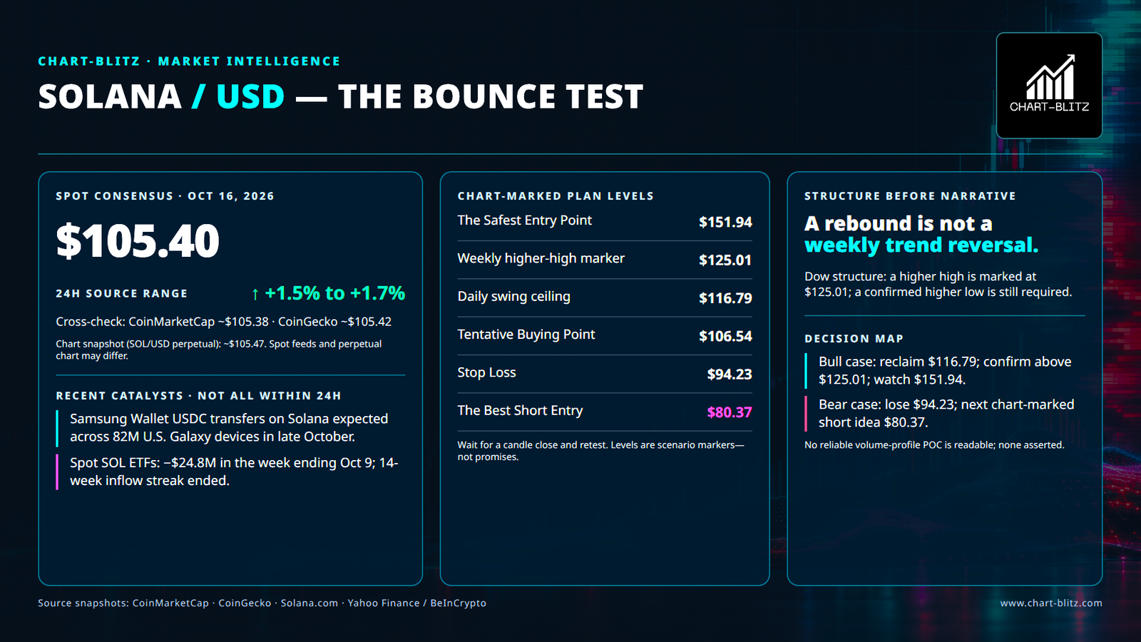
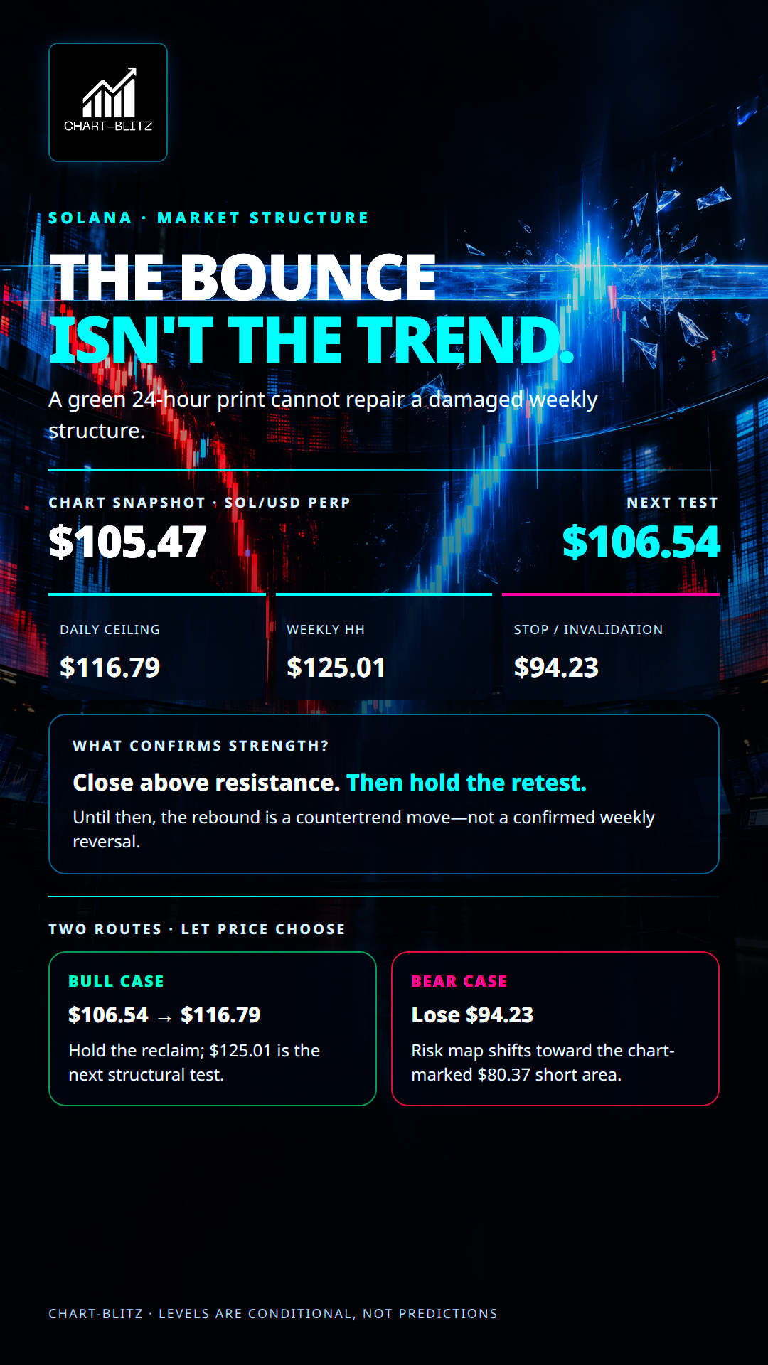
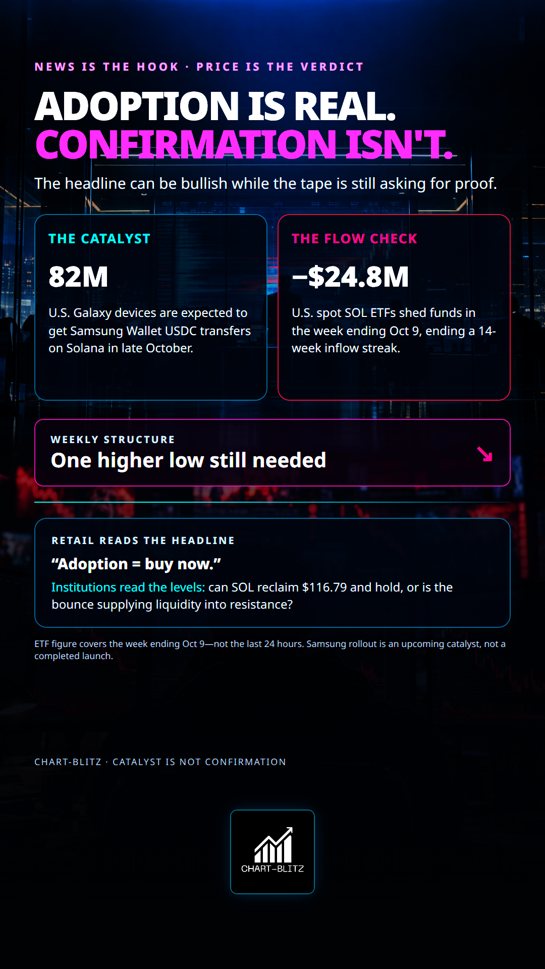
A green day does not rewrite a weekly trend. Solana is caught between a compelling adoption story and a chart that still demands structural proof. The official Solana news page says Samsung Wallet is expected to support USDC cross-border transfers on Solana across 82 million U.S. Galaxy devices beginning in the last week of October. That is a meaningful upcoming adoption catalyst. It is not a completed launch, and it is not a technical reversal signal. Meanwhile, a Yahoo Finance/BeInCrypto report says U.S. spot SOL ETFs recorded $24.8 million in net outflows during the week ending October 9, ending a 14-week inflow streak. That is recent flow context, not a claim about the last 24 hours.
News gives the market a subject; price structure gives traders timing and method. In a bank trading room, a headline is not an instruction to buy. It is a prompt to ask where the market is trading relative to resting orders, trapped positions, and unconfirmed resistance. Retail traders may translate “adoption” into “buy immediately.” Institutions are more likely to ask whether the market can reclaim supply and hold it after the headline-driven demand arrives. A favorable narrative can be real while an entry is still poor. The chart is not proof that large players are manipulating every move; it is a map of observable levels where liquidity and positioning may matter.
【📊Analysis Baseline Statement】
All technical analyses below are based on the price snapshot locked on October 16, 2026 (EST): 02:05 Solana (SOL) = $105.38 USD. Please treat this report is an analytical map, not a live executable quote. Fragmented crypto venues can differ by a few dollars; every decision must be checked against the same venue and a completed candle before action is considered.
💡Four frames. One question: did it hold?
The Price and Timestamp above are the print this piece froze at the close of writing — not the tape now. Markets move; the copy does not. The only check that matters is whether that freeze still holds. Open Chart Grid: One name, Four frames, locked Weekly → Daily → Monthly → 4-Hour, the article’s print against the live chart. You do not pick timeframes, and you should not trust the headline. Hold or break: you decide.
🌊Weekly chart: a higher high is progress, not a confirmed uptrend
The EMA Ribbon combines multiple exponential moving averages into a dynamic trend zone. It is useful on a weekly chart because the question is whether price can reclaim a broad area of trend resistance, not whether one short candle looks impressive. A ribbon that fans upward can signal aligned trend strength; a compressed or downward-sloping ribbon warns that consensus is weak or contested. SOL has rebounded from the chart-marked $59.59 area, but the important test is whether price can close above the ribbon and remain there. The rebound may reflect short covering and tactical buying. Retail may mistake that relief move for a new primary trend. Larger participants can use the ribbon as a place to test whether trapped supply is still waiting to sell. One cross through the band is not enough; a close and successful retest matter more.
Weekly Timeframe for SOL (Solana)
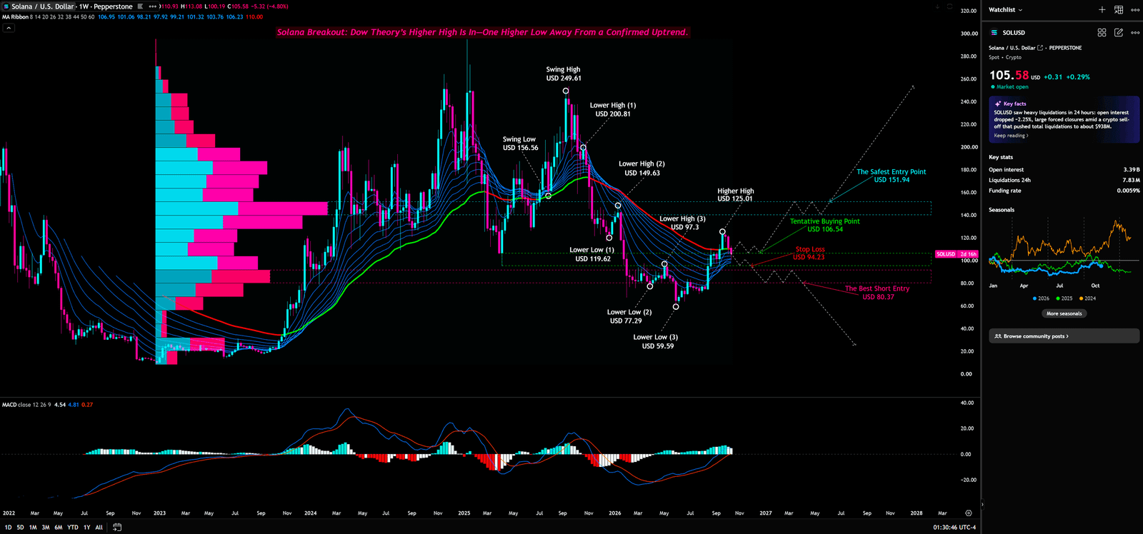
The chart also contains a Volume Profile histogram. Volume Profile groups traded activity by price rather than by time, helping traders distinguish areas of acceptance from areas price moved through quickly. The histogram is visible, but a precise POC label or value cannot be reliably read. No price will therefore be presented as the “whale cost basis,” and no vacuum-zone target will be invented. The proper advanced use is conditional: if a clearly identified low-volume area is traversed, price can move faster than it does through a heavily accepted zone; but without a readable POC or nodes, no specific level can be claimed. Retail often treats every bar in the profile as support. Institutions watch the actual response when price reaches a node. If the POC is not legible, it is not a usable POC claim.
The weekly MACD compares faster and slower exponential averages, then plots a signal line and histogram to summarize momentum changes. It is best used here as a secondary check against price structure. The MACD pane is visible, but the screenshot does not support a confident claim about an exact crossover, divergence, or zero-line condition. A rebound may involve short-covering flows; retail can overread a changing histogram as a reversal; institutions still need price to break a meaningful structural ceiling. No divergence is asserted.
Dow Theory treats a sequence of Higher Highs and Higher Lows as the skeleton of an uptrend. Lower Highs and Lower Lows point the other way. The weekly chart marks a Higher High at $125.01 and explicitly says one Higher Low is still needed to confirm an uptrend. Other visible annotations include Lower Highs at $200.81, $149.63, and $97.30, plus Lower Lows at $119.62, $77.29, and $59.59. The defensible conclusion is not “the bull market is back.” It is that the local structure has improved, but a higher low still has to form. In a trading room, a large order breaking a prior high is only the first print; the retest shows whether genuine demand is willing to defend the new level. Retail often celebrates the breakout candle. Institutions wait for the pullback. No Elliott Wave count is marked clearly, so no 1–2–3–4–5 count is imposed on the chart.
The weekly scenarios are straightforward. The bull case needs a higher low after the marked higher high and continued acceptance above $125.01. The bear case strengthens if the rebound fails and the marked $94.23 stop/invalidation level is lost. A neutral outcome is continued rotation between support and resistance. In all three cases, closing prices matter more than intraday wicks.
📊Daily chart: Fibonacci is a map of possible reactions, not an automatic entry button
Fibonacci Retracement projects candidate reaction levels from a selected swing high and swing low. It is useful on the daily chart because it frames the current recovery against a medium-term move, but its lines are reference zones rather than guarantees. One visible recent set includes $116.79 at 0, $99.70 at 0.125, $84.52 at 0.236, and $64.57 at 0.382. With SOL around $105.40, price sits between $99.70 and $116.79. That places the market in a contested zone. A close above $116.79 followed by a successful retest would improve the recovery case. A loss of $99.70 would weaken it and expose the next visible reference at $84.52, without guaranteeing a move there.
Daily Timeframe for SOL (Solana)
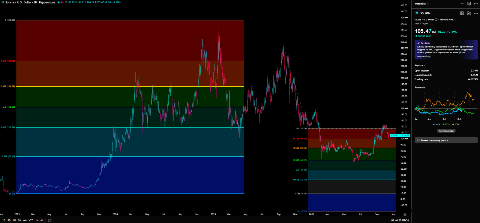
A separate, wider-range Fibonacci set shows $223.22, $186.38, $152.56, $118.74, and $70.60. These levels come from a different selected range and should not be blended into the recent set as if they were one ladder. The common retail error is to assume that more lines create more certainty. The actual value comes from knowing which swing anchors produced each set and waiting for price action to confirm a reaction. A concentration of widely watched levels can attract orders; retail may select whichever line supports its existing position, while institutions can observe where stops cluster. Until weekly structure confirms a higher low, the daily bounce remains a candidate secondary recovery—not a confirmed primary reversal.
🌙Monthly chart: volatility is visible; the long-cycle reversal is not proven
Bollinger Bands usually place a moving-average centre line between upper and lower bands based on standard deviations. Expanding bands indicate rising volatility; contracting bands can flag compression. The monthly chart visibly contains Bollinger Bands, but the small labels and settings cannot be read with enough confidence to publish exact values. The chart shows a substantial decline followed by a recovery. That is not enough, on its own, to call a long-term bull-market reversal. Short-term flows can trade the expanding volatility; retail may mistake a bounce from depressed prices for a durable cycle bottom; institutions will look for repeated monthly closes above meaningful levels.
Monthly Timeframe for SOL (Solana)
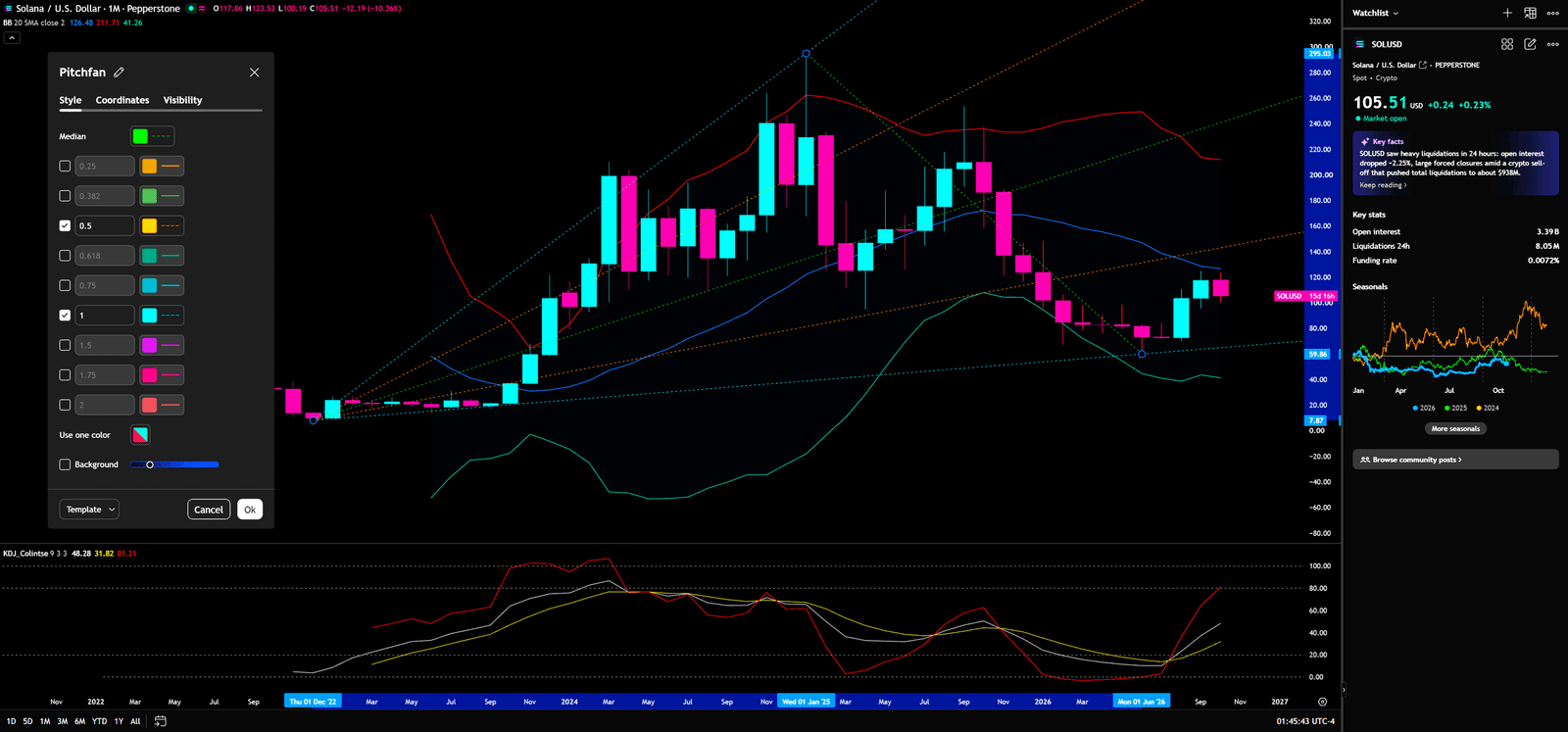
KDJ is a momentum oscillator related to Stochastic, with K and D lines and a more sensitive J line. It can warn that momentum is changing, but extreme readings can persist in a strong trend, and a fast turn is not a price-confirmed reversal. KDJ is visible in the monthly pane, but its small legend cannot be independently checked at the required precision. No numerical reading, golden cross, or divergence is claimed. A rising J line would at most suggest a change in momentum; it would not prove that long-horizon capital has reallocated. Retail can treat the earliest turn as a bottom. Institutions generally want price and structure to confirm it.
A Pitchfork tool is also visible. It uses three selected pivots to draw a median line and parallel boundaries, creating a possible path and dynamic support/resistance framework. It is included because the monthly chart displays the tool, but its anchors and exact levels are not clear enough to claim a specific channel response. The geometry is subjective and depends on pivot selection. Flows may rebalance around a median line; retail can treat a drawn boundary as an inviolable wall; institutions will look for a close and retest. The Dow structure remains more important than an unverified angle.
📐Four-hour chart: Gann angles help frame the short-term path, not overrule the weekly trend
A Gann Fan projects multiple slopes from a selected pivot and is used as a reference for price velocity and dynamic support/resistance. The four-hour screenshot shows a fan of angular lines extending from prior lows and highs. After a peak near $124, SOL declined and rebounded around the $100–$106 area. Because the tool’s meaning depends on its anchors and chart scale, no exact angle or future value is asserted. Short-term buyers may be covering after a sharp drop; retail can chase a sequence of green candles; institutions can compare that rebound with descending resistance and wait for a close. If SOL loses $99.70 and then the weekly $94.23 invalidation, the short-term bullish interpretation must be withdrawn.
4-Hour Timeframe for SOL (Solana)
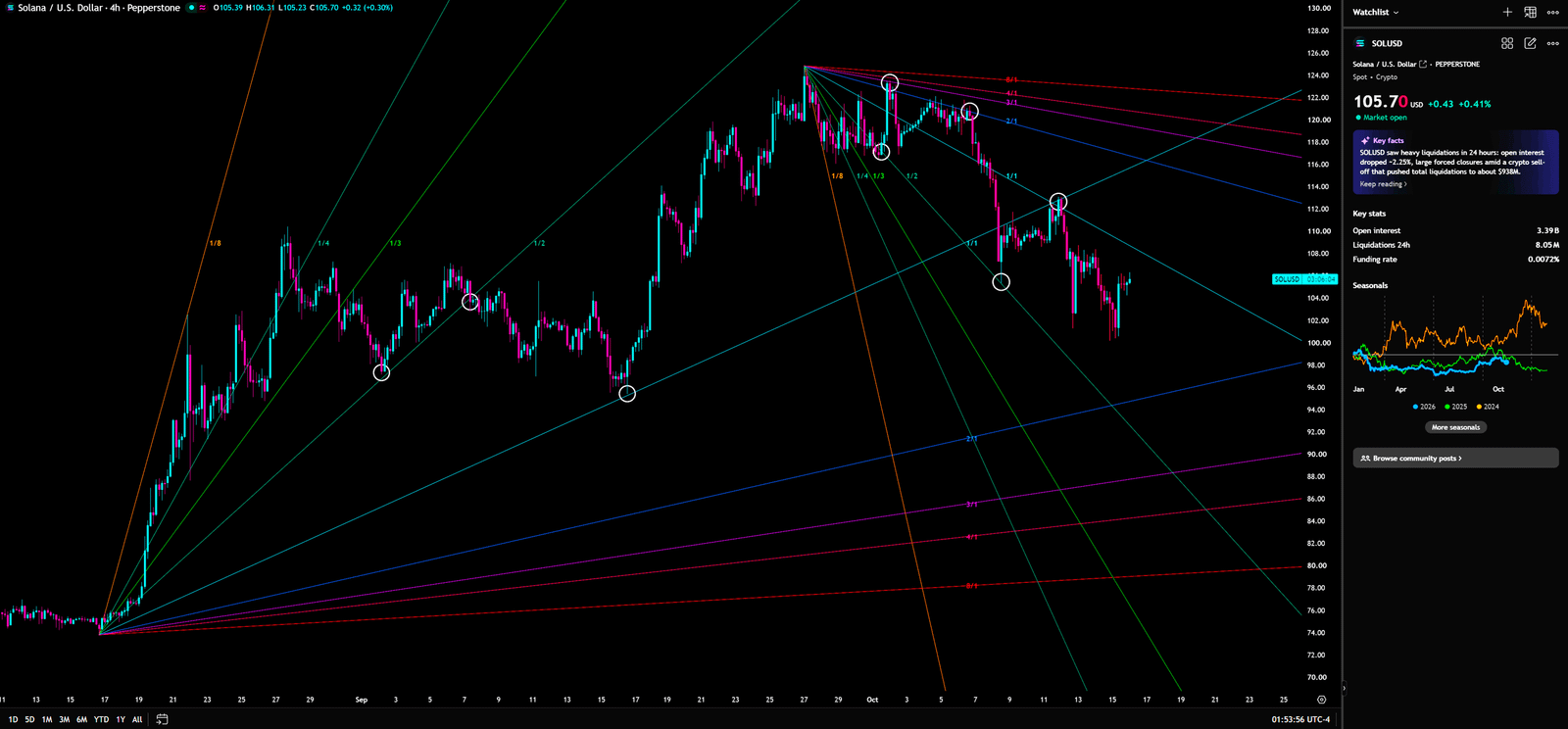
No readable four-hour KDJ or exact Volume Profile price node is shown, so none is added. The four-hour chart’s job is to test whether daily resistance and weekly support are being respected—not to replace the higher-timeframe conclusion. A trading desk uses the shorter timeframe to time an entry; it does not let the faster chart rewrite the strategic map.
🎯Bull, Base, and Bear Scenario Scripts
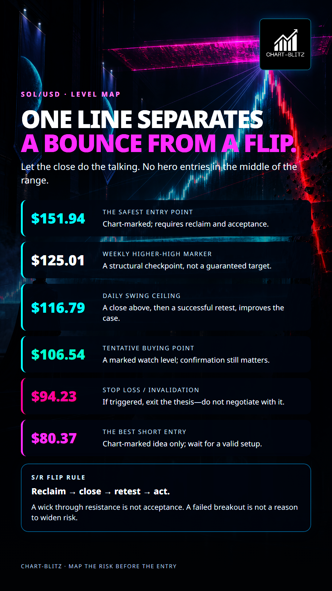
Bullish scenario: SOL reclaims the chart-marked tentative buying point at $106.54 on a close and holds it. A daily close above $116.79, followed by a successful retest, would improve the case for a test of the weekly Higher High marker at $125.01. A higher low above that structure would open the chart-marked $151.94 “Safest Entry Point” as a later reference. Invalidation begins with a close back below $99.70; a move to the marked $94.23 stop cancels the original long thesis. The $151.94 label is not a guaranteed target.
Bearish scenario: Price fails between $106.54 and $116.79, closes below $99.70, and then loses $94.23 on the weekly chart. That would strengthen the failed-rebound interpretation. The chart labels $80.37 as “The Best Short Entry,” but that is a marked idea—not an instruction to short at the current quote. A trader would still need a valid setup and rejection at that future area. A sustained reclaim of $106.54 and then $116.79 would weaken or invalidate the bearish case.
Neutral scenario: SOL remains between $99.70 and $116.79 without a decisive close. Waiting may be better than forcing a position. A confirmed reclaim and retest can define a long-side setup; a loss of $99.70 and then $94.23 can define a weaker structure. Chasing in the middle of the range often produces poor risk/reward. Trading-room discipline is not confidence; it is a pre-defined point at which the thesis is wrong.
🔥Why the liquidity question matters more than the headline
An adoption story can draw fresh attention, but attention is not the same thing as durable spot demand. The weekly ETF outflow figure is also not a complete map of all institutional positioning: it covers a specific product category and one reporting week, while crypto exposure can be expressed through other vehicles, derivatives, or direct holdings. It is evidence of a change in one observable flow channel, not proof that every large investor is selling. The correct use is comparative. If the Samsung Wallet milestone approaches and SOL begins to reclaim resistance on closing prices, that would show the narrative is being translated into demand. If the headlines grow louder while price keeps failing beneath the daily ceiling, the market is telling traders that expectations have not yet become sustained buying.
The institutional analogy is an auction, not a conspiracy. A bank desk does not need to “control” the market to benefit from knowing where liquidity is likely to sit. Stops often gather under obvious lows; breakout orders gather above obvious highs; momentum traders enter after a close confirms a move. Those behaviours can make price accelerate when a widely watched level gives way. Retail traders often see a candle, assign it a story, and then enter without defining what would prove the story wrong. A professional process starts with the opposite question: if this trade is wrong, where must the market go, and how much capital is at risk before that point?
♟️Cross-timeframe confirmation: hierarchy prevents mixed signals
The weekly chart sets the strategic bias. The daily chart identifies the nearer boundaries. The monthly chart provides the volatility and cycle context. The four-hour chart can help refine timing only after those higher frames define a plausible setup. That order matters because the same move can look bullish on a four-hour chart and remain only a countertrend rally on a weekly chart. A short-term higher low around the $100 area may improve local price action, but it cannot by itself satisfy the weekly requirement for a confirmed higher low after the marked $125.01 higher high.
This hierarchy also protects against indicator stacking. EMA Ribbon, MACD, Fibonacci, Bollinger Bands, KDJ, Pitchfork, and Gann Fan each describe different properties of price; they do not become independent confirmations merely because several appear on the same screen. Moving averages smooth trend, MACD summarizes momentum, Fibonacci maps selected swings, bands describe volatility, and oscillators respond to the location of price within a recent range. Pitchforks and Gann angles depend on chosen anchors and scale. When several tools point to a similar region, the overlap is a reason to pay attention, not a guarantee that the region will hold. The final evidence remains the market’s close, follow-through, and retest.
For example, if SOL closes above $116.79 but immediately falls back below it, the first break may have harvested breakout orders rather than established acceptance. A successful retest would look different: price returns toward the level, selling pressure fades, and buyers prevent a decisive close back beneath it. That sequence is more informative than a single wick. Conversely, a daily close below $99.70 followed by a weak recovery could turn that former floor into resistance. The chart-marked $94.23 stop would then become the more important weekly risk line. Traders should not treat these levels as exact physical walls; crypto trades continuously, and volatile candles can overshoot them.
📝Translating the marked plan into controlled risk
The chart labels $106.54 as a tentative buying point and $94.23 as a stop loss. The gap between those two figures is $12.31 per SOL, or roughly 11.6% of the $106.54 entry reference before fees, slippage, and execution differences. That distance is large enough that a position should not be sized by emotion or by a fixed number of coins. A risk budget is chosen first; the position size is then derived from the distance to the invalidation point. This is not a recommended trade size or a promise about loss. It is a reminder that a chart label is not a complete plan until the trader has considered the loss if the label fails.
There is another practical issue: a stop order and a chart invalidation are not identical in fast markets. A sudden move can gap through a level or fill at a worse price than expected. If the weekly $94.23 level is the thesis boundary, a trader still needs to decide whether the plan uses a closing-price rule, an intraday stop, or a combination. Each choice produces different risk. Moving the stop farther away after entry does not reduce risk; it increases the amount exposed to the same thesis. A disciplined plan also includes a no-trade condition. If price remains between $99.70 and $116.79 and no clear retest develops, preserving capital can be a valid outcome.
For a bearish idea, the chart’s $80.37 “Best Short Entry” marker should be interpreted as a future watch area, not a command to sell short now. Price would first need to weaken through the relevant support structure and then show a credible failed recovery near the marked zone. If the market instead reclaims $106.54 and $116.79, a short thesis based only on the old downtrend becomes less attractive. This is where the S/R Flip framework is useful: resistance that is broken and then defended can become support; support that is lost and then rejected from below can become resistance. The flip is confirmed by behaviour after the break, not by drawing a line through the chart.
🎭What would change the view
The constructive case would improve if SOL holds above $106.54, reclaims $116.79 on a daily close, and then forms a higher low on a retest. A weekly acceptance above $125.01 would be a stronger structural development than a temporary intraday spike. The next chart-marked reference at $151.94 should only enter the discussion if those earlier checkpoints are cleared. A failure to hold $99.70 would lower confidence in the near-term bounce; a weekly loss of $94.23 would invalidate the chart’s marked long-risk plan. Below that, $80.37 remains a chart annotation for a possible short setup, not a guaranteed destination.
The adoption narrative will become more useful when it moves from a scheduled announcement to observable usage and when price responds constructively. A launch date, a social-media trend, or a positive ecosystem update does not by itself establish token demand. Likewise, one week of ETF outflows does not establish a permanent institutional exit. Readers should look for repeated evidence: whether flows stabilize, whether the market can hold reclaimed levels, whether pullbacks become shallower, and whether the weekly structure begins to print a genuine higher low. That is how the story shifts from “this could matter” to “the market is repricing it.” Until then, the catalyst remains context, not confirmation.
The chart’s own annotations are Tentative Buying Point $106.54, Stop Loss $94.23, The Safest Entry Point $151.94, and The Best Short Entry $80.37. These are chart labels, not independently backtested signals. Before taking any real position, calculate the distance to invalidation, size the risk, and wait for the relevant candle close. If the stop is hit, exit the thesis rather than moving the stop because the Samsung story sounds attractive. Headlines are context; the risk limit is your actual cost
I will continue to closely monitor the price action of this Crypto. As soon as a critical reversal signal appears on the charts, I will update my analysis and insights right here immediately. Remember to Bookmark this page and come back often to check for the latest updates!
Want to see our full, interactive chart breakdown? If you want to learn how to draw weekly VPFR, Fibonacci, EMA Ribbon, MACD, Supertrend, and S/R Flip frameworks designed for real trading decisions. Please browse the following『Further Reading』links. Fundamental news tells you what happened. Technical analysis predicts what will happen. To master the professional framework that separates market signal from noise, explore our exclusive models at https://www.chart-blitz.com/fxcx-app/omni-chart.html?symbol=SOL.
📚Further Reading:
To help everyone gain a deeper understanding of the various technical indicators mentioned in this article, we have specially prepared the following further reading materials. These cover key analytical tools found across the weekly, daily, monthly, and 4-hour charts.
- Decoding Fibonacci Retracement: The Perfect Blend of Natural Law and Market Psychology — Fibonacci Retracement is not just a set of magical numbers; it is a manifestation of market psychology. Learning how to correctly draw and interpret Fibonacci levels is a required course for every serious trader.
- Is a Major Move Hiding in Plain Sight? Dow Theory May Already Know the Answer — As retail traders continue to chase short-term signals, experienced market readers are looking deeper — into trend structure, volume behavior, and market phases that may expose the early clues of a coming breakout.
- Understanding VPFR: Finding the Hidden Footprints of Market Makers — The Volume Profile Fixed Range (VPFR) is a powerful tool that tells us where the most trading occurred within a specific price range. This helps us identify true support and resistance levels, as well as potential ‘Vacuum Zones’.
- S/R Flip Support and Resistance Swap Strategy — S/R Flip is one of the most powerful concepts in technical analysis. This article uses real cases to teach you how to use S/R Flip to capture the highest win-rate trading opportunities.
- MACD Momentum Indicator Momentum First — What Does the MACD Line Crossing Above Zero Mean? Golden Cross & Divergence Signals!
- Gann Fan Masterclass — Deep dive into W.D. Gann’s angle theory to identify the geometric relationship between time and price in the market.
- Strategies for EMA Ribbon Bearish Alignment: Dead Cat Bounce or Real Reversal — Deep dive into the EMA Ribbon to understand the battle between short-term and long-term capital.
- Bollinger Band: Long-Term Repricing Zone — The Ultimate Tool to Capture Massive Market Moves Tired of getting shaken out of winning trades too early? Or buying right before a trend reverses? An ex-banker reveals how to use the Bollinger Band to filter out market noise and ride the big waves.
- KDJ Stochastic Indicator Bottom Confirmation — What is the implication of a downward-curving KDJ? Understand in one article how to use dynamic indicators to catch market turning points.
【Disclaimer】 The content herein is for educational purposes and reflects the author’s personal opinion only; it is not investment advice. All financial investments, including cryptocurrencies, carry significant risk, and you could lose your entire capital. To support this site, this article may contain affiliate links. While we strive for accuracy, we cannot guarantee all information is complete or error-free. Please conduct your own research and be fully responsible for your own investment decisions.