Fetching Live Market Data...
When you make a trade, you should have a clear target of where you expect to get out
William Delbert Gann – 1949
The headline is bullish. The test is not. The narrative has all the ingredients that make late buyers nervous about waiting. The Block reported Bitcoin moving above $85,000 after a sharp recovery, with more than $750 million of crypto liquidations in 24 hours and roughly $648 million of that amount coming from shorts. Strategy disclosed another 950-BTC purchase. CoinStats recorded $190.7 million of Bitcoin ETF net inflow on September 24 and about $2.82 billion over 30 days. Those are not trivial figures. They are credible reasons for capital to pay attention
But a good headline and a completed breakout are two different assets. The dealing-room question is never merely, “Did a catalyst arrive?” It is, “After the catalyst arrives, who is still willing to buy higher?” That distinction separates an informed participant from a headline passenger. ETF flows can improve the demand backdrop. A short squeeze can accelerate price. Neither one erases an overhead stock of inventory just because the social feed has become enthusiastic.
Glassnode’s current framework puts long-term-holder cost basis, a futures-liquidation shelf, and the US spot-ETF complex’s break-even near the same $83K–$86K ceiling. That is a rare convergence. It does not make the area impossible to cross; it makes the area expensive to cross without acceptance. A market can touch a wall with leverage, stop-losses and a bright news cycle. It can remove that wall only when buyers remain after the urgency fades.
News is the amplifier. The completed close is the vote.
【📊Analysis Baseline Statement】
All technical analyses below are based on the price snapshot locked on September 25, 2026 (EST): 02:57 Bitcoin (BTC) = $84,042.6 USD. The chart snapshots cluster around $84,000, so this report is an analytical map, not a live executable quote. Fragmented crypto venues can differ by a few dollars; every decision must be checked against the same venue and a completed candle before action is considered.

💡Four frames. One question: did it hold?
The Price and Timestamp above are the print this piece froze at the close of writing — not the tape now. Markets move; the copy does not. The only check that matters is whether that freeze still holds. Open Chart Grid: One name, Four frames, locked Weekly → Daily → Monthly → 4-Hour, the article’s print against the live chart. You do not pick timeframes, and you should not trust the headline. Hold or break: you decide.
📈 Weekly structure: Bitcoin is repairing, not yet acquitted
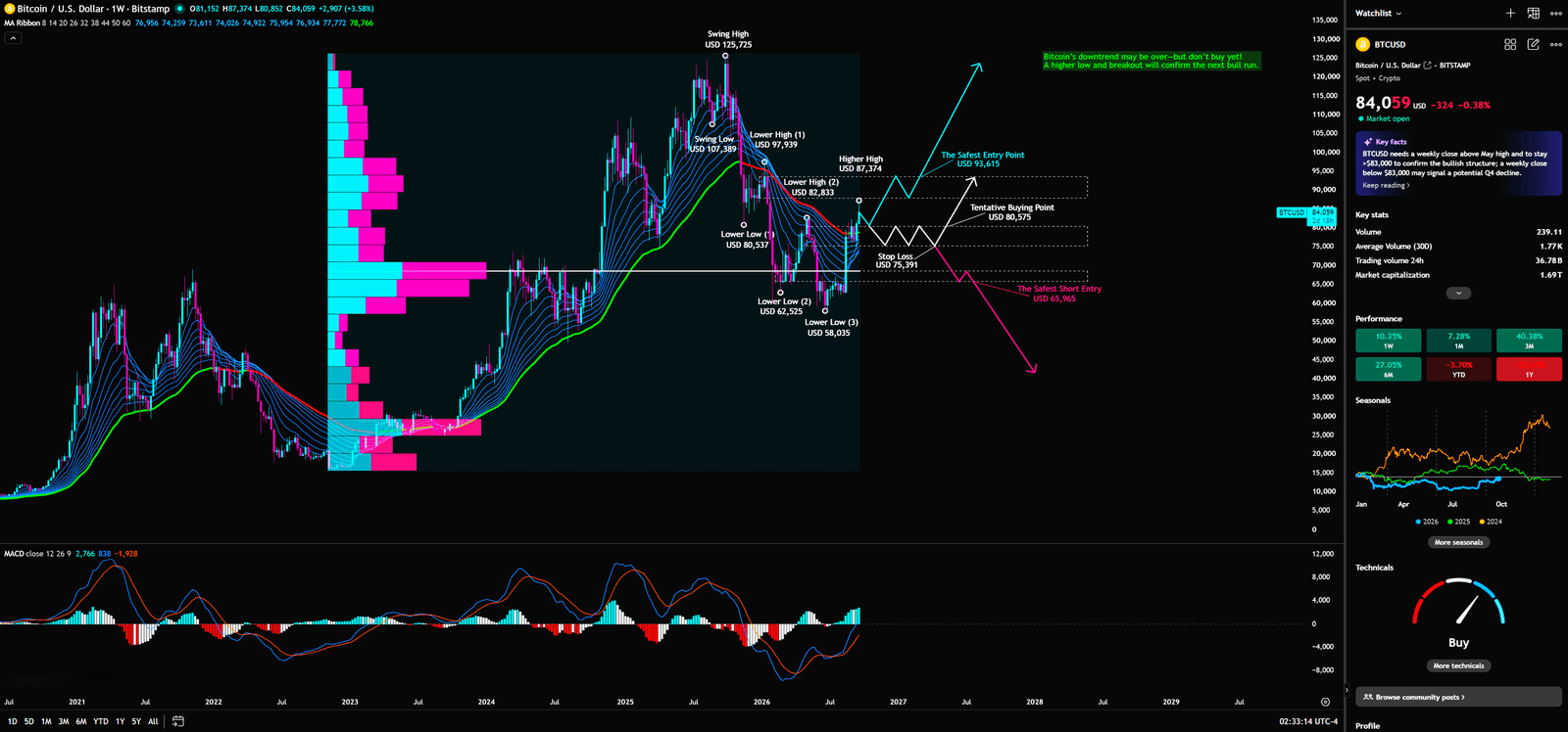
The weekly chart is the court of record. It shows an EMA Ribbon, a Fixed Range Volume Profile, MACD, and explicit Dow Theory swing labels. Each tool answers a distinct institutional question. The ribbon asks where different layers of average cost sit. VPFR asks where the market historically accepted inventory. MACD asks whether momentum is changing speed. Dow Theory asks whether price has actually rewritten its sequence of highs and lows. A four-hour candle can create drama. A weekly close is where that drama is either admitted into evidence or dismissed.
Weekly Timeframe for BTC (Bitcoin)
Dow Theory: a rally can be real without being a reversal
Dow Theory defines an uptrend through Higher Highs and Higher Lows. It defines a downtrend through Lower Highs and Lower Lows. The visible weekly ledger begins with a $125,725 swing high, then shows a swing low around $107,389, lower highs near $97,374 and $82,833, and lower lows around $80,537, $62,525, and $58,035. The current rebound is therefore a repair operation inside a historically damaged sequence. It is not yet a clean Higher High / Higher Low sequence that can be marketed as a completed regime change.
What does that reveal about capital behavior? Funds can cover shorts, accumulate opportunistically and lift a market without declaring that all prior supply has been removed. What does retail commonly misread? A recovery from $75K to $84K can feel like proof that the old downtrend no longer matters. What can institutions exploit? They can let momentum buyers press into the next obvious lower-high zone, then test whether those buyers defend a retest once the initial impulse has disappeared.
A bank does not restore a borrower’s full credit line after one improved payment. It watches whether the improved behavior persists through the next review. Bitcoin deserves the same discipline. The weekly map identifies $80,575 as the marked Tentative Buying Point and $93,615 as the marked Safest Entry Point. The first is an area for a conditional retest. The second is a stronger structural test. Neither label means “buy immediately.” The labels define where the market has to answer a better question.
A bounce is not a reversal. A reversal is a rewritten structure.
If BTC can reclaim $89,051 on the daily structure, then carry through and hold a weekly close above $93,615, the pathway to $97,374 and $107,389 becomes structurally more credible. If price cannot do that, then the rally may still be useful—but mainly as a higher-quality information event. It tells observers where supply is waiting. The professional advantage is not predicting every move. It is knowing which move changed the evidence and which one merely changed the mood.
EMA Ribbon: average cost does not forget a good headline
An EMA Ribbon layers exponential moving averages from different lookback windows. The faster lines react to shorter-term speculative cost; the slower lines approximate the longer-held average cost of larger participants. A durable trend normally shows price moving above the ribbon, the ribbon expanding in the same direction, and pullbacks holding above it. A curl or compression can indicate repair. It does not automatically confirm a new expansionary trend.
The weekly ribbon is improving from prior pressure, yet it remains a test zone rather than an established runway. That is why this tool belongs on the weekly timeframe. Large capital does not redeploy simply because a 15-minute signal turns green. It looks for a cost structure that stops acting as overhead supply and starts behaving as support.
Capital behavior here is usually crowded. Former buyers trying to exit at break-even, short-term traders adding to strength, and short sellers buying back exposure can all transact in the same region. Retail often sees a ribbon start to curl and declares that the market is “back.” Institutional desks ask whether the first pullback holds above the slower cost bands. If price repeatedly reaches the ribbon and is sold back down, the ribbon is not a bull flag. It is a distribution corridor.
The correct question is uncomfortable: if demand is as strong as the headline suggests, why would it fail its first retest? A sustained hold answers that question. A rejection does not prove that Bitcoin is doomed; it proves that the market has not yet earned the bullish conclusion being sold to it.
VPFR: high-volume shelves are warehouses; vacuum zones are elevator shafts
Fixed Range Volume Profile distributes activity across price, rather than across time. Its Point of Control is the price bucket with the greatest transacted volume in the selected range. High-volume nodes indicate historical acceptance. Low-volume nodes are thinner corridors in which price can travel quickly because less inventory was exchanged there. The weekly profile visibly concentrates more historical activity in the upper-$60Ks to lower-$70Ks than in the faster-moving bands above and below it. The exact POC value is not labeled clearly enough to invent a false number, so the correct interpretation is qualitative: there is a meaningful acceptance shelf below current price, not a guaranteed floor.
This is the difference that gets traders hurt. High volume means many positions exist. It does not mean every holder will defend at any price. If BTC loses the $75,391 Stop Loss after failing the $80,575 area, the next move should not be treated as if support arrives at every thousand-dollar interval. A thin profile zone can behave like an elevator shaft: price moves quickly when the old inventory is not there to slow it.
What is the capital behavior? Stops, leveraged liquidations and discretionary selling can become synchronized when a known level fails. What does retail misread? It turns a thick volume area into an immortal support label. What do institutions do? They often prefer to sell into a well-advertised resistance during a positive news cycle, then let trapped longs become the next source of selling if support breaks.
This is why ETF flows are valuable information but poor standalone trade triggers. The ETF figures tell you regulated demand exists. VPFR tells you where the market still has to settle old inventory. A flow headline can help price enter a low-volume corridor. It cannot guarantee that price will exit that corridor above the next supply wall.
MACD: rising from underwater is not the same as reaching shore
MACD measures the spread between a faster and slower EMA, then compares that spread with a signal line. The histogram visualizes the pace of change. A rising histogram or bullish crossover can show that selling pressure is fading. It does not, on its own, prove that the primary trend has reversed. The weekly MACD has repaired materially from its prior negative condition; the line pair and histogram show that bullish momentum is present. That is useful evidence. It is not an exemption from price confirmation.
A professional risk desk does not restore maximum exposure just because a red risk indicator turns amber. Amber means observe more closely. Bitcoin’s improving MACD can reflect spot accumulation, short covering, or both. Retail often reads the first bullish crossover as the earliest possible entry. Institutions prefer the later but cleaner test: can price reclaim $89,051 and then turn $93,615 into a defended floor?
Momentum improvement is evidence of repair, not a license to ignore resistance.
The weekly conclusion is therefore firm but not dogmatic. The rebound has meaningful momentum. The structure still needs a higher-quality acceptance event. That is exactly the sort of tension that produces the best trading opportunities and the worst FOMO decisions.



📊 Daily Fibonacci: $79,960 is defense; $89,051 is the buyers’ examination
The daily chart displays Fibonacci Retracement, an EMA Ribbon and MACD. The marked Fibonacci range runs from $126,440 at the high to levels including 0.236 = $101,253, 0.382 = $89,051, 0.5 = $79,960, 0.618 = $57,866, and 0.786 = $39,225. With the working price near $84,039, Bitcoin has reclaimed the 0.5 midpoint but remains below the 0.382 barrier. That makes the current zone constructive but unfinished.
Daily Timeframe for BTC (Bitcoin)
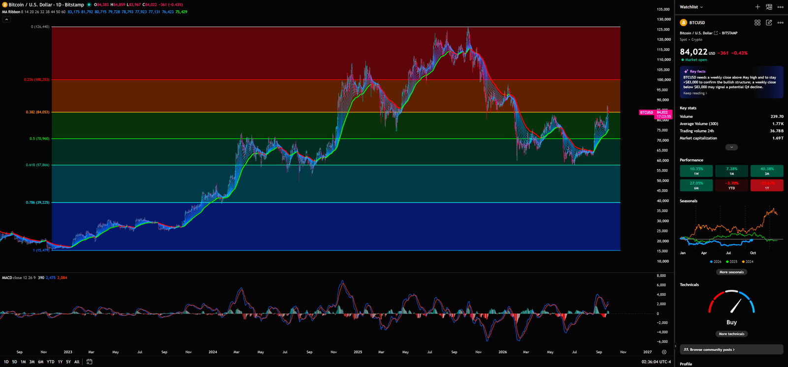
Fibonacci Retracement partitions a prior move into commonly watched proportions. The 0.5 level is a psychological midpoint; 0.618 is often treated as a deeper retracement threshold; 0.382 frequently becomes the first serious obstacle during a recovery. The tool is not magical. It matters because many discretionary traders, systematic plans and risk protocols congregate around the same areas. Shared attention creates shared order flow.
What is capital doing at $79,960? Defending it says buyers are willing to absorb a retracement. What does retail misread? It treats a hold above the midpoint as proof that the recovery has already won. What do institutions require? A break of $89,051, followed by a lower-volume retest that stays above it. The first tests whether buyers can break supply. The second tests whether buyers still exist after the breakout crowd has spent its capital.
The daily EMA Ribbon supports that interpretation. It maps short- and intermediate-term average cost. When the fast group starts to rise but the slower group has not fully converted to support, the market is repairing rather than trending cleanly. Capital may be willing to trade tactical upside. It is not necessarily prepared to pay any price. Retail sees a ribbon bend and labels a bull market. Institutional traders wait for expansion, a defended retest, and alignment with the weekly structure.
Daily MACD has improved alongside the weekly momentum picture. That convergence matters because it reduces the chance that the bounce is purely an intraday accident. Yet two improving momentum readings still cannot create a breakout by decree. The logically correct statement is: “MACD is improving, therefore the probability of a repair attempt is higher.” The logically false extension is: “MACD is improving, therefore $86K must break.” Markets are full of true observations combined into bad conclusions.
📉 Monthly Bollinger Bands and KDJ: patience is not an all-in signal
The monthly chart presents Bollinger Bands and KDJ. Bollinger Bands frame a moving average with upper and lower bands that expand or contract with realized volatility. A price near the lower half after a retreat from the upper band can indicate a long-cycle repair zone, but it is not a standalone buy command. BTC has retreated from the upper-band region and now trades below the monthly middle area while remaining above the lower boundary. That is consistent with repair under a still-important mean-reversion test.
Monthly Timeframe for BTC (Bitcoin)
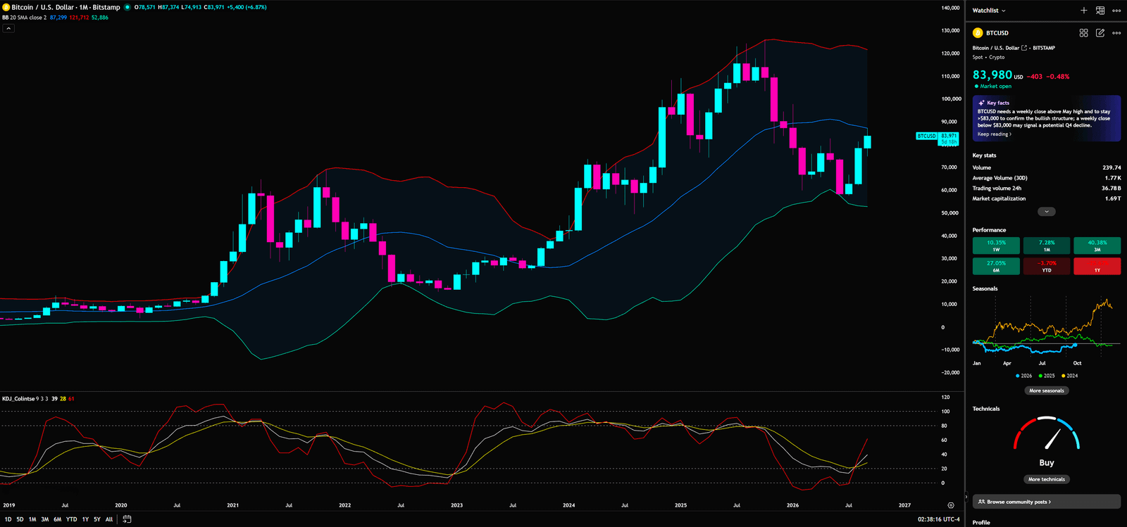
Monthly bands deserve more respect than a flashy intraday candle because a monthly close is difficult to fake with a few hours of excitement. What does capital behavior look like here? Longer-term allocators can begin evaluating exposure while waiting for volatility to resolve. What does retail misread? It sees the lower half of a band and calls it “cheap.” What do institutions look for? A recovery of the middle band, an upward expansion in volatility, and price acceptance that survives the next monthly decision point.
KDJ is a stochastic-style oscillator that locates the close within a recent high-low range, smoothing it into K and D lines while using J as a more sensitive component. The monthly KDJ is recovering from a low area. That says downside speed has eased and a repair attempt has more room to develop. It does not say a long-term bottom is complete. Oscillators can remain extreme for longer than an impatient trader can remain solvent.
The monthly chart is offering patience. It is not issuing an all-in certificate.
The combined read is disciplined. A rising KDJ gives the recovery a better backdrop. A price still needing to recover the Bollinger midline limits the confidence of the conclusion. If BTC loses $75,391, an improving oscillator does not overrule price invalidation. In a real risk process, the price that cancels the thesis carries more authority than the indicator that made the thesis attractive.
📐 Four-hour Gann Fan: measure speed; do not worship geometry
The four-hour chart contains a Gann Fan and rising angle structure anchored from the roughly $75,300 low. A Gann Fan projects price-time slopes such as 1×1, 1×2 and 1×3 from a material pivot. Used responsibly, it is a speed filter. It helps analysts see whether price remains on a given advance rate, slows into a correction, or loses a slope that had been repeatedly respected. It is not a cosmological oracle.
4-Hour Timeframe for BTC (Bitcoin)
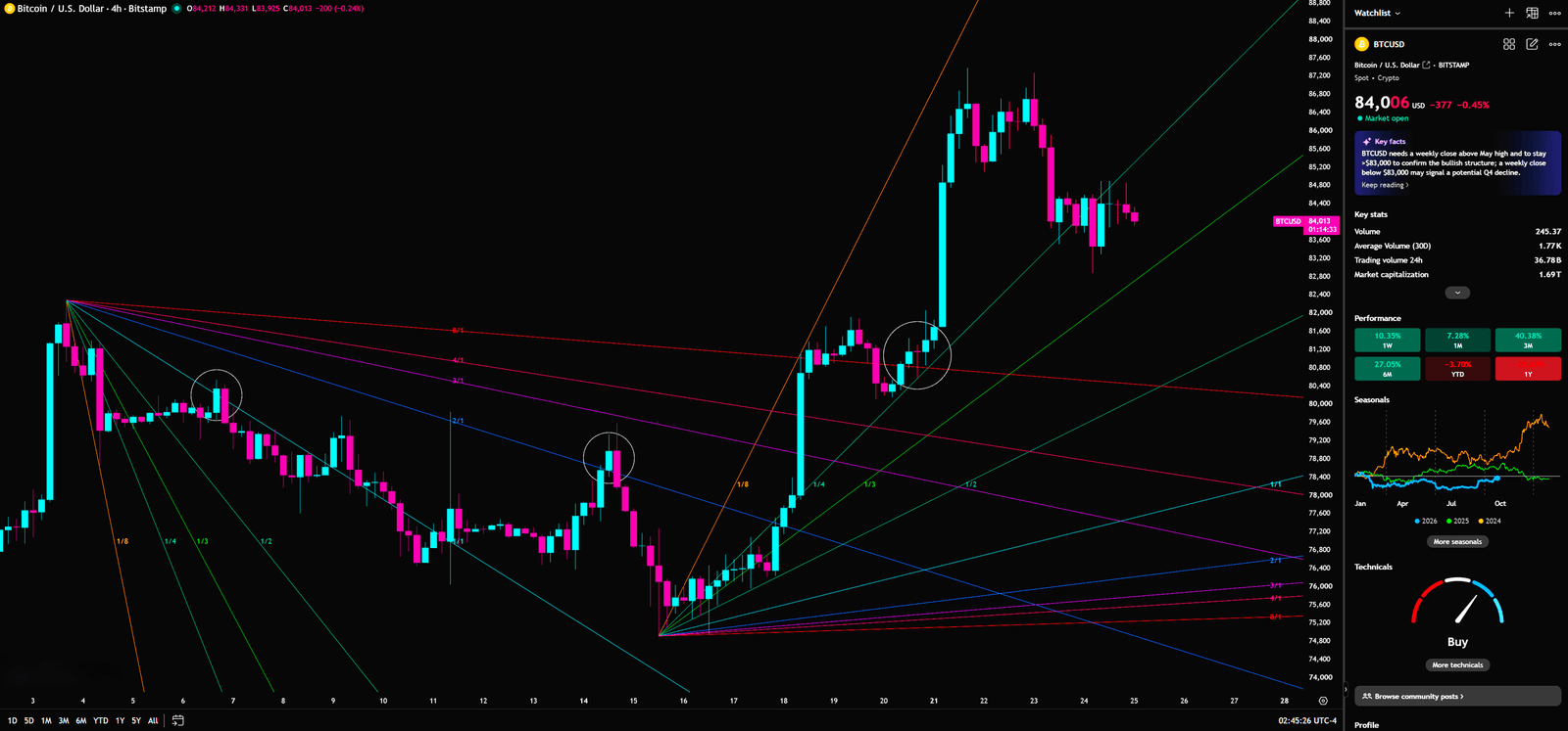
BTC accelerated from the low into the $86K area, then began consolidating within the rising fan structure. The useful short-term question is not “Which ray predicts destiny?” It is “Does a pullback preserve the speed that the higher timeframes require?” Capital behavior around the high can blend short-covering, breakout buying and profit-taking. Retail often treats every bounce from an angle as support. Institutions treat the fan as a confirmation filter: a failed slope, followed by a failed reclaim, says the immediate speed has weakened.
Require a $80,575 rejection, a completed close through $89,051, and a retest that stays above it. Without all three, the move has not proven a breakout.
In bank execution language, the task is to see whether liquidity stays after the first aggressive print. If it does, capital can stay. If it leaves, capital should not pretend that a diagonal line has changed the weekly trend.
Elliott Wave discipline: no visible count, no invented certainty
There is no clearly verifiable 1–2–3–4–5 annotation on this set of charts, so this analysis will not decorate uncertainty with a convenient wave count. The proper rule is nevertheless essential: if anyone claims an advancing impulse is in wave four, the wave-four low may not overlap the wave-one high. If it does, that 1–2–3–4–5 hypothesis fails and a larger A–B–C corrective interpretation must move back into consideration.
This rule is the line between analysis and storytelling. Retail traders often use a wave label to justify a position they already own. Professional risk managers use the invalidation point to define the cost of being wrong. The purpose of chart analysis is not to make every forecast sound elegant. It is to know exactly when evidence no longer supports the story.
Retail versus institutions: the same $86K produces two different ledgers
Retail sees ETF inflows, short liquidations, a price back above $84K, and a feed counting down to $90K. Institutions see an $83K–$86K cluster of long-term-holder cost basis, ETF break-even and liquidation fuel. The same breakout can therefore be valuable for two opposing reasons. It can signal genuine absorption, or it can create the best possible liquidity for holders who accumulated lower to transfer risk.
$86K is not a prediction. It is the price at which weak evidence becomes expensive
🎯Scenario map: prepare three routes, not one confident forecast
Bullish scenario — resistance is accepted, not merely touched
Trigger: A completed daily close above $89,051, followed by a successful retest, with the higher-quality confirmation being a weekly close and hold above $93,615. The four-hour fan should regain constructive speed. A single headline wick is insufficient.
Capital interpretation: Reclaiming 0.382 and holding it shows that higher average cost is being accepted. Holding $93,615 on the weekly frame suggests that a larger supply zone is being absorbed rather than merely tested.
Targets and invalidation: Initial reference is $97,374, followed by $101,253 and $107,389. A long thesis is weakened if price breaks $93,615 and immediately closes back below it; the cleaner the rejection, the faster the plan should return to observation rather than hope.
Bearish scenario — $79,960 breaks and the rebound becomes a better sale
Trigger: A completed daily close below $79,960 followed by a failed reclaim, especially if BTC then loses the marked $75,391 Stop Loss while the four-hour Gann structure continues to reject recovery attempts.
Capital interpretation: A loss of the 0.5 retracement converts “buy the pullback” positions into trapped supply. In a thinner profile area, stops, liquidations and discretionary selling can synchronize.
Targets and invalidation: The chart-marked $65,965 is the safe-short-entry reference, followed by weekly references near $62,525 and $58,035. The bearish case weakens materially if price recovers $80,575, then reclaims and holds $89,051. That would turn the breakdown into a liquidity sweep and force short-side risk to be reassessed.
Neutral scenario — the range is designed to punish people who need to be right quickly
Trigger: BTC remains between $80,575 and $89,051, with neither side earning a completed daily confirmation and four-hour angles repeatedly broken and reclaimed.
Trading implication: This is the situation that produces the most compulsive overtrading. Range tactics are only for participants with a precise position-size, stop and time rule. For everyone else, no trade is a legitimate risk decision. The most expensive dealing-room error is not missing a range. It is treating every range bounce as the start of a new trend
♟️Conditional trading plan: give courage to rules, not feelings
Theoretically, Bitcoin’s decline is not necessarily over. But if BTC stops falling, turns upward and accelerates, the relevant question is whether it can break resistance and hold it. If it breaks and establishes support, a position can be evaluated. If the stop is reached, the position is exited. That is the S/R Flip rule in plain language: the market may change; the rule for evidence does not.
| Setup | Required evidence | Reference entry / confirmation | Invalidation | Next reference |
| Aggressive pullback long | $80,575 retest, four-hour rejection of lower prices and a recovery | Around $80,575; scale rather than chase | $75,391 | $89,051 → $93,615 |
| Conservative trend long | Daily acceptance above $89,051 and a defended retest; ideally weekly acceptance above $93,615 | After $89,051 / $93,615 confirmation | Close back below reclaimed level | $97,374 → $101,253 → $107,389 |
| Thesis failure / exit | Loss of $79,960, especially a loss of $75,391 | Do not average blindly | $75,391 is the hard defense | Reassess $65,965, $62,525, $58,035 |
| Re-entry after failure | A completed reclaim and S/R Flip at the relevant level | Close + retest + hold | Failure back below reclaimed level | Build a new map from the new structure |
Before any position, ask three questions. Where does the thesis become wrong? What percentage of capital is at risk between entry and stop? Is the entry based on a completed close, or on fear of missing out? If the answer to the last question is FOMO, waiting for one more candle is usually cheaper than paying tuition to the market.
I will continue to closely monitor the price action of this Crypto. As soon as a critical reversal signal appears on the charts, I will update my analysis and insights right here immediately. Remember to Bookmark this page and come back often to check for the latest updates!
Want to see our full, interactive chart breakdown? If you want to learn how to draw weekly VPFR, Fibonacci, EMA Ribbon, MACD, Supertrend, and S/R Flip frameworks designed for real trading decisions. Please browse the following『Further Reading』links. Fundamental news tells you what happened. Technical analysis predicts what will happen. To master the professional framework that separates market signal from noise, explore our exclusive models at https://www.chart-blitz.com/fxcx-app/omni-chart.html?symbol=BTC.
📚Further Reading:
To help everyone gain a deeper understanding of the various technical indicators mentioned in this article, we have specially prepared the following further reading materials. These cover key analytical tools found across the weekly, daily, monthly, and 4-hour charts.
- Decoding Fibonacci Retracement: The Perfect Blend of Natural Law and Market Psychology — Fibonacci Retracement is not just a set of magical numbers; it is a manifestation of market psychology. Learning how to correctly draw and interpret Fibonacci levels is a required course for every serious trader.
- Is a Major Move Hiding in Plain Sight? Dow Theory May Already Know the Answer — As retail traders continue to chase short-term signals, experienced market readers are looking deeper — into trend structure, volume behavior, and market phases that may expose the early clues of a coming breakout.
- Understanding VPFR: Finding the Hidden Footprints of Market Makers — The Volume Profile Fixed Range (VPFR) is a powerful tool that tells us where the most trading occurred within a specific price range. This helps us identify true support and resistance levels, as well as potential ‘Vacuum Zones’.
- S/R Flip Support and Resistance Swap Strategy — S/R Flip is one of the most powerful concepts in technical analysis. This article uses real cases to teach you how to use S/R Flip to capture the highest win-rate trading opportunities.
- MACD Momentum Indicator Momentum First — What Does the MACD Line Crossing Above Zero Mean? Golden Cross & Divergence Signals!
- Gann Fan Masterclass — Deep dive into W.D. Gann’s angle theory to identify the geometric relationship between time and price in the market.
- Strategies for EMA Ribbon Bearish Alignment: Dead Cat Bounce or Real Reversal — Deep dive into the EMA Ribbon to understand the battle between short-term and long-term capital.
- Bollinger Band: Long-Term Repricing Zone — The Ultimate Tool to Capture Massive Market Moves Tired of getting shaken out of winning trades too early? Or buying right before a trend reverses? An ex-banker reveals how to use the Bollinger Band to filter out market noise and ride the big waves.
- KDJ Stochastic Indicator Bottom Confirmation — What is the implication of a downward-curving KDJ? Understand in one article how to use dynamic indicators to catch market turning points.
【Disclaimer】 The content herein is for educational purposes and reflects the author’s personal opinion only; it is not investment advice. All financial investments, including cryptocurrencies, carry significant risk, and you could lose your entire capital. To support this site, this article may contain affiliate links. While we strive for accuracy, we cannot guarantee all information is complete or error-free. Please conduct your own research and be fully responsible for your own investment decisions.